 kage
kage
shi-ui.vercel.app
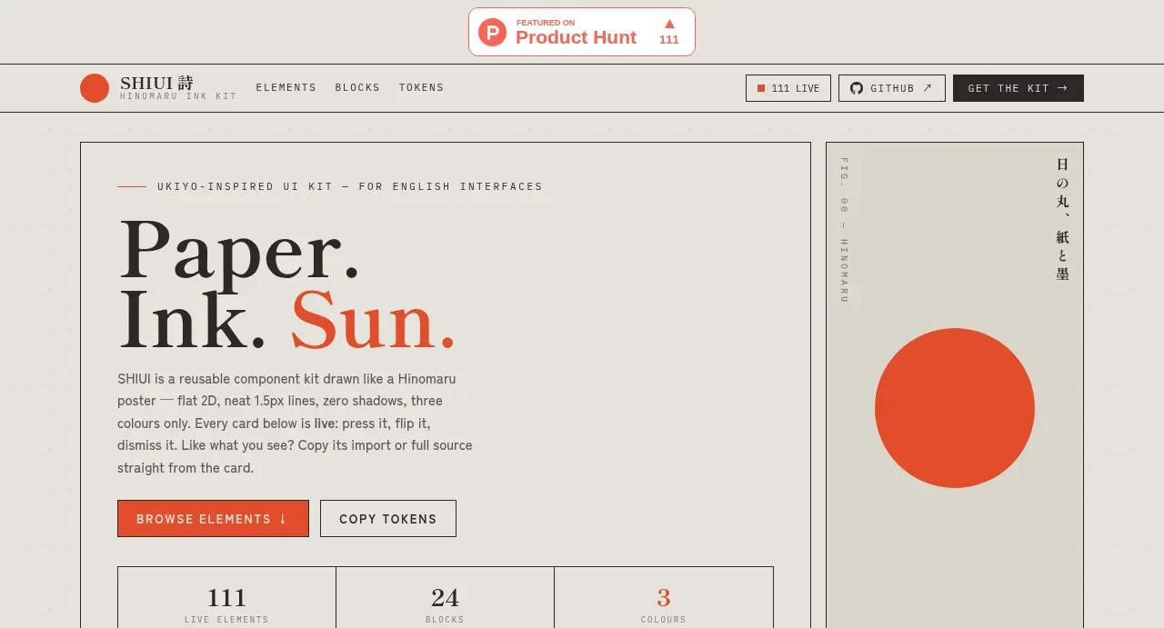
Design analysis
The hero combines a large serif statement, short explanatory copy, two actions, compact metrics, and a bold color specimen so the visual language is understood immediately.
Prompt preview
## Reference images

Study these alongside the description below: hierarchy, rhythm, spacing, colour. Build for the product you are asked about, using this design language.

- Component: https://kage-design-assets.t3.tigrisfiles.io/components/shiui/3111a107-5e9b-4487-9176-525a4b4c448a-1789365764-1.webp
- Full page it was cut from: https://kage-design-assets.t3.tigrisfiles.io/screenshots/shiui/3111a107-5e9b-4487-9176-525a4b4c448a-1789365716423-full.webp
- Component on Kage: https://kage.design/component/shiui-hero

## Before you start
Ask what the user's product and brand are, then apply the principles below to their context rather than reproducing this reference.

Create a split hero for a component catalogue. Use a two-column bordered frame: the left side contains a tiny eyebrow, oversized editorial serif heading with one accent-colored word, concise supporting copy, primary and secondary buttons, and a three-cell stat strip; the right side is a minimal color/specimen panel with one large geometric accent. Use a warm paper background around #e8e7e1, charcoal text around #292926, muted gray rules around #aaa9a1, and one vermilion accent around #e94d2f. Use 42–54px serif display type, 10–12px uppercase utility text, 16–24px internal gaps, square corners, and thin borders. On mobile, stack the columns while preserving the action and metric hierarchy.

Never: use logos, product names, copy, illustrations or imagery from the reference.
More components
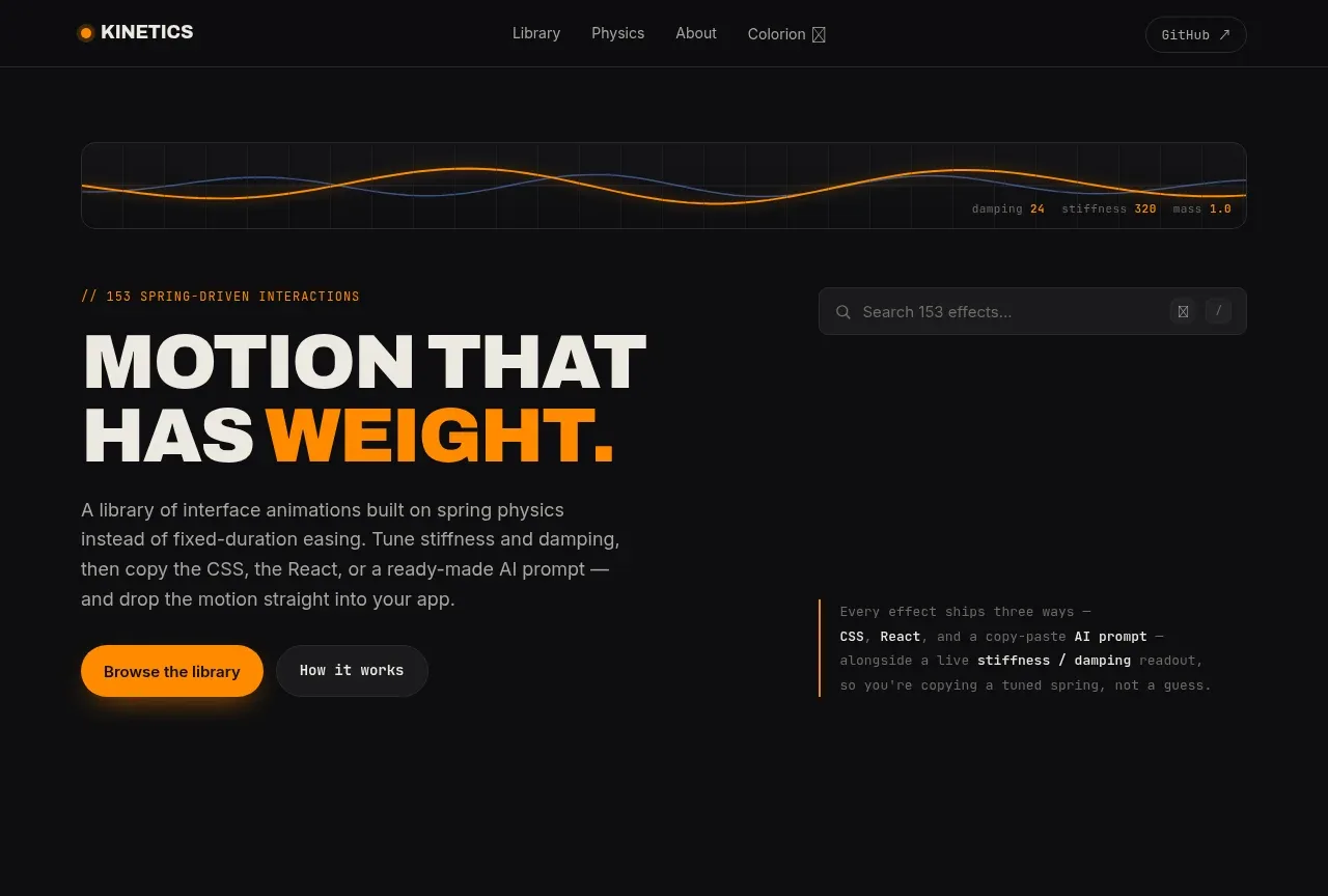
 Motion-focused hero introduction
kinetics.colorion.co · Hero
Motion-focused hero introduction
kinetics.colorion.co · Hero
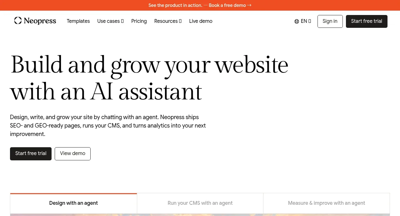
 AI website builder hero
Neopress · Hero
AI website builder hero
Neopress · Hero
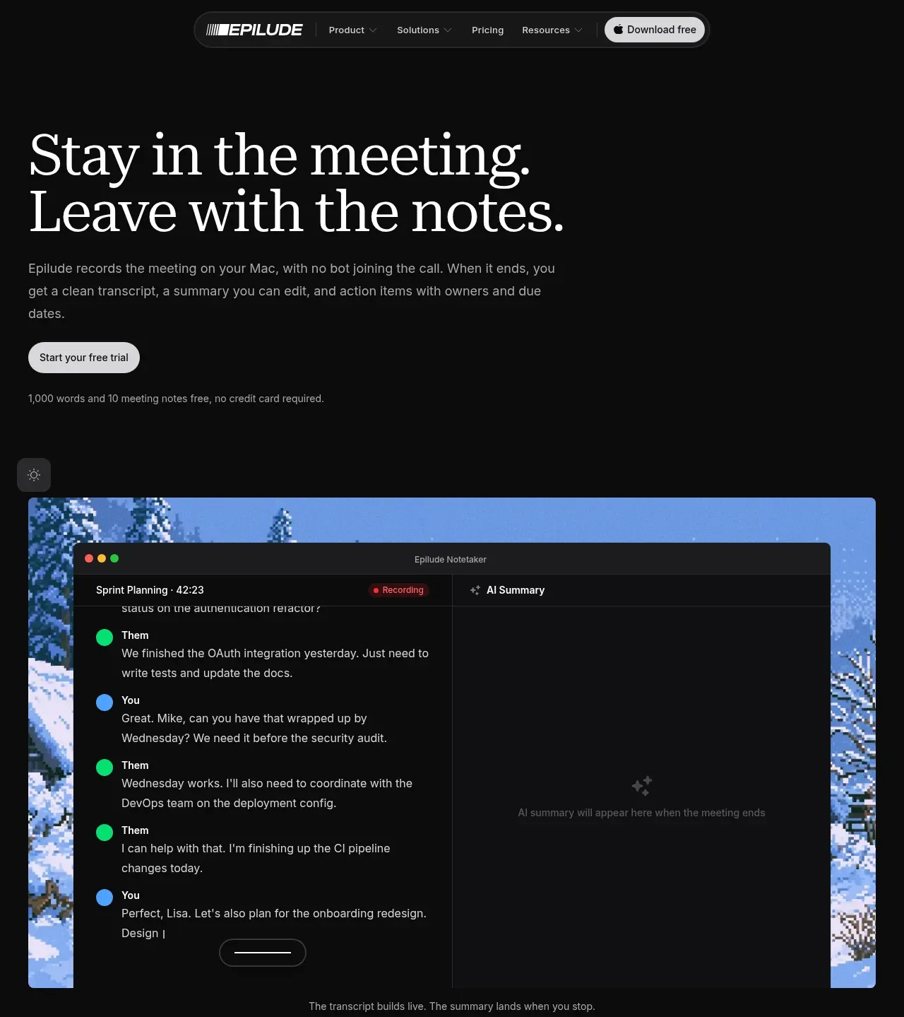
 Meeting notes hero
Epilude Notetaker · Hero
Meeting notes hero
Epilude Notetaker · Hero
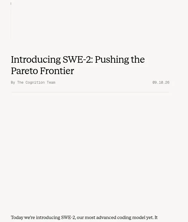
 Article introduction and opening chart
Cognition's SWE-2 · Hero
Article introduction and opening chart
Cognition's SWE-2 · Hero
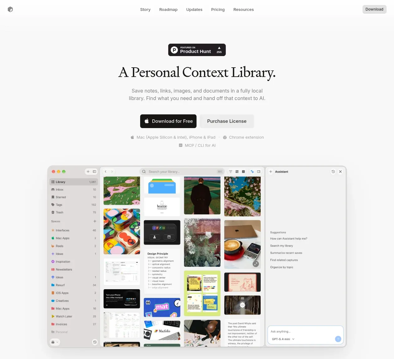
 Product introduction with interface preview
Resurf · Hero
Product introduction with interface preview
Resurf · Hero

 Editorial product hero
DockFix 5.0 · Hero
Editorial product hero
DockFix 5.0 · Hero