 kage
kage
agentshrine.com
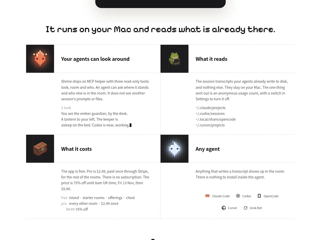
Design analysis
Four compact feature blocks explain what the product can inspect, read, cost, and support. A two-column editorial grid combines small visual markers, bold labels, explanatory copy, and occasional code-like details.
Prompt preview
## Reference images

Study these alongside the description below: hierarchy, rhythm, spacing, colour. Build for the product you are asked about, using this design language.

- Component: https://kage-design-assets.t3.tigrisfiles.io/components/shrine/ff477ea2-1694-4783-bdc4-4322fec31da4-1792130652-5.webp
- Full page it was cut from: https://kage-design-assets.t3.tigrisfiles.io/screenshots/shrine/ff477ea2-1694-4783-bdc4-4322fec31da4-1792130580085-full.webp
- Component on Kage: https://kage.design/component/shrine-feature-grid-2

## Before you start
Ask what the user's product's four most important capabilities are, which proof points are available, and what brand system should be used. Then create an original feature grid.

- Use a centered max-width with a two-column grid on desktop and a single column on mobile.
- Give each feature a small visual marker or icon, a concise bold title, a short explanatory paragraph, and optional supporting detail such as a path, metric, or example.
- Separate items with delicate horizontal rules or generous whitespace rather than heavy cards; preserve a calm editorial rhythm.
- Align icon, heading, and text consistently across columns, and keep each item similar in visual weight even when copy lengths differ.
- Use near-black headings, muted gray body text, off-white page background, and one or two small accent colors for semantic markers.
- Treat technical snippets as readable inline text or code styling, not as dense blocks. Add hover affordances only if a feature opens more information.

Never: use the reference's logo, product name, copy, illustrations, imagery, or exact visual assets.
More components

 Data-to-action engine
Salience · Feature grid
Data-to-action engine
Salience · Feature grid
 Actionable alert workflow
Salience · Feature grid
Actionable alert workflow
Salience · Feature grid
 Trust proof and core outcomes
Salience · Feature grid
Trust proof and core outcomes
Salience · Feature grid
 Three-step implementation flow
Salience · Feature grid
Three-step implementation flow
Salience · Feature grid
 What analytics misses
Salience · Feature grid
What analytics misses
Salience · Feature grid

 Workflow features and capabilities
CrewTower Mod for Claude Code · Feature grid
Workflow features and capabilities
CrewTower Mod for Claude Code · Feature grid