 kage
kage
simhadigital.com
Design analysis
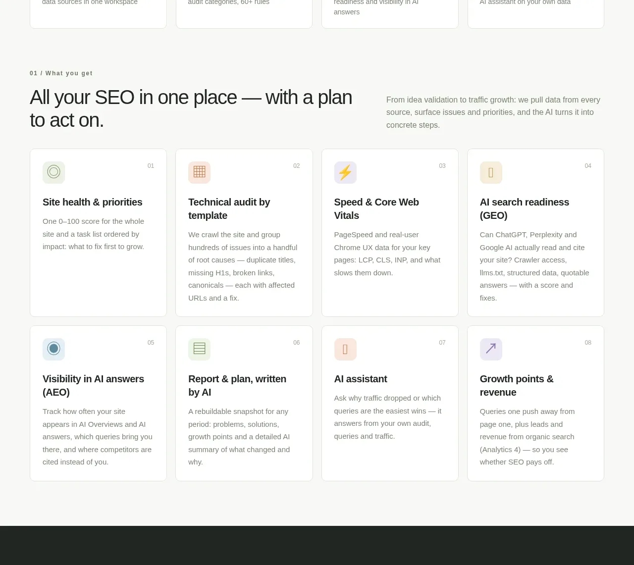
A section intro frames the promise, then eight numbered cards organize the product's capabilities into a consistent four-by-two grid with small colored icons.
Prompt preview
## Reference images

Study these alongside the description below: hierarchy, rhythm, spacing, colour. Build for the product you are asked about, using this design language.

- Component: https://kage-design-assets.t3.tigrisfiles.io/components/simha-digital/94ffd0b7-28d3-4d9a-b697-c16514e9c8c4-1790057073-4.webp
- Full page it was cut from: https://kage-design-assets.t3.tigrisfiles.io/screenshots/simha-digital/94ffd0b7-28d3-4d9a-b697-c16514e9c8c4-1790056948469-full.webp
- Component on Kage: https://kage.design/component/simha-digital-feature-grid

## Before you start
Ask what the user's product's core capabilities are, which should be prioritized, and what brand system should control card accents. Apply the principles below to that content.

Build a feature section with a small numbered eyebrow, a two-column intro row containing a large benefit-led heading and supporting paragraph, followed by an eight-card responsive grid. Cards should share a consistent anatomy: small colored icon tile and index, bold feature title, and concise explanatory text. Use a clean warm-white canvas #F8F9F6, near-black #202522, muted #7A8179, white cards #FFFFFF, and very subtle pastel accent tiles in green, peach, yellow, and lavender. Give cards 1px #E0E3DD borders, 8px radius, 16–18px padding, and equal minimum heights. Use 30–34px section heading, 14px body, 14px card titles, and generous row gaps. Add restrained hover elevation, but no distracting animation. Collapse from four columns to two and then one.

Never use the reference's logo, product name, copy, illustrations, or imagery.
More components

 Spend visibility and daily-cost breakdown
Subscrr · Feature grid
Spend visibility and daily-cost breakdown
Subscrr · Feature grid
 Reminders and simple setup flow
Subscrr · Feature grid
Reminders and simple setup flow
Subscrr · Feature grid

 Security and permissions cards
NotchPop · Feature grid
Security and permissions cards
NotchPop · Feature grid
 Focused feature cards
NotchPop · Feature grid
Focused feature cards
NotchPop · Feature grid
 Interactive product demonstration
NotchPop · Feature grid
Interactive product demonstration
NotchPop · Feature grid
 Quiet information cards
NotchPop · Feature grid
Quiet information cards
NotchPop · Feature grid