 kage
kage
simhadigital.com
Design analysis
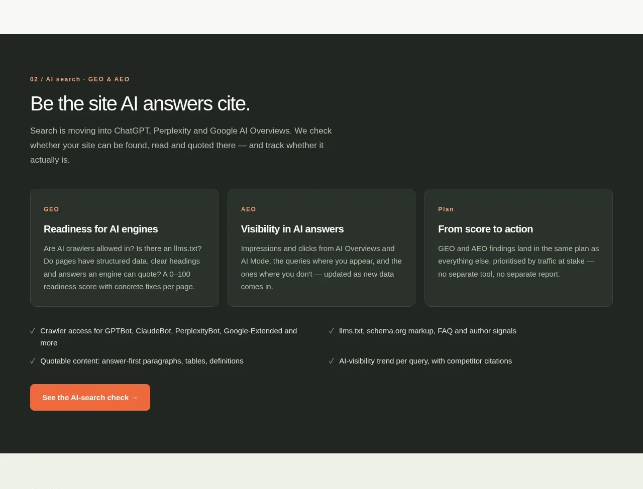
A dark contrast band introduces the AI-search offering, using three large cards, supporting checklist rows, and a bright CTA to make the workflow feel actionable.
Prompt preview
## Reference images

Study these alongside the description below: hierarchy, rhythm, spacing, colour. Build for the product you are asked about, using this design language.

- Component: https://kage-design-assets.t3.tigrisfiles.io/components/simha-digital/94ffd0b7-28d3-4d9a-b697-c16514e9c8c4-1790057073-5.webp
- Full page it was cut from: https://kage-design-assets.t3.tigrisfiles.io/screenshots/simha-digital/94ffd0b7-28d3-4d9a-b697-c16514e9c8c4-1790056948469-full.webp
- Component on Kage: https://kage.design/component/simha-digital-feature-grid-2

## Before you start
Ask what AI, automation, or advanced workflow the user's product provides, who needs it, and what action should follow this section. Translate those answers into this dark editorial pattern.

Create a full-width dark feature band with an eyebrow, a large outcome-oriented heading, and a short paragraph at the top. Below, place three equal dark-green cards that explain a progressive framework; each card gets a tiny category label, strong title, and compact description. Under the cards, add two columns of checkmarked supporting capabilities and one orange CTA. Use #202522 or #1E2521 as the background, #F5F7F1 for headings, #AAB3A7 for body text, muted card fill #29332C, pale borders #3A443C, and orange #F46B43 for the CTA. Use 30–34px heading typography, 13px body text, 8px card radius, and 16–20px spacing. Keep contrast accessible and stack the cards/checklist on mobile.

Never use the reference's logo, product name, copy, illustrations, or imagery.
More components

 Spend visibility and daily-cost breakdown
Subscrr · Feature grid
Spend visibility and daily-cost breakdown
Subscrr · Feature grid
 Reminders and simple setup flow
Subscrr · Feature grid
Reminders and simple setup flow
Subscrr · Feature grid

 Security and permissions cards
NotchPop · Feature grid
Security and permissions cards
NotchPop · Feature grid
 Focused feature cards
NotchPop · Feature grid
Focused feature cards
NotchPop · Feature grid
 Interactive product demonstration
NotchPop · Feature grid
Interactive product demonstration
NotchPop · Feature grid
 Quiet information cards
NotchPop · Feature grid
Quiet information cards
NotchPop · Feature grid