kage
kage
simhadigital.com
Design analysis
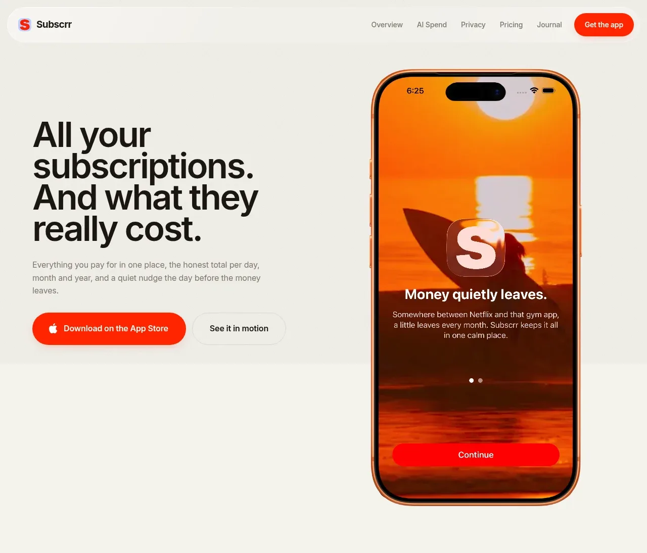
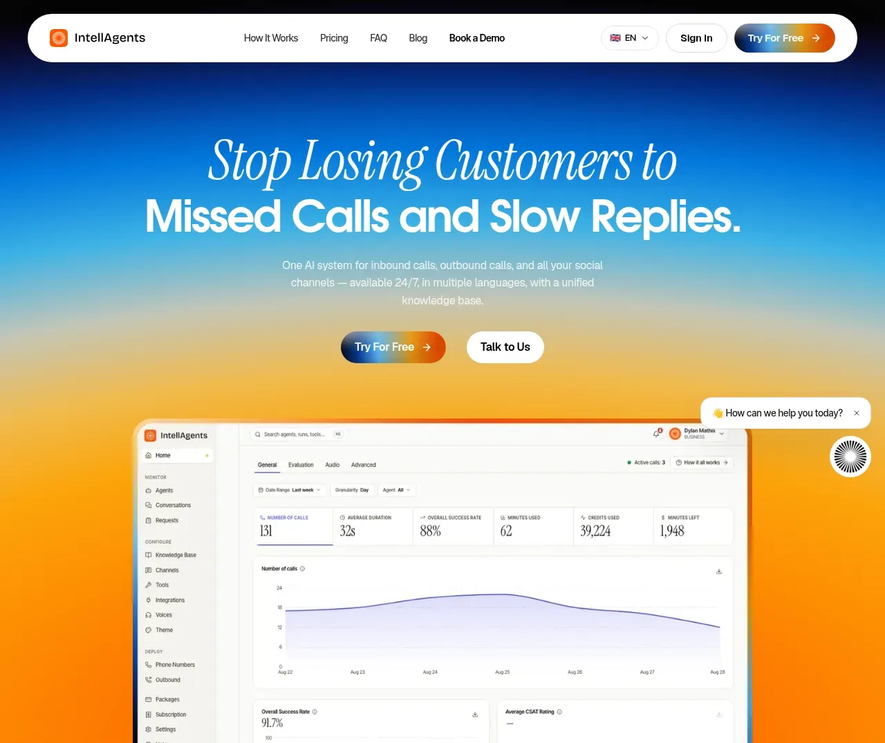
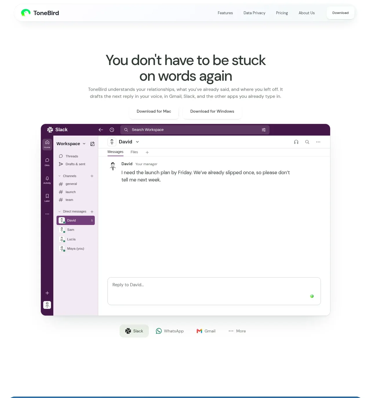
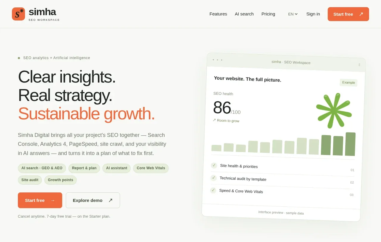
The hero pairs a large three-line outcome statement and supporting paragraph with pill labels and two CTAs on the left, while a tilted product-preview card provides a tangible visual on the right.
Prompt preview
## Reference images

Study these alongside the description below: hierarchy, rhythm, spacing, colour. Build for the product you are asked about, using this design language.

- Component: https://kage-design-assets.t3.tigrisfiles.io/components/simha-digital/94ffd0b7-28d3-4d9a-b697-c16514e9c8c4-1790057072-1.webp
- Full page it was cut from: https://kage-design-assets.t3.tigrisfiles.io/screenshots/simha-digital/94ffd0b7-28d3-4d9a-b697-c16514e9c8c4-1790056948469-full.webp
- Component on Kage: https://kage.design/component/simha-digital-hero

## Before you start
Ask what the user's product does, who the ideal customer is, and what brand colors and conversion goal should guide the hero. Apply these principles to that answer.

Create a spacious two-column hero directly below the navigation. Let the left column carry a small eyebrow, a large three-line headline with one accent-colored line, concise explanatory copy, topical pills, primary and secondary buttons, and a low-emphasis reassurance line. Let the right column contain an abstract product UI preview or dashboard card, slightly rotated, with a soft shadow and enough whitespace around it. Align both columns to a common visual center, use a max-width around 820px, and make the text column dominant. Use near-black #202522, warm off-white #F8F9F6, muted gray #737A73, orange #F46B43, pale green #EAF2DF, and restrained green #71B64A. Headline should be approximately 40–46px desktop with tight line-height; body 14px and relaxed line-height. Use 8px radii, thin #DDE1D9 borders, and pill labels with pale green fills. On mobile, stack the visual below the CTAs.

Never use the reference's logo, product name, copy, illustrations, or imagery.