 kage
kage
simhadigital.com
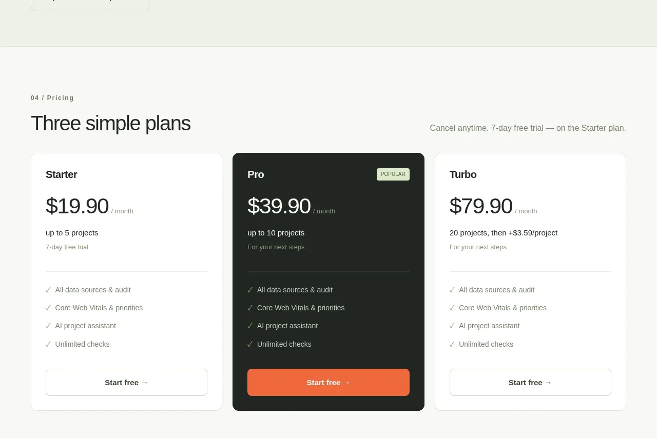
Design analysis
Three aligned plans make comparison immediate; the center plan is visually selected with a dark fill and a small popularity badge while each card ends in a clear CTA.
Prompt preview
## Reference images

Study these alongside the description below: hierarchy, rhythm, spacing, colour. Build for the product you are asked about, using this design language.

- Component: https://kage-design-assets.t3.tigrisfiles.io/components/simha-digital/94ffd0b7-28d3-4d9a-b697-c16514e9c8c4-1790057073-7.webp
- Full page it was cut from: https://kage-design-assets.t3.tigrisfiles.io/screenshots/simha-digital/94ffd0b7-28d3-4d9a-b697-c16514e9c8c4-1790056948469-full.webp
- Component on Kage: https://kage.design/component/simha-digital-pricing-table

## Before you start
Ask what pricing model, plan names, limits, billing cadence, and preferred conversion action fit the user's product. Build the structure around that information.

Create a pricing section with a small eyebrow, a left-aligned heading, and a quiet trial/cancellation reassurance on the right. Below, show three equal pricing cards with plan name, prominent price and billing unit, limits, short supporting line, divider, checkmarked feature list, and full-width CTA. Emphasize the recommended middle plan using a deep charcoal background, light text, an orange filled CTA, and a small pale badge; keep the outer cards white with dark text and outlined buttons. Use #F8F9F6, #FFFFFF, #202522, #727970, #E0E3DD, #F46B43, and pale green #DCEBCB. Use 8px card radius, 18–20px padding, 28–32px price type, and identical card heights. Make billing controls keyboard accessible if included, and stack cards on mobile.

Never use the reference's logo, product name, copy, illustrations, or imagery.
More components
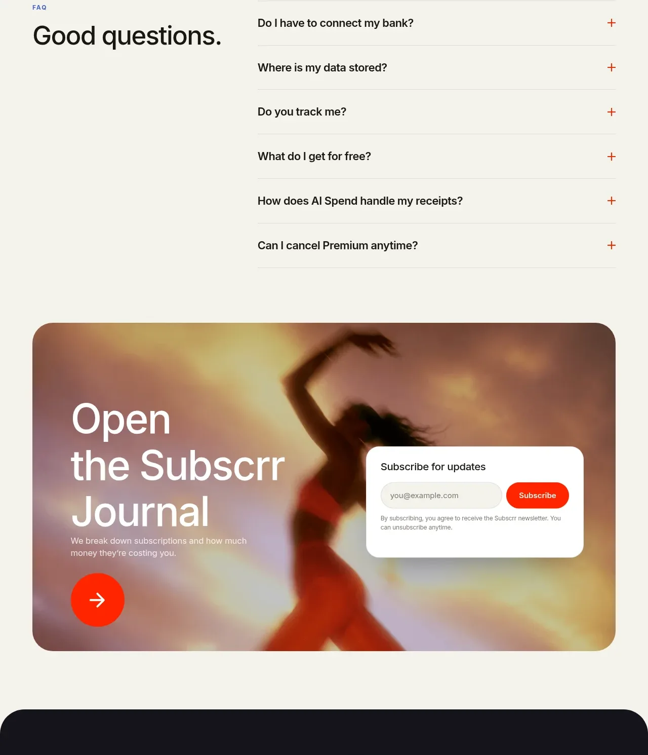
 Free and premium pricing comparison
Subscrr · Pricing table
Free and premium pricing comparison
Subscrr · Pricing table
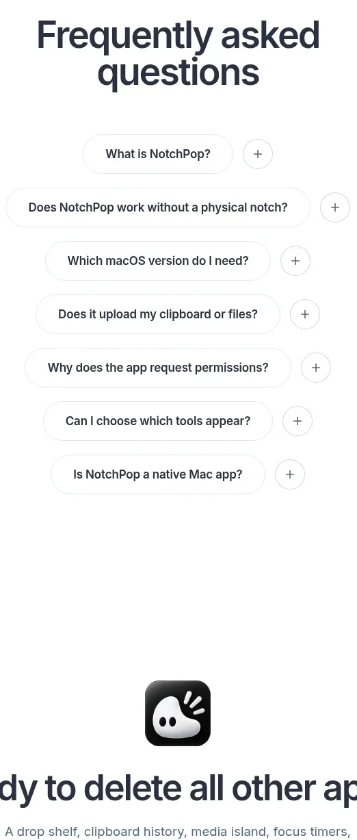
 One-time purchase pricing
NotchPop · Pricing table
One-time purchase pricing
NotchPop · Pricing table
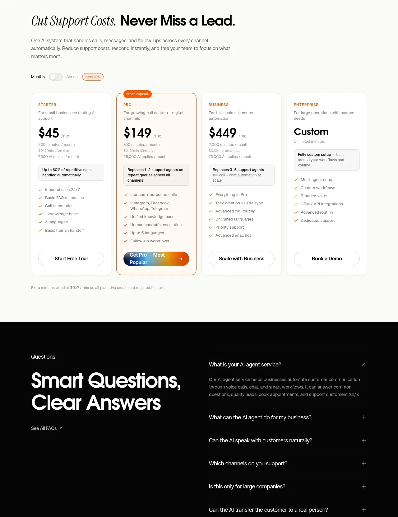
 Support plan pricing
IntellAgents.io · Pricing table
Support plan pricing
IntellAgents.io · Pricing table
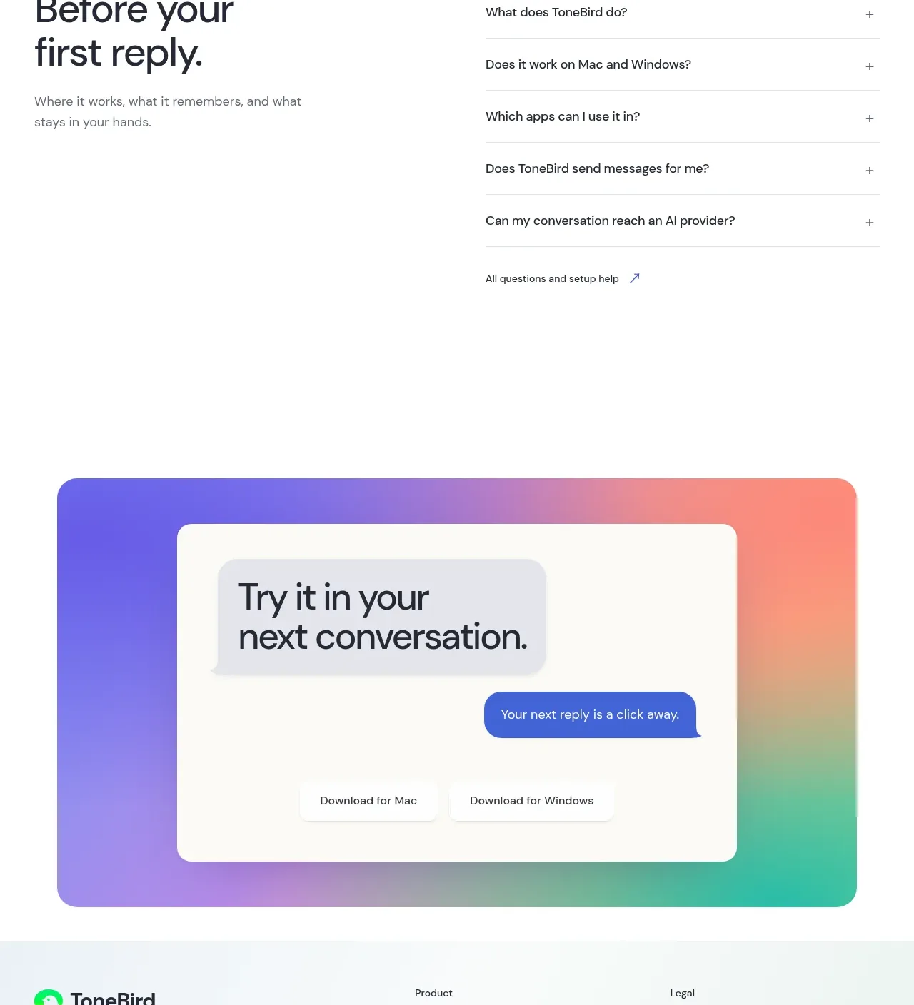
 Four-tier pricing table
ToneBird · Pricing table
Four-tier pricing table
ToneBird · Pricing table
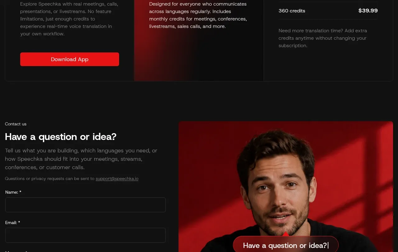
 Trial and subscription plans
Speechka · Pricing table
Trial and subscription plans
Speechka · Pricing table
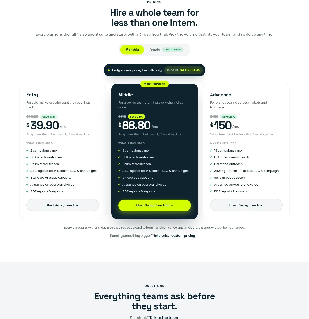
 Three-tier pricing plans
Naise AI · Pricing table
Three-tier pricing plans
Naise AI · Pricing table