 kage
kage
temprl.org
Design analysis
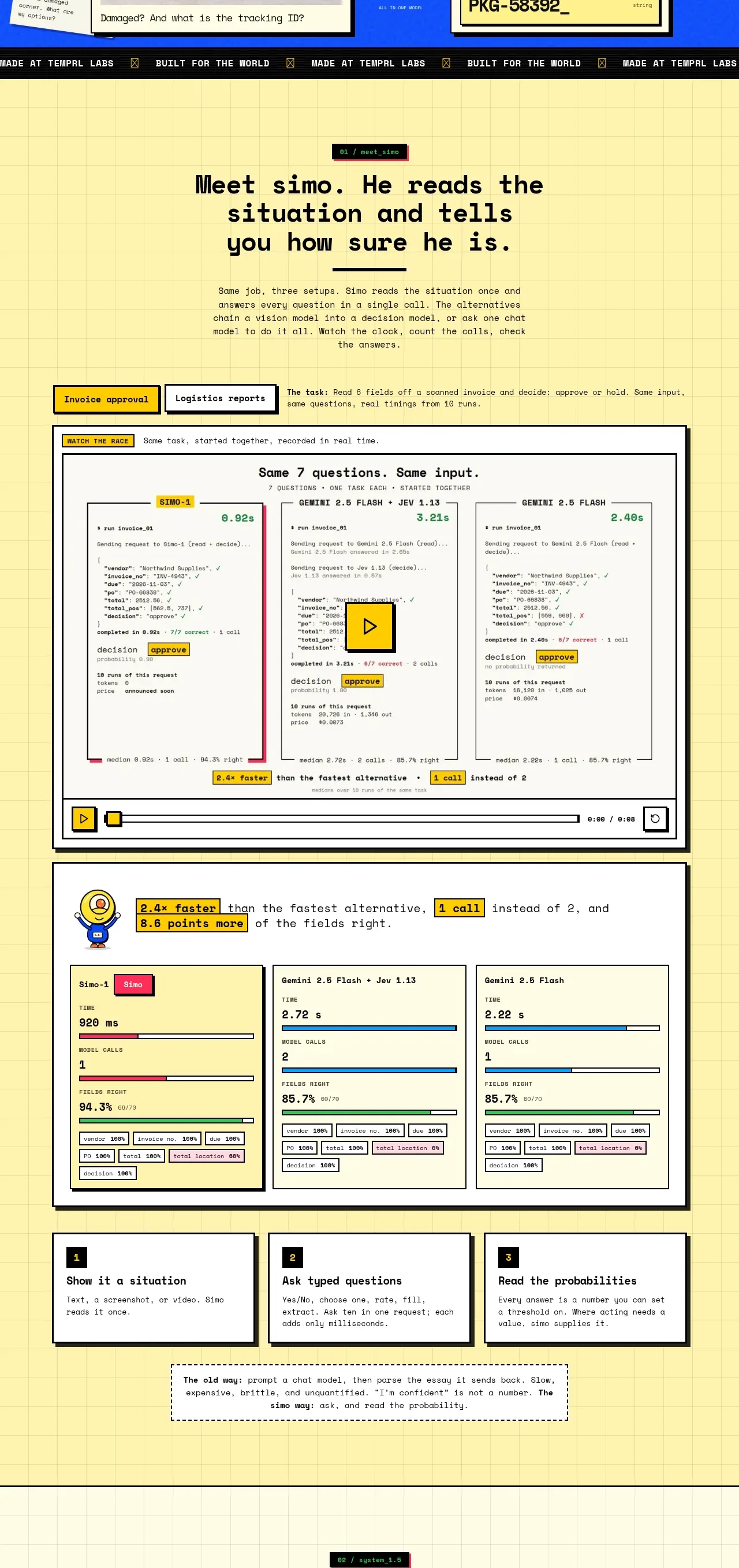
A long pale-yellow feature section explains the product through a headline, a side-by-side workflow comparison, metric cards, and three concise steps. The repeated framed modules turn abstract claims into inspectable evidence.
Prompt preview
## Reference images

Study these alongside the description below: hierarchy, rhythm, spacing, colour. Build for the product you are asked about, using this design language.

- Component: https://kage-design-assets.t3.tigrisfiles.io/components/simo/01913313-62ce-4f89-a048-ac4500929f0e-1791525856-2.webp
- Full page it was cut from: https://kage-design-assets.t3.tigrisfiles.io/screenshots/simo/01913313-62ce-4f89-a048-ac4500929f0e-1791525747684-full.webp
- Component on Kage: https://kage.design/component/simo-feature-grid

### Before you start
Ask the user which workflow, outputs, and proof points best explain their product. Then apply these principles to design an original feature section.

Use a pale warm-yellow background with a faint square grid. Center a short section label, a large two-line heading, supporting paragraph, and a strong divider rule. Follow it with a large bordered demonstration module that compares several outcomes or model paths in parallel. Below, add a compact metrics row, then three equal step cards explaining the workflow in sequence. Use consistent 2px dark borders, hard black offset shadows, mostly square corners with only slight radius, and yellow/pink/blue status accents. Keep all cards aligned to a shared content width and vary their internal density so the main comparison remains dominant. Use mono labels, small highlighted chips, and simple bars or controls as visual evidence. On mobile, turn comparisons into a vertical sequence and retain the step numbering.

Never: copy the reference's logo, product name, copy, illustrations, imagery, or exact data.
More components

 Privacy and optional intelligence
Mailwell · Feature grid
Privacy and optional intelligence
Mailwell · Feature grid
 Reliable, recoverable actions
Mailwell · Feature grid
Reliable, recoverable actions
Mailwell · Feature grid
 Unified account setup
Mailwell · Feature grid
Unified account setup
Mailwell · Feature grid
 Fast local workflow and calm reading
Mailwell · Feature grid
Fast local workflow and calm reading
Mailwell · Feature grid

 Cloud layer workflows
ProcBoss · Feature grid
Cloud layer workflows
ProcBoss · Feature grid
 Operational blind spots
ProcBoss · Feature grid
Operational blind spots
ProcBoss · Feature grid