 kage
kage
temprl.org
Design analysis
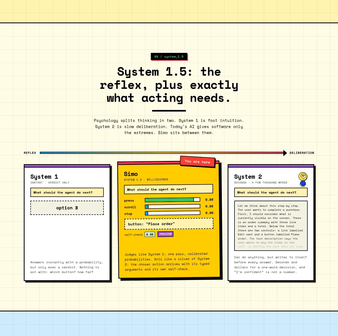
This section frames the product as a middle layer between fast reflexes and slower deliberation, with three contrasting system cards and an emphasized center card. The visual hierarchy makes the product's role obvious at a glance.
Prompt preview
## Reference images

Study these alongside the description below: hierarchy, rhythm, spacing, colour. Build for the product you are asked about, using this design language.

- Component: https://kage-design-assets.t3.tigrisfiles.io/components/simo/01913313-62ce-4f89-a048-ac4500929f0e-1791525857-3.webp
- Full page it was cut from: https://kage-design-assets.t3.tigrisfiles.io/screenshots/simo/01913313-62ce-4f89-a048-ac4500929f0e-1791525747684-full.webp
- Component on Kage: https://kage.design/component/simo-feature-grid-2

### Before you start
Ask the user what competing approaches or system layers their product coordinates. Then use these rules to build an original explanatory section.

Create a lightly gridded neutral section with a centered eyebrow, bold heading, short explanatory copy, and a horizontal spectrum or arrow showing two opposing modes. Below it, place three equal cards: a lightweight option, the user's product in the center, and a more deliberate option. Give the center card a bright accent background and strongest emphasis, while the outer cards remain off-white with distinct colored top rules. Use thick outlines, compact monospace labels, clear question/answer snippets, and one or two small confidence indicators. Keep the cards visually connected to the spectrum above. On mobile, stack the cards while preserving the center card's prominence.

Never: copy the reference's logo, product name, copy, illustrations, imagery, or exact system names.
More components

 Privacy and optional intelligence
Mailwell · Feature grid
Privacy and optional intelligence
Mailwell · Feature grid
 Reliable, recoverable actions
Mailwell · Feature grid
Reliable, recoverable actions
Mailwell · Feature grid
 Unified account setup
Mailwell · Feature grid
Unified account setup
Mailwell · Feature grid
 Fast local workflow and calm reading
Mailwell · Feature grid
Fast local workflow and calm reading
Mailwell · Feature grid

 Cloud layer workflows
ProcBoss · Feature grid
Cloud layer workflows
ProcBoss · Feature grid
 Operational blind spots
ProcBoss · Feature grid
Operational blind spots
ProcBoss · Feature grid