 kage
kage
temprl.org
Design analysis
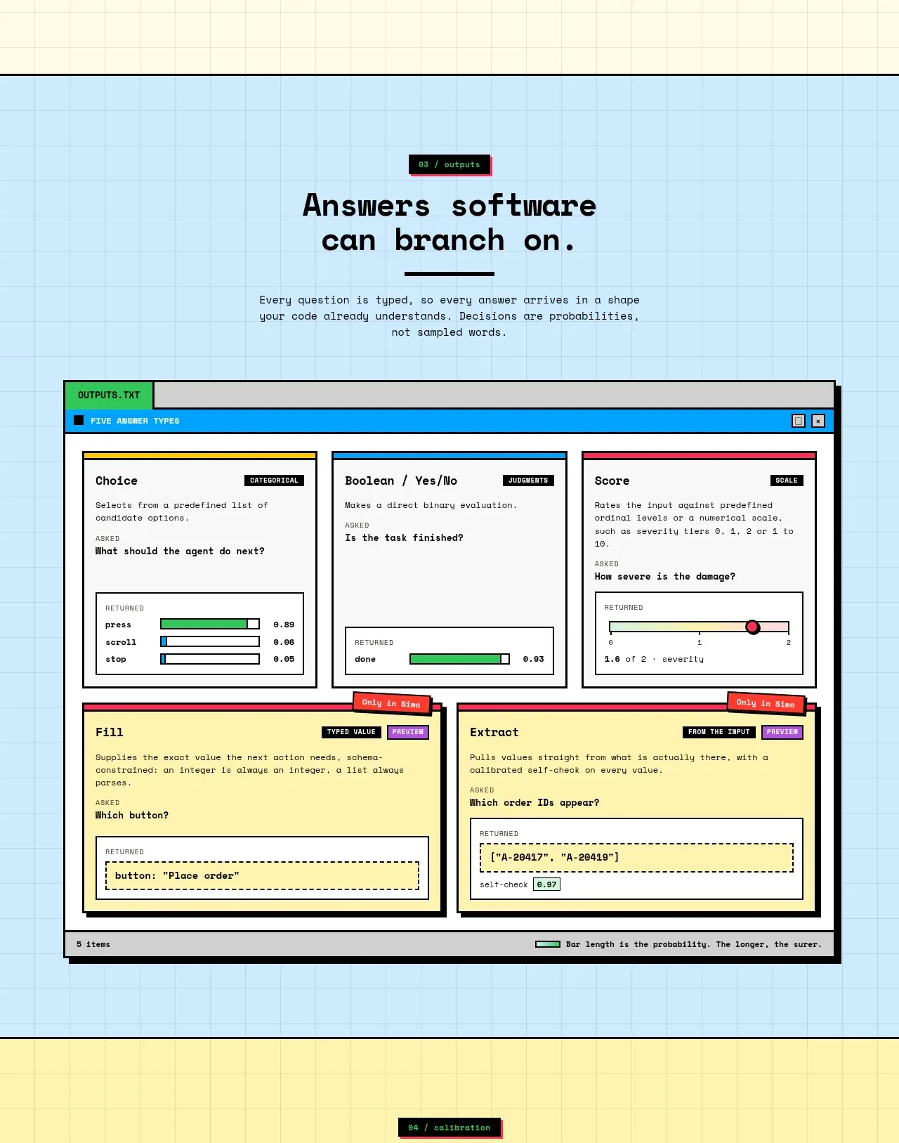
A blue-tinted section introduces typed answers, then presents a large faux application window containing several output types. The window chrome and color-coded cards make the technical concept approachable and scannable.
Prompt preview
## Reference images

Study these alongside the description below: hierarchy, rhythm, spacing, colour. Build for the product you are asked about, using this design language.

- Component: https://kage-design-assets.t3.tigrisfiles.io/components/simo/01913313-62ce-4f89-a048-ac4500929f0e-1791525857-4.webp
- Full page it was cut from: https://kage-design-assets.t3.tigrisfiles.io/screenshots/simo/01913313-62ce-4f89-a048-ac4500929f0e-1791525747684-full.webp
- Component on Kage: https://kage.design/component/simo-feature-grid-3

### Before you start
Ask the user what kinds of structured outputs their product generates and which one matters most. Then design an original section using these principles.

Use a light blue grid background and a centered section heading with a brief explanation. Make the main artifact a large browser-like or desktop-like window with a dark title bar, compact metadata, and a clean off-white interior. Inside, arrange 3 top cards for distinct answer types and 2 wider cards beneath for richer outputs. Color-code the cards with restrained blue, yellow, pink, or green accents, and show believable fields, controls, confidence bars, and returned values. Give the window a heavy outline and hard shadow, but keep internal borders lighter. Ensure the artifact is understandable without reading every tiny label, and make cards responsive by switching to a single-column layout on narrow screens.

Never: copy the reference's logo, product name, copy, illustrations, imagery, or exact schemas.
More components

 Privacy and optional intelligence
Mailwell · Feature grid
Privacy and optional intelligence
Mailwell · Feature grid
 Reliable, recoverable actions
Mailwell · Feature grid
Reliable, recoverable actions
Mailwell · Feature grid
 Unified account setup
Mailwell · Feature grid
Unified account setup
Mailwell · Feature grid
 Fast local workflow and calm reading
Mailwell · Feature grid
Fast local workflow and calm reading
Mailwell · Feature grid

 Cloud layer workflows
ProcBoss · Feature grid
Cloud layer workflows
ProcBoss · Feature grid
 Operational blind spots
ProcBoss · Feature grid
Operational blind spots
ProcBoss · Feature grid