 kage
kage
temprl.org
Design analysis
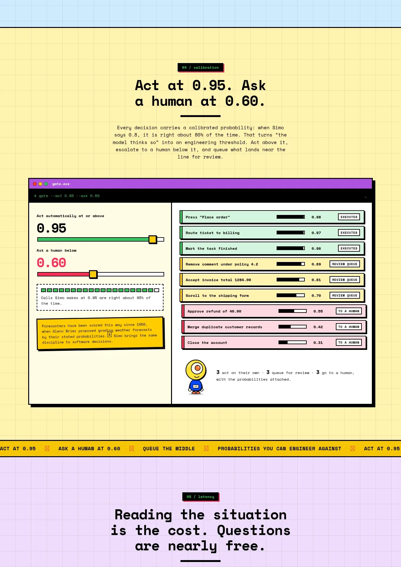
A warm yellow section explains confidence thresholds and shows a split control-room interface with automatic actions, queued review, and human handoff. Threshold sliders and colored rows make escalation policies concrete.
Prompt preview
## Reference images

Study these alongside the description below: hierarchy, rhythm, spacing, colour. Build for the product you are asked about, using this design language.

- Component: https://kage-design-assets.t3.tigrisfiles.io/components/simo/01913313-62ce-4f89-a048-ac4500929f0e-1791525858-5.webp
- Full page it was cut from: https://kage-design-assets.t3.tigrisfiles.io/screenshots/simo/01913313-62ce-4f89-a048-ac4500929f0e-1791525747684-full.webp
- Component on Kage: https://kage.design/component/simo-feature-grid-4

### Before you start
Ask the user what decisions can be automated, what requires review, and what confidence thresholds matter. Then create an original policy-control section.

Build a warm yellow, lightly gridded section with a centered headline and concise explanatory copy. Below it, show a large split dashboard: the left side contains two prominent threshold values, a slider, and an explanatory callout; the right side contains a vertical action queue with confidence bars and three states such as execute, review, and hand off. Use green for automatic, yellow for review, and pink/red for escalation, while keeping text near-black and panels off-white. Use thick framing, square-ish corners, strong alignment, and one small mascot-like or product-neutral status marker only if it fits the user's brand. Make controls keyboard accessible and let users change thresholds with immediate visual feedback.

Never: copy the reference's logo, product name, copy, illustrations, imagery, or exact policies.
More components

 Privacy and optional intelligence
Mailwell · Feature grid
Privacy and optional intelligence
Mailwell · Feature grid
 Reliable, recoverable actions
Mailwell · Feature grid
Reliable, recoverable actions
Mailwell · Feature grid
 Unified account setup
Mailwell · Feature grid
Unified account setup
Mailwell · Feature grid
 Fast local workflow and calm reading
Mailwell · Feature grid
Fast local workflow and calm reading
Mailwell · Feature grid

 Cloud layer workflows
ProcBoss · Feature grid
Cloud layer workflows
ProcBoss · Feature grid
 Operational blind spots
ProcBoss · Feature grid
Operational blind spots
ProcBoss · Feature grid