 kage
kage
temprl.org
Design analysis
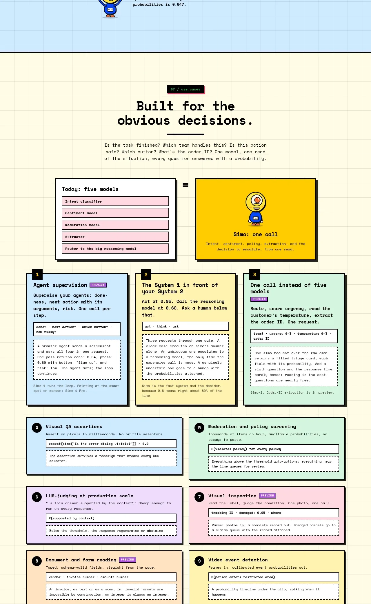
A pale section translates the product into practical use cases: a central one-call comparison is followed by a numbered grid of supervisory, routing, inspection, and extraction scenarios. The numbered cards support fast scanning.
Prompt preview
## Reference images

Study these alongside the description below: hierarchy, rhythm, spacing, colour. Build for the product you are asked about, using this design language.

- Component: https://kage-design-assets.t3.tigrisfiles.io/components/simo/01913313-62ce-4f89-a048-ac4500929f0e-1791525860-8.webp
- Full page it was cut from: https://kage-design-assets.t3.tigrisfiles.io/screenshots/simo/01913313-62ce-4f89-a048-ac4500929f0e-1791525747684-full.webp
- Component on Kage: https://kage.design/component/simo-feature-grid-5

### Before you start
Ask the user which real-world use cases are most valuable and what decision flow connects them. Then design an original use-case section.

Use a warm off-white or pale-yellow gridded background. Introduce the section with a centered heading and a compact explanation, then show one prominent comparison at the top: many specialist steps on the left, one coordinated product action on the right. Below, organize 6–9 numbered use-case cards in a responsive multi-column grid. Each card needs a short title, a one-sentence explanation, a small input/output example, and an optional status chip. Use varied pastel fills to distinguish categories, heavy black borders, hard shadows, and clear numbered badges. Add one centered secondary CTA after the grid. Preserve a logical reading order on mobile and keep card copy concise.

Never: copy the reference's logo, product name, copy, illustrations, imagery, or exact use-case text.
More components

 Privacy and optional intelligence
Mailwell · Feature grid
Privacy and optional intelligence
Mailwell · Feature grid
 Reliable, recoverable actions
Mailwell · Feature grid
Reliable, recoverable actions
Mailwell · Feature grid
 Unified account setup
Mailwell · Feature grid
Unified account setup
Mailwell · Feature grid
 Fast local workflow and calm reading
Mailwell · Feature grid
Fast local workflow and calm reading
Mailwell · Feature grid

 Cloud layer workflows
ProcBoss · Feature grid
Cloud layer workflows
ProcBoss · Feature grid
 Operational blind spots
ProcBoss · Feature grid
Operational blind spots
ProcBoss · Feature grid