kage
kage
temprl.org
Design analysis
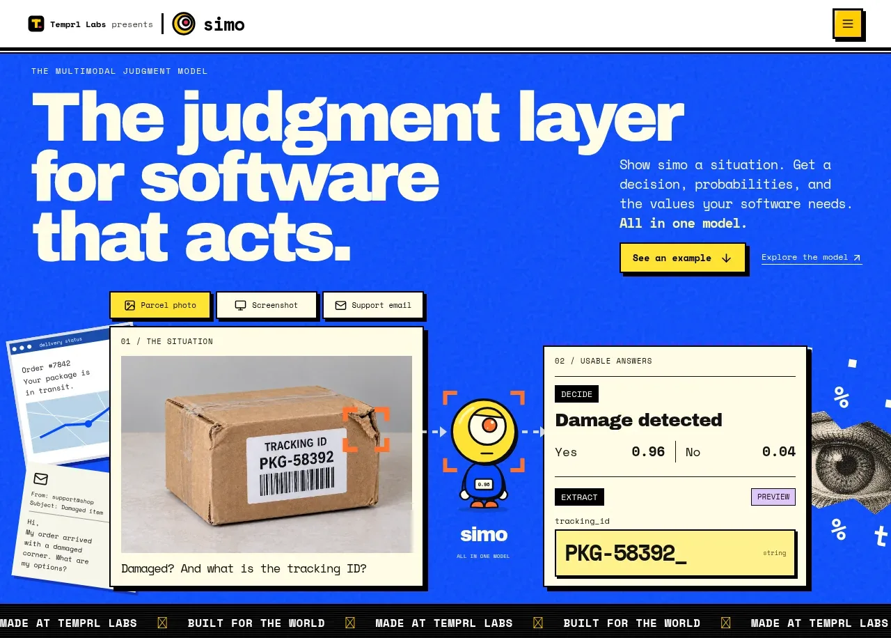
The hero uses an oversized statement, a short explanatory paragraph, a yellow CTA, and a large product walkthrough composed of framed interface cards. Electric blue, thick outlines, and playful technical labels make the proposition immediately legible.
Prompt preview
## Reference images

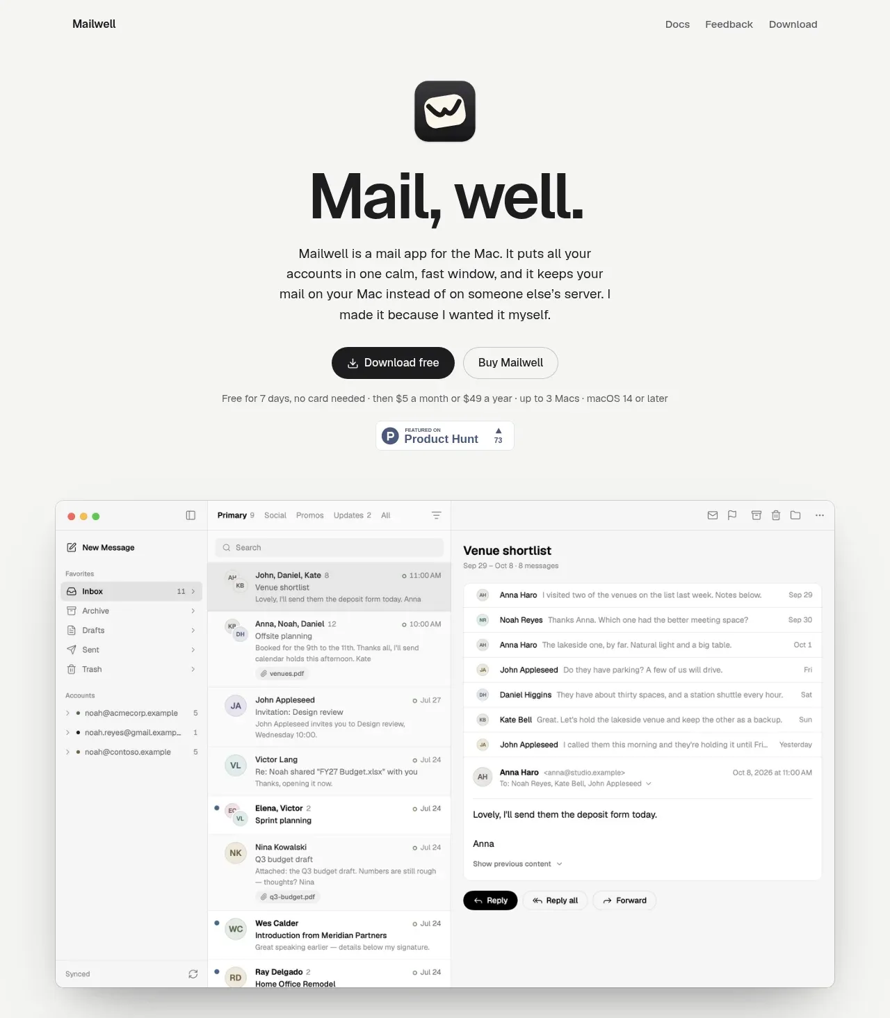
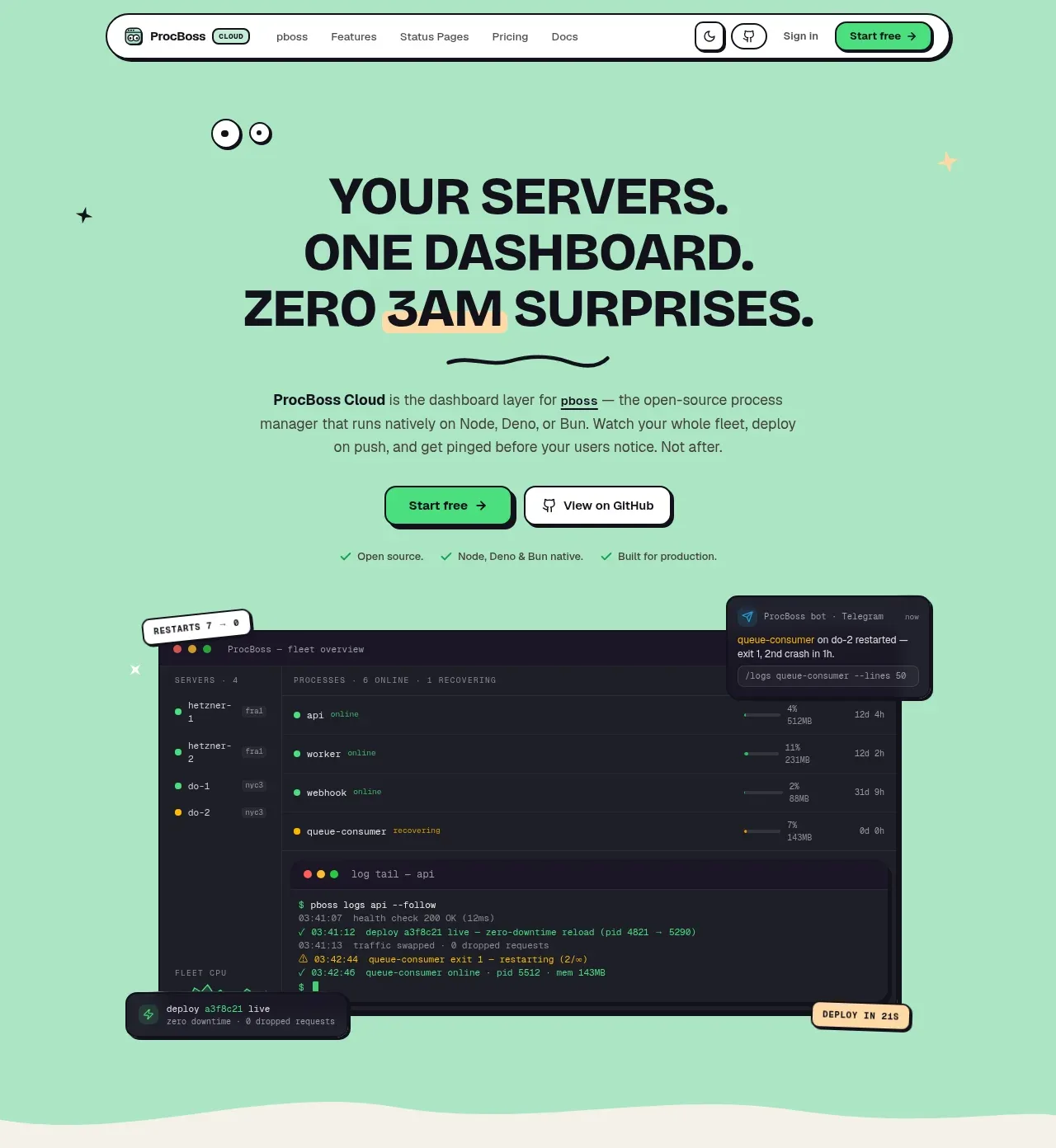
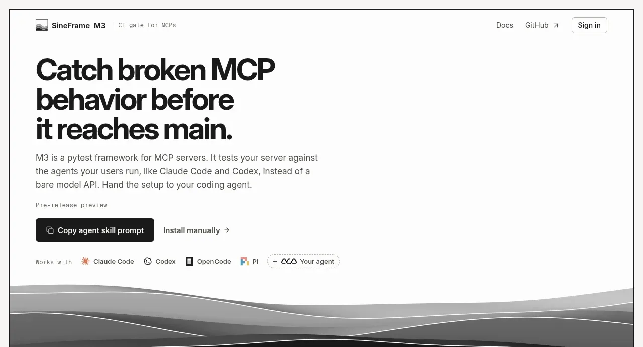
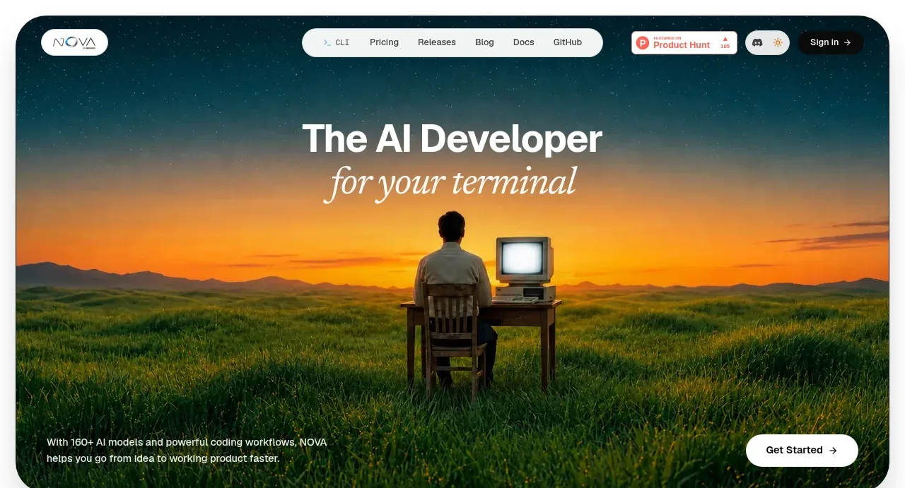
Study these alongside the description below: hierarchy, rhythm, spacing, colour. Build for the product you are asked about, using this design language.

- Component: https://kage-design-assets.t3.tigrisfiles.io/components/simo/01913313-62ce-4f89-a048-ac4500929f0e-1791525855-1.webp
- Full page it was cut from: https://kage-design-assets.t3.tigrisfiles.io/screenshots/simo/01913313-62ce-4f89-a048-ac4500929f0e-1791525747684-full.webp
- Component on Kage: https://kage.design/component/simo-hero

### Before you start
Ask the user what their product does, what action the hero should drive, and what brand personality it should express. Then use these rules to build an original hero.

Create a full-width hero with a saturated blue field and a two-part top composition: an oversized, tightly leading headline on the left and concise supporting copy plus one bright primary CTA on the right. Underneath, show a product-specific visual demonstration using 2–3 deliberately framed interface panels rather than a generic stock image. Use off-white panels, black 2px outlines, occasional yellow and pink labels, and hard offset shadows instead of soft elevation. Establish a clear desktop grid, then stack the copy and visual on mobile. Typography should pair a bold grotesk/display face for the headline with a small monospaced technical face for labels and body copy. Add subtle utility metadata, but preserve generous breathing room around the headline. Make the CTA high contrast and include a visible hover state.

Never: copy the reference's logo, product name, copy, illustrations, imagery, or exact interface artwork.