 kage
kage
m3.sineframe.com
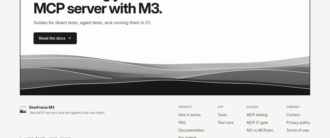
Design analysis
A bordered CTA panel closes the content with a strong documentation invitation, one action, and the recurring layered monochrome visual along its bottom edge.
Prompt preview
## Reference images

Study these alongside the description below: hierarchy, rhythm, spacing, colour. Build for the product you are asked about, using this design language.

- Component: https://kage-design-assets.t3.tigrisfiles.io/components/sineframe-m3/9bef993c-d1bd-4942-a7c3-753981df67d7-1791525889-9.webp
- Full page it was cut from: https://kage-design-assets.t3.tigrisfiles.io/screenshots/sineframe-m3/9bef993c-d1bd-4942-a7c3-753981df67d7-1791525776498-full.webp
- Component on Kage: https://kage.design/component/sineframe-m3-cta

## Before you start
Ask what the user's product and brand are, then apply the following principles to that product rather than reproducing this reference.

Build a closing call-to-action inside a large bordered panel. Use a bold 42–48px headline, a short supporting sentence, and one dark primary button aligned to the left. Reserve the lower portion of the panel for an abstract, low-contrast layered monochrome wave or stripe treatment that visually connects to the rest of the page without using a literal illustration.

Use warm white #f7f6f3, a near-black 1px border #1b1b1b, black text #171717, gray supporting copy #6c6a64, and a black button with white text. Use 6px radius, 36–40px internal padding, and enough bottom space for the visual treatment. Make the CTA responsive, keep the action prominent, and add hover/focus states. The decorative visual must be aria-hidden and never obscure content.

Never:
- use logos, product names, copy, illustrations, or imagery from the reference
More components
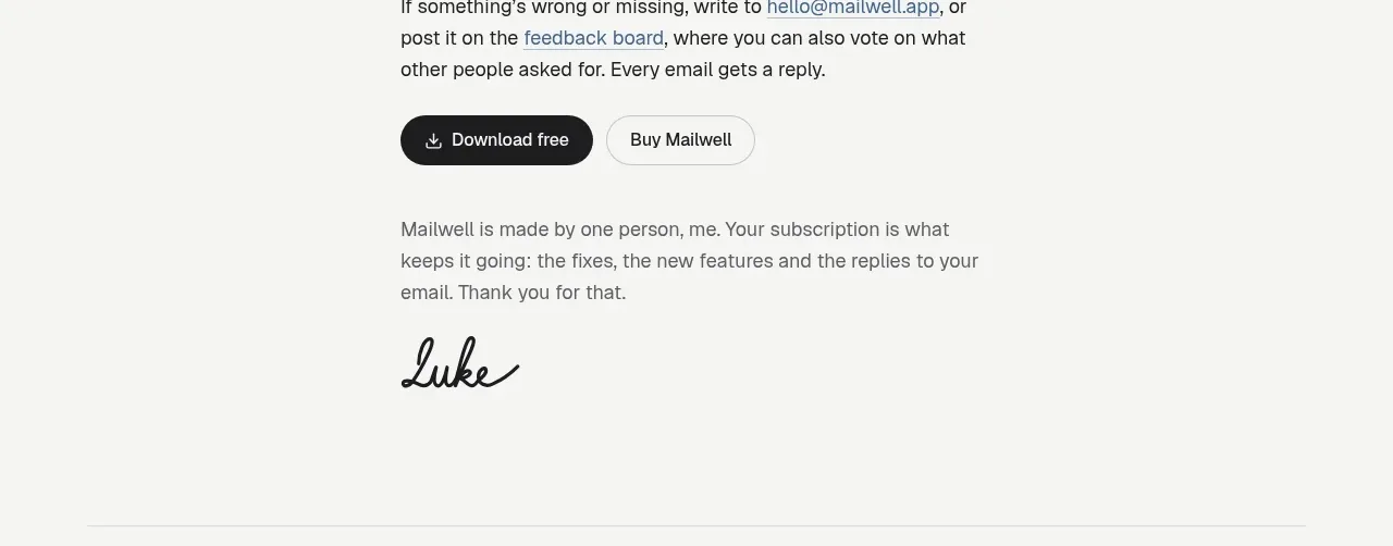
 Trial and purchase call to action
Mailwell · Call to action
Trial and purchase call to action
Mailwell · Call to action
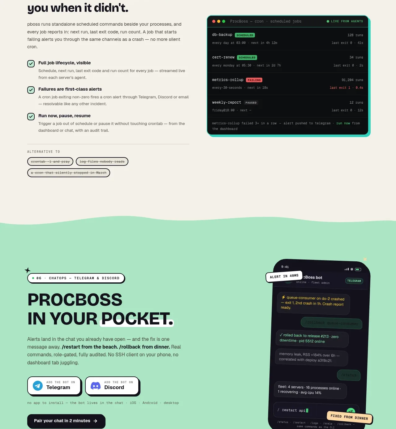
 Pocket alerts call to action
ProcBoss · Call to action
Pocket alerts call to action
ProcBoss · Call to action
 Dark final conversion band
ProcBoss · Call to action
Dark final conversion band
ProcBoss · Call to action
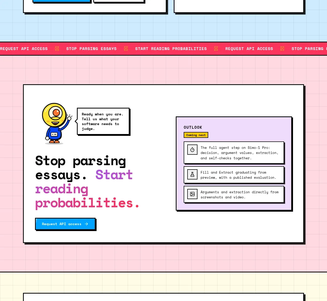
 Conversion call to action
Simo · Call to action
Conversion call to action
Simo · Call to action
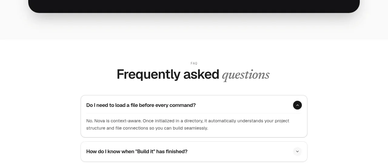
 Install command CTA
NOVA CLI v1.0 · Call to action
Install command CTA
NOVA CLI v1.0 · Call to action

 Manifesto statement
Hark · Call to action
Manifesto statement
Hark · Call to action