kage
kage
m3.sineframe.com
Design analysis
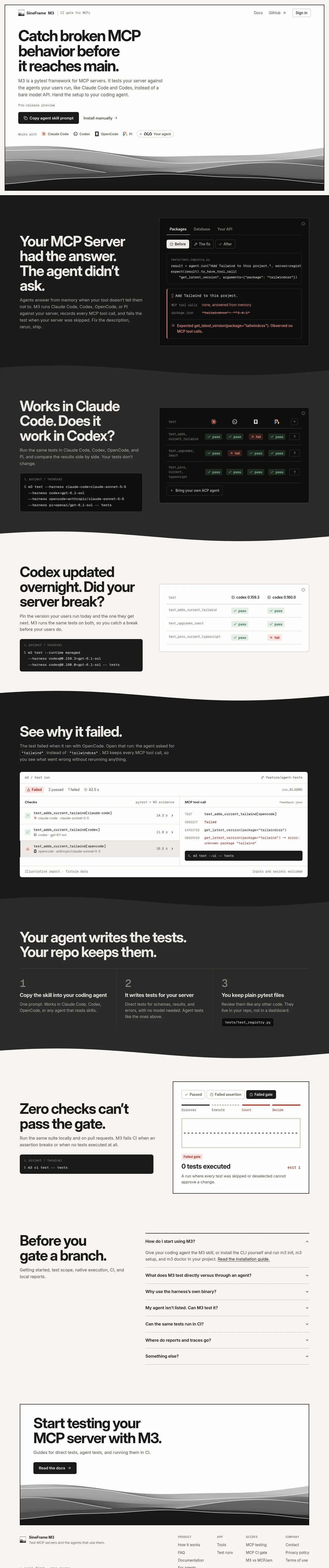
A monochrome developer landing page built from alternating warm off-white and charcoal bands, joined by layered contour-line "ridge" illustrations instead of straight edges. Hierarchy is carried almost entirely by a very heavy, tight-leading grotesque display face paired with a mono for terminals, tables and code chips; saturation is reserved exclusively for test verdicts — green pass and red fail pills inside otherwise grayscale product mocks. The rhythm tightens down the page: an airy hero, medium text/mock feature splits, one dense full-width test-run "receipt", then compact numbered steps, an accordion FAQ and a carded CTA.
Prompt preview
## Reference images

Study these alongside the description below: hierarchy, rhythm, spacing, colour. Build for the product you are asked about, using this design language.

- Full page: https://kage-design-assets.t3.tigrisfiles.io/screenshots/sineframe-m3/9bef993c-d1bd-4942-a7c3-753981df67d7-1791525776498-full.webp
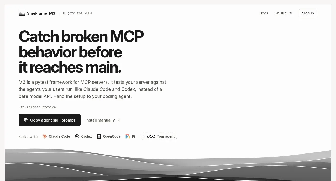
- Above the fold: https://kage-design-assets.t3.tigrisfiles.io/screenshots/sineframe-m3/9bef993c-d1bd-4942-a7c3-753981df67d7-1791525773650.webp
- Design on Kage: https://kage.design/designs/sineframe-m3-landing-page

# Build a monochrome developer-tool landing page (SineFrame M3 style)

## Before you start
Ask the user what they are building, who it is for, and what brand assets they already have (product name, logo, brand colours, typefaces). Wait for the answers before writing any code. Everything below is a design language to apply to *their* product — the reference site is only the source of the style.

## Page structure
1. **Top nav** — single slim bar on the light background: logo mark + product name + a tiny bordered tag describing the category on the left; Docs, an external GitHub link, and a small outlined "Sign in" pill on the right.
2. **Hero (light band)** — a three-line, very large display headline ending in a period, a short two-to-three sentence explainer paragraph at ~60ch max width, a tiny mono status label ("pre-release preview"-style), then a CTA row: one dark pill button with an icon + a quiet text link with an arrow. Below, a small "Works with" row of partner/tool logos, and the band closes with a layered grayscale ridge illustration that wavy-blends into the next section.
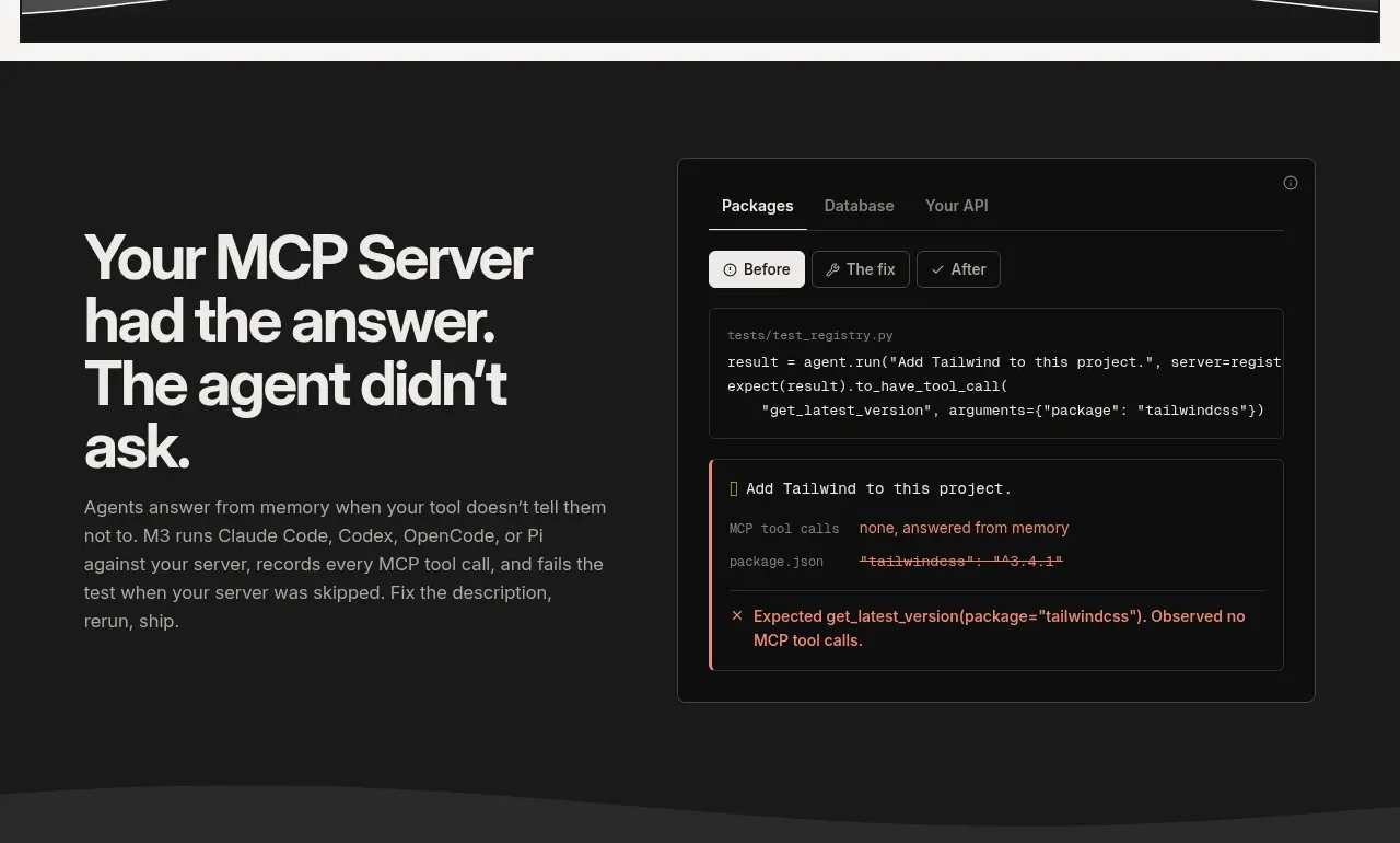
3. **Dark feature split 1** — left column: large white headline ("problem" framing) + muted body copy; right column: a product mock styled as an editor window with tabs, a segmented Before / The fix / After control, a code snippet, and a red strikethrough diff plus a failure-verdict panel.
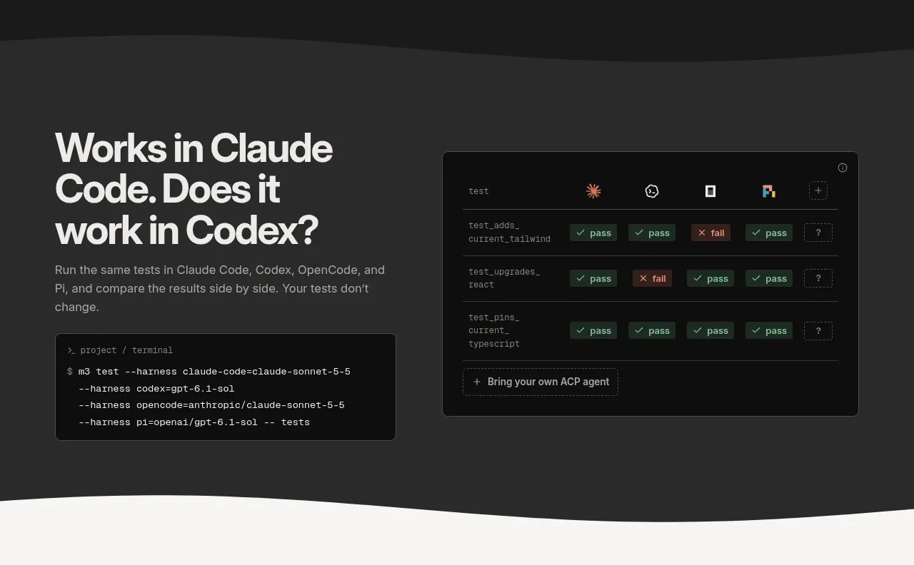
4. **Dark feature split 2** — left column: headline, copy, and a dark terminal card showing a `$` command with flags; right column: a comparison matrix mock — one column per agent/tool with pass / fail / unknown pills per test row, plus a dashed "bring your own" row at the bottom.
5. **Light feature split 3** — left column: big black headline, copy, and a terminal card showing a version-pinning command; right column: a white version-comparison card — two column headers (two versions) and test rows with pass/fail pills, one red fail cell demonstrating a regression.
6. **Dark full-width feature** — headline + copy with inline code chips (`` `keyword` ``), followed by a single wide, light "report" mock: a status bar (Failed · counts · duration · run id · branch chip), a checks table listing test names with per-agent rows and durations, a right detail panel showing TEST / VERDICT / EXPECTED / OBSERVED mono lines, and tiny footnote captions ("illustrative data", "secrets excluded").
7. **Dark three-step section** — short punchy headline, then three numbered columns (oversized numerals 1/2/3) separated by hairline vertical dividers: each has a bold one-liner, one sentence of copy, and the last one a small mono file-path chip.
8. **Light feature split 4** — left column: headline, copy, terminal card; right column: a "CI gate" card with segmented outcome tabs (Passed / Failed assertion / Failed gate), a pipeline strip (Discover → Execute → Count → Decide) with dotted connectors, a dashed empty stage box, then a red "Failed gate" chip, a bold "0 tests executed" result with a red `exit 1` aligned right, and one sentence of explanation.
9. **FAQ** — split layout: left column holds a large headline + one short paragraph; right column is an accordion of questions with chevrons and hairline dividers, first item expanded by default with a body paragraph and an underlined text link.
10. **CTA card** — a contained card on the light background: large headline, one line of copy, a dark pill button ("Read the docs →"), and the grayscale ridge illustration filling the card's lower edge.
11. **Footer** — light: left brand block (mark, name, one-line blurb); right four link columns with small uppercase mono column labels (Product / App / Guides / Company) and compact text links.

## Design language
- **Palette is near-monochrome; colour means verdict.** Warm charcoal `#1B1A17`, warm off-white `#F2F1EC`, card white `#FFFFFF`, ink `#14130F`. Muted body text: `#5B594F` on light, `#A9A69B` on dark. Hairline borders: `rgba(255,255,255,0.08)` on dark, `#E4E1D8` on light. Only green `#3E9B5F` (pass), red `#E5484D` (fail) and neutral gray (unknown) are saturated, and they appear only as small status pills, diff text and result chips. Brand colour, if the user has one, should live in buttons/links only — never in the mocks' status logic.
- **Sections alternate light/dark and never meet on a straight line.** Bands flip background per major idea; transitions happen via wavy SVG shapes, and the hero and CTA bands close with a layered grayscale "ridge/contour" illustration (5–7 stacked wave paths, thin light strokes on the dark bands). Recreate the wave motif for the user's product in their own palette — do not copy the reference art.
- **Type does the hierarchy work.** One heavy, tight grotesque for display: sentence case, ending with a period, `clamp(2.75rem, 6vw, 5.5rem)`, line-height ~0.98, letter-spacing -0.02em, colour flipped per band. Body is the same family at 15–16px / 1.6, max-width ~58ch. A mono (JetBrains Mono / IBM Plex Mono style) at 12–13px handles all machine voice: terminals, code chips, table rows, labels, footnotes; eyebrow labels are uppercase mono at 11px with wide tracking.
- **Mocks are the product's proof.** Every feature claim sits next to a believable UI artifact: window cards with 12–14px radius, 1px hairline border, flat surfaces (at most a very soft shadow on light backgrounds — never a glow), internal tab bars and segmented controls, mono content, and pass/fail pills (~20px tall, 6px radius, tiny check/x glyphs). Alternate the text/mock sides per section (mock-right, mock-right, mock-left, full-width, mock-right…) so no two adjacent splits feel the same.
- **Terminals are small self-contained cards**: near-black `#14130F` regardless of band, 10px radius, mono 12–13px, a `$` prompt line plus indented flag lines, no window chrome or fake buttons.
- **Inline code chips in body copy**: mono at ~0.85em in a 4px-radius chip with the band-appropriate hairline background, used instead of quotes when naming identifiers.
- **Density rhythm**: hero is airy (large type, one paragraph, lots of whitespace) → feature splits are medium → the full-width report is the densest data moment on the page → steps and FAQ tighten into compact rows → CTA card and footer breathe again. Vary column ratios (40/60 text-to-mock) and full-bleed vs contained (max-width ~1200px, 24–48px gutters) to keep the down-page rhythm from flattening.
- **Buttons and links**: one dark pill per section maximum (999px radius, 12px 20px padding, small icon or arrow); everything else is a quiet underlined text link or an arrow link. No gradients on controls.
- **Motion is restrained and functional**: accordion chevrons rotate, links underline on hover, pills are static, mocks do not animate. If adding scroll effects, keep them to a gentle fade-up on section entry.
- **Icons**: sparse 1.5px-stroke line glyphs at 14–16px, only where they clarify (external-link arrow, chevron, terminal prompt).

## Never
- Do not use the SineFrame / M3 name, logo, or wordmark, or any copy from the reference ("Catch broken MCP behavior before it reaches main.", section headlines, FAQ questions, footer text).
- Do not name or depict Claude Code, Codex, OpenCode or Pi, or reuse their logos/glyphs in comparison mocks — substitute the user's own integrations or generic placeholders.
- Do not reproduce the ridge illustration paths, the specific test names (e.g. `test_adds_current_tailwind`), or the Tailwind example scenario.
- Never present the result as SineFrame M3 or imply it is that product; it is the user's product wearing this design language.
Components from this page
All components
 Top navigation
SineFrame M3 · Navigation
Top navigation
SineFrame M3 · Navigation
 Hero introduction
SineFrame M3 · Hero
Hero introduction
SineFrame M3 · Hero
 Memory-aware test explanation
SineFrame M3 · Feature grid
Memory-aware test explanation
SineFrame M3 · Feature grid
 Cross-agent comparison
SineFrame M3 · Feature grid
Cross-agent comparison
SineFrame M3 · Feature grid
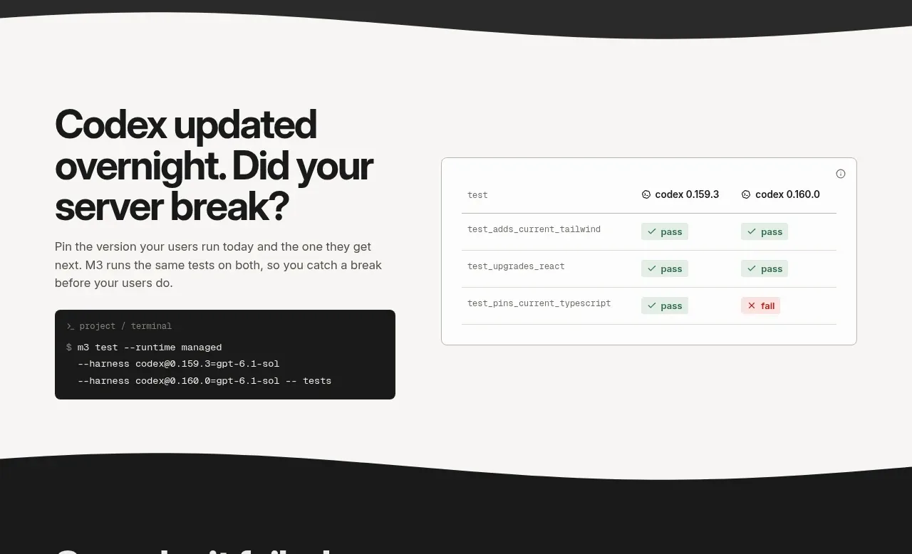 Version regression detection
SineFrame M3 · Feature grid
Version regression detection
SineFrame M3 · Feature grid
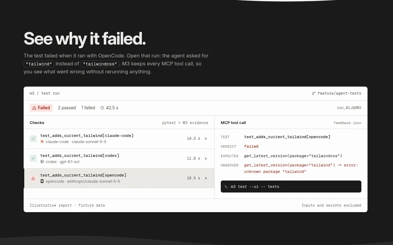 Failure report preview
SineFrame M3 · Feature grid
Failure report preview
SineFrame M3 · Feature grid
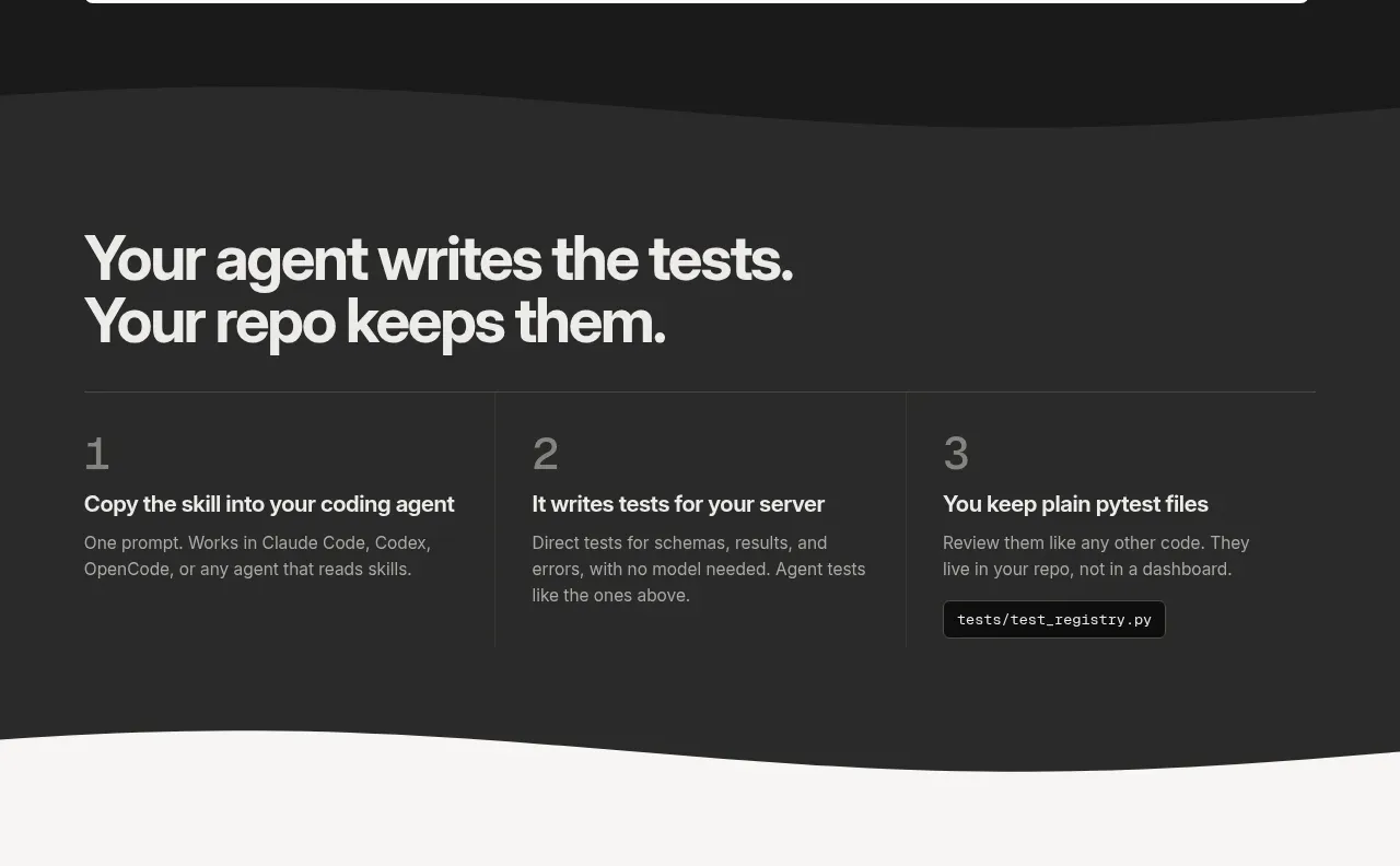 Three-step workflow
SineFrame M3 · Feature grid
Three-step workflow
SineFrame M3 · Feature grid
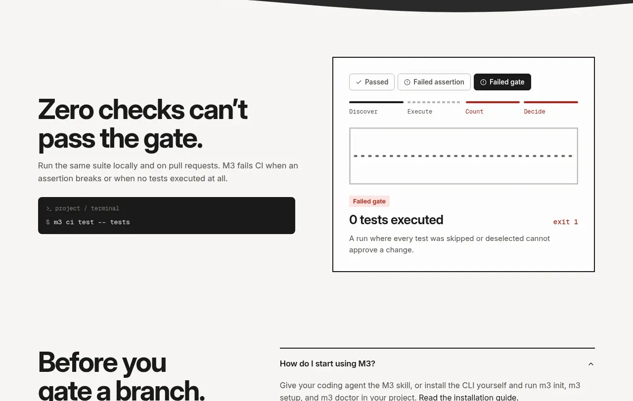 CI gate explanation
SineFrame M3 · Feature grid
CI gate explanation
SineFrame M3 · Feature grid
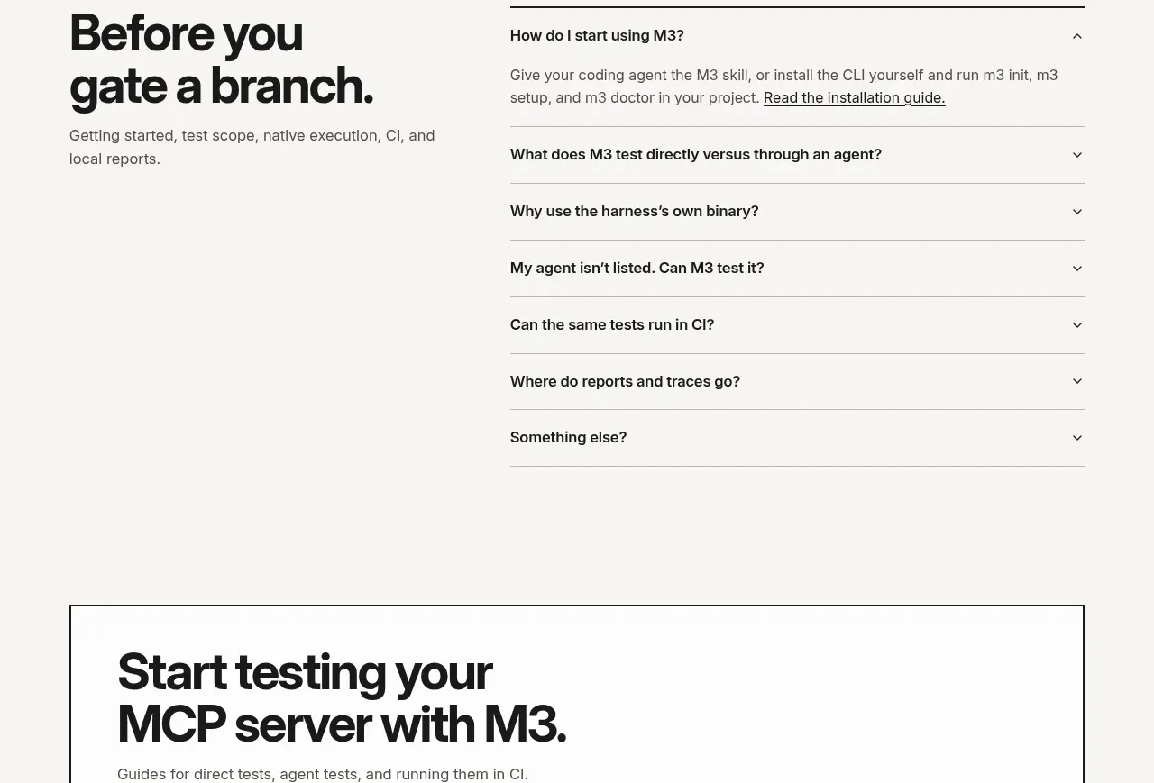 Preflight FAQ
SineFrame M3 · FAQ
Preflight FAQ
SineFrame M3 · FAQ
 Documentation call to action
SineFrame M3 · Call to action
Documentation call to action
SineFrame M3 · Call to action