 kage
kage
m3.sineframe.com
Design analysis
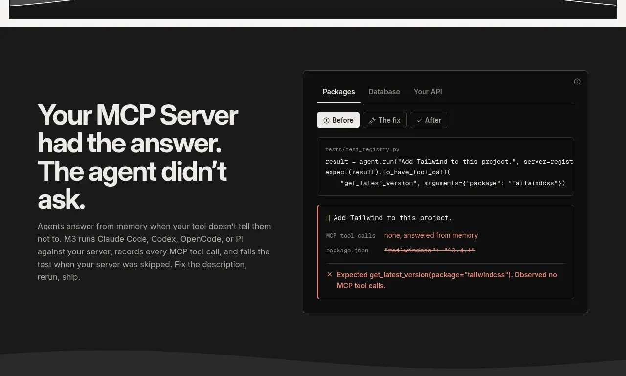
A dark explanatory band pairs a large claim and paragraph on the left with a framed diagnostic UI on the right, making the abstract testing problem tangible.
Prompt preview
## Reference images

Study these alongside the description below: hierarchy, rhythm, spacing, colour. Build for the product you are asked about, using this design language.

- Component: https://kage-design-assets.t3.tigrisfiles.io/components/sineframe-m3/9bef993c-d1bd-4942-a7c3-753981df67d7-1791525887-2.webp
- Full page it was cut from: https://kage-design-assets.t3.tigrisfiles.io/screenshots/sineframe-m3/9bef993c-d1bd-4942-a7c3-753981df67d7-1791525776498-full.webp
- Component on Kage: https://kage.design/component/sineframe-m3-feature-grid

## Before you start
Ask what the user's product and brand are, then apply the following principles to that product rather than reproducing this reference.

Build a dark split feature section explaining the first major product benefit. Use a 44–48px bold heading on the left, a 15px gray paragraph below it, and a polished dark diagnostic panel on the right. The panel should look like an application surface with a thin border, small tab labels, status chips, a code excerpt, and a clearly highlighted error result. Keep both columns aligned around the vertical center and give the section generous 72–96px top and bottom padding.

Use near-black charcoal (#191919) with slightly lighter panels (#101010), white headings (#f5f5f3), muted gray copy (#aaa9a4), and restrained accent colors for success and failure (desaturated green and red). Borders should be 1px #3a3a38, radius 6–8px. Use monospace at 11–12px inside code and UI diagnostics. On mobile, stack the panel beneath the copy. Make tabs and status chips visually legible, but keep interactions lightweight.

Never:
- use logos, product names, copy, illustrations, or imagery from the reference
More components

 Privacy and optional intelligence
Mailwell · Feature grid
Privacy and optional intelligence
Mailwell · Feature grid
 Reliable, recoverable actions
Mailwell · Feature grid
Reliable, recoverable actions
Mailwell · Feature grid
 Unified account setup
Mailwell · Feature grid
Unified account setup
Mailwell · Feature grid
 Fast local workflow and calm reading
Mailwell · Feature grid
Fast local workflow and calm reading
Mailwell · Feature grid

 Cloud layer workflows
ProcBoss · Feature grid
Cloud layer workflows
ProcBoss · Feature grid
 Operational blind spots
ProcBoss · Feature grid
Operational blind spots
ProcBoss · Feature grid