 kage
kage
m3.sineframe.com
Design analysis
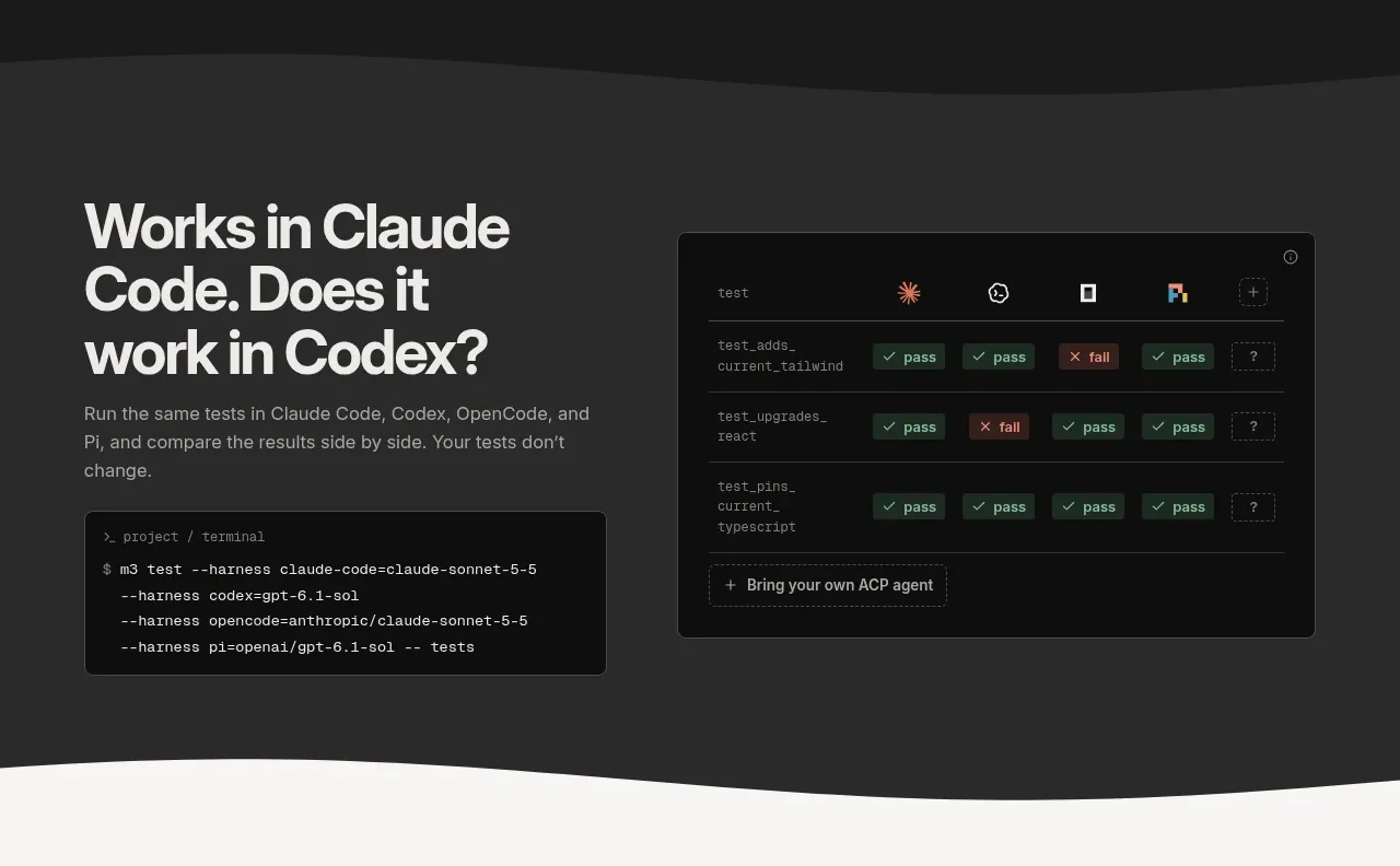
A second charcoal feature band demonstrates side-by-side agent results with a comparison matrix and an accompanying terminal command, emphasizing repeatability.
Prompt preview
## Reference images

Study these alongside the description below: hierarchy, rhythm, spacing, colour. Build for the product you are asked about, using this design language.

- Component: https://kage-design-assets.t3.tigrisfiles.io/components/sineframe-m3/9bef993c-d1bd-4942-a7c3-753981df67d7-1791525887-3.webp
- Full page it was cut from: https://kage-design-assets.t3.tigrisfiles.io/screenshots/sineframe-m3/9bef993c-d1bd-4942-a7c3-753981df67d7-1791525776498-full.webp
- Component on Kage: https://kage.design/component/sineframe-m3-feature-grid-2

## Before you start
Ask what the user's product and brand are, then apply the following principles to that product rather than reproducing this reference.

Create a dark feature section for comparing outputs across multiple runtimes or integrations. Place a strong multiline heading and concise explanation in the left column, with a terminal/code block below. Put a wide comparison panel in the right column containing a header row, several test rows, colored pass/fail pills, and a small “add another integration” affordance. Use a 50/50 grid with 44px minimum column gap and align the visual tops.

Use charcoal #292928 for the section, #101010 for panels, #f4f4f1 for headings, #aaa9a4 for body text, and very subtle #40403d dividers. Give panels 6px radius and code blocks 5px radius. Use a mono font for commands and a compact 12px UI type scale. Preserve ample whitespace and make the comparison horizontally scrollable on narrow screens. Rows should support hover highlighting and accessible labels for status.

Never:
- use logos, product names, copy, illustrations, or imagery from the reference
More components

 Privacy and optional intelligence
Mailwell · Feature grid
Privacy and optional intelligence
Mailwell · Feature grid
 Reliable, recoverable actions
Mailwell · Feature grid
Reliable, recoverable actions
Mailwell · Feature grid
 Unified account setup
Mailwell · Feature grid
Unified account setup
Mailwell · Feature grid
 Fast local workflow and calm reading
Mailwell · Feature grid
Fast local workflow and calm reading
Mailwell · Feature grid

 Cloud layer workflows
ProcBoss · Feature grid
Cloud layer workflows
ProcBoss · Feature grid
 Operational blind spots
ProcBoss · Feature grid
Operational blind spots
ProcBoss · Feature grid