 kage
kage
m3.sineframe.com
Design analysis
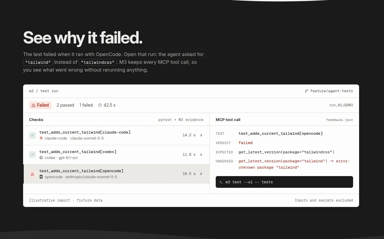
A dark section introduces the value of actionable failure evidence and gives the report preview most of the visual weight in a large white-on-dark card.
Prompt preview
## Reference images

Study these alongside the description below: hierarchy, rhythm, spacing, colour. Build for the product you are asked about, using this design language.

- Component: https://kage-design-assets.t3.tigrisfiles.io/components/sineframe-m3/9bef993c-d1bd-4942-a7c3-753981df67d7-1791525888-5.webp
- Full page it was cut from: https://kage-design-assets.t3.tigrisfiles.io/screenshots/sineframe-m3/9bef993c-d1bd-4942-a7c3-753981df67d7-1791525776498-full.webp
- Component on Kage: https://kage.design/component/sineframe-m3-feature-grid-4

## Before you start
Ask what the user's product and brand are, then apply the following principles to that product rather than reproducing this reference.

Build a dark explanatory section with a small left-aligned heading, supporting copy, and a large report preview below. The report should be a realistic but fictional test-run surface: top metadata bar, overall status, a two-column checks/results table, timestamps, and a terminal-style command area. Use the report as the primary artifact, with enough width and padding to read as a product preview rather than a decorative image.

Set the section background to #191919, headings to #f4f4f1, and copy to #aaa9a4. Make the report card #f7f7f4 with #d1d0ca borders, 6px radius, dark text, subtle gray row separators, and restrained red/green status accents. Use 76–100px vertical padding and a max-width around 790px. Ensure the table becomes horizontally scrollable on small screens and status meaning is not conveyed by color alone.

Never:
- use logos, product names, copy, illustrations, or imagery from the reference
More components

 Privacy and optional intelligence
Mailwell · Feature grid
Privacy and optional intelligence
Mailwell · Feature grid
 Reliable, recoverable actions
Mailwell · Feature grid
Reliable, recoverable actions
Mailwell · Feature grid
 Unified account setup
Mailwell · Feature grid
Unified account setup
Mailwell · Feature grid
 Fast local workflow and calm reading
Mailwell · Feature grid
Fast local workflow and calm reading
Mailwell · Feature grid

 Cloud layer workflows
ProcBoss · Feature grid
Cloud layer workflows
ProcBoss · Feature grid
 Operational blind spots
ProcBoss · Feature grid
Operational blind spots
ProcBoss · Feature grid