 kage
kage
m3.sineframe.com
Design analysis
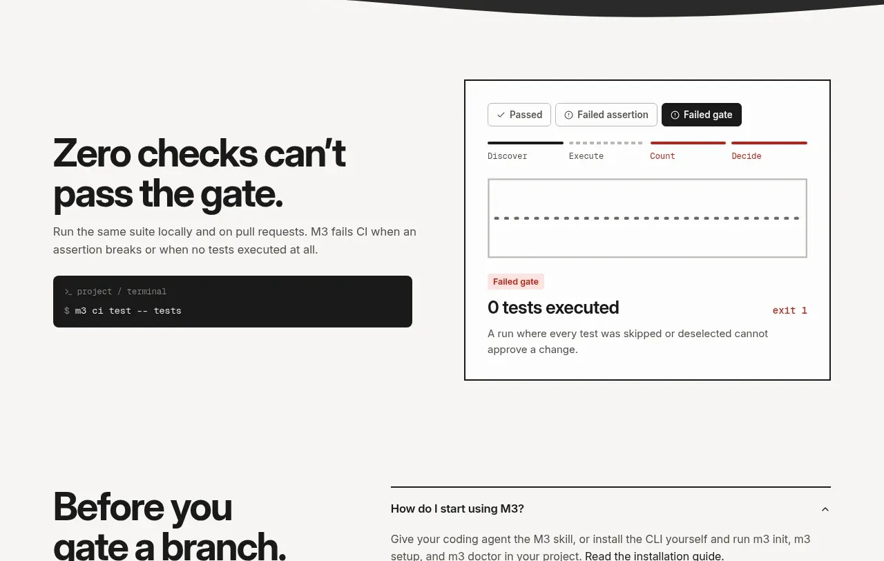
A light section explains why skipped checks matter, pairing an operational headline and command with a bordered process/gate diagram.
Prompt preview
## Reference images

Study these alongside the description below: hierarchy, rhythm, spacing, colour. Build for the product you are asked about, using this design language.

- Component: https://kage-design-assets.t3.tigrisfiles.io/components/sineframe-m3/9bef993c-d1bd-4942-a7c3-753981df67d7-1791525889-7.webp
- Full page it was cut from: https://kage-design-assets.t3.tigrisfiles.io/screenshots/sineframe-m3/9bef993c-d1bd-4942-a7c3-753981df67d7-1791525776498-full.webp
- Component on Kage: https://kage.design/component/sineframe-m3-feature-grid-6

## Before you start
Ask what the user's product and brand are, then apply the following principles to that product rather than reproducing this reference.

Build a light split feature section about enforcing a quality gate. Put a large direct headline, short explanatory paragraph, and dark command block on the left. On the right, create a bordered white diagram card with a compact status legend, a horizontal sequence of stages, a simple empty-state graph or track, and a prominent gate outcome. The diagram should communicate that zero executed checks is not equivalent to success.

Use #f7f6f3 for the page, #171717 for text, #6b6963 for copy, white #fffefa for the card, and #262626 for the command block. Use 1px dark outer border for the diagram, 5px inner radius, muted gray stage labels, and restrained red for failure. Keep the section at 72–96px vertical padding and maintain strong alignment between the text and card. Make the diagram responsive by allowing its internals to scale or scroll.

Never:
- use logos, product names, copy, illustrations, or imagery from the reference
More components

 Privacy and optional intelligence
Mailwell · Feature grid
Privacy and optional intelligence
Mailwell · Feature grid
 Reliable, recoverable actions
Mailwell · Feature grid
Reliable, recoverable actions
Mailwell · Feature grid
 Unified account setup
Mailwell · Feature grid
Unified account setup
Mailwell · Feature grid
 Fast local workflow and calm reading
Mailwell · Feature grid
Fast local workflow and calm reading
Mailwell · Feature grid

 Cloud layer workflows
ProcBoss · Feature grid
Cloud layer workflows
ProcBoss · Feature grid
 Operational blind spots
ProcBoss · Feature grid
Operational blind spots
ProcBoss · Feature grid