kage
kage
m3.sineframe.com
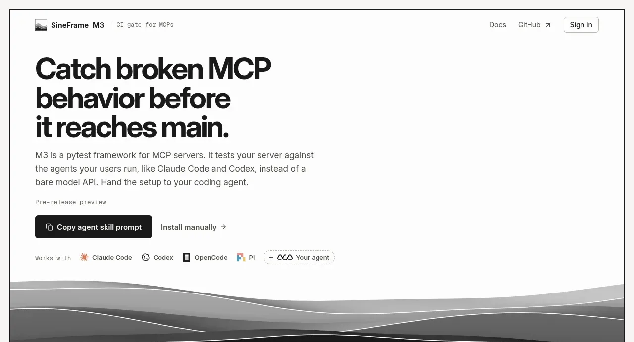
Design analysis
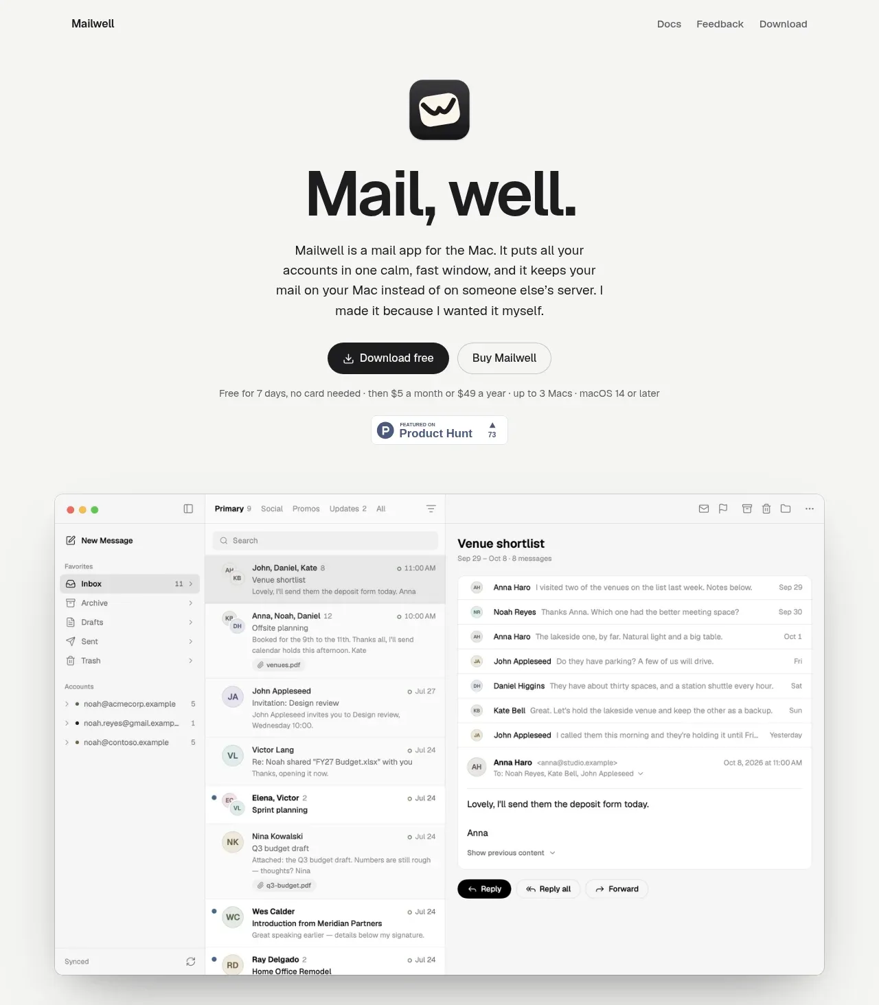
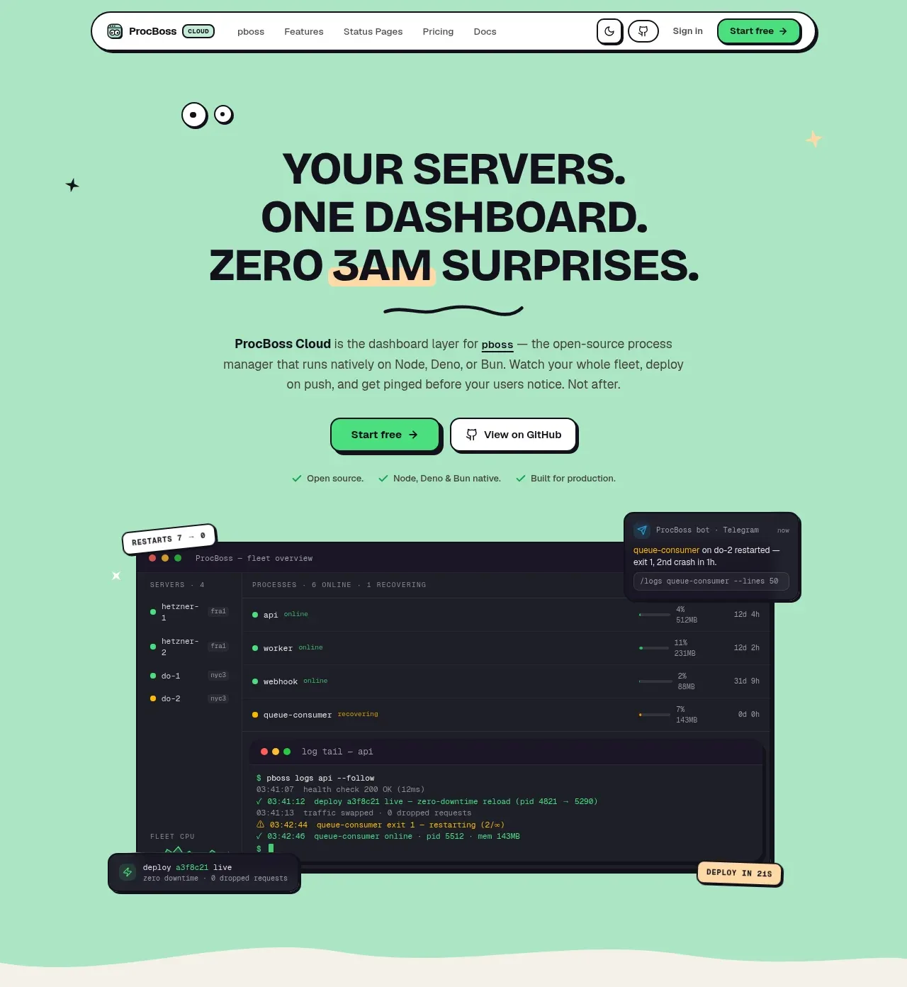
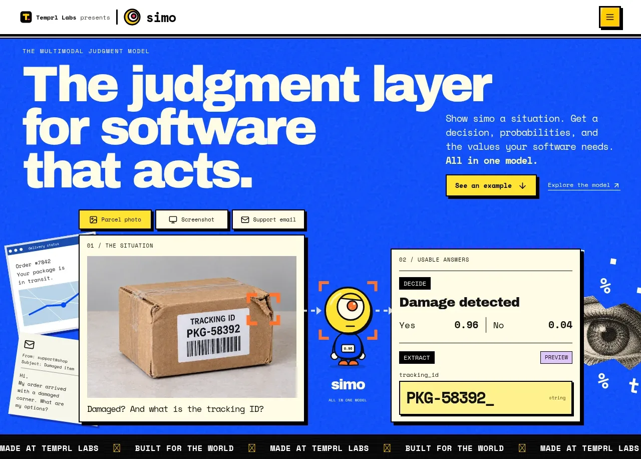
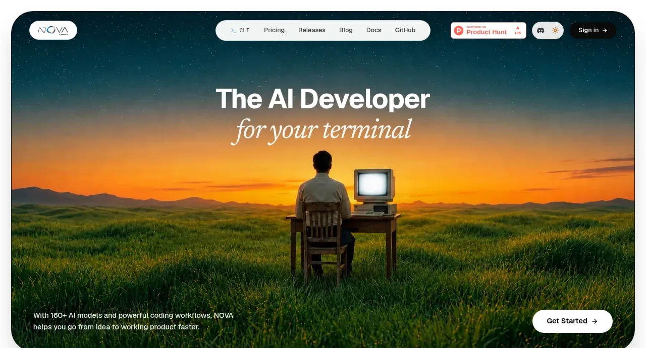
The hero uses an oversized multiline promise, concise supporting copy, two setup paths, and a compatibility row before ending in an abstract monochrome visual.
Prompt preview
## Reference images

Study these alongside the description below: hierarchy, rhythm, spacing, colour. Build for the product you are asked about, using this design language.

- Component: https://kage-design-assets.t3.tigrisfiles.io/components/sineframe-m3/9bef993c-d1bd-4942-a7c3-753981df67d7-1791525887-1.webp
- Full page it was cut from: https://kage-design-assets.t3.tigrisfiles.io/screenshots/sineframe-m3/9bef993c-d1bd-4942-a7c3-753981df67d7-1791525776498-full.webp
- Component on Kage: https://kage.design/component/sineframe-m3-hero

## Before you start
Ask what the user's product and brand are, then apply the following principles to that product rather than reproducing this reference.

Create a high-impact product hero beneath the navigation. Use a two-column-feeling composition, but keep the content anchored to the left: a very large 42–48px bold multiline headline with tight line-height, a 16px muted paragraph constrained to roughly 470px, a tiny eyebrow for release status, and a primary dark button beside a low-emphasis text link. Add a compact “works with” compatibility row below, using neutral text and small abstract badges rather than recognizable brand marks. End the hero with a wide, shallow monochrome layered-wave visual that acts as a distinctive product texture.

Use an off-white canvas (#f7f6f3), #151515 text, #686762 body copy, black primary button (#171717) with white text, 8px radius, and thin neutral borders. Keep the content max-width around 800px with 36–40px side padding; use 24–32px vertical gaps. The hero should feel editorial and calm, with no gradients except the abstract visual. Buttons need hover/focus states and the compatibility row should wrap on small screens.

Never:
- use logos, product names, copy, illustrations, or imagery from the reference