kage
kage
slashy.com
Design analysis
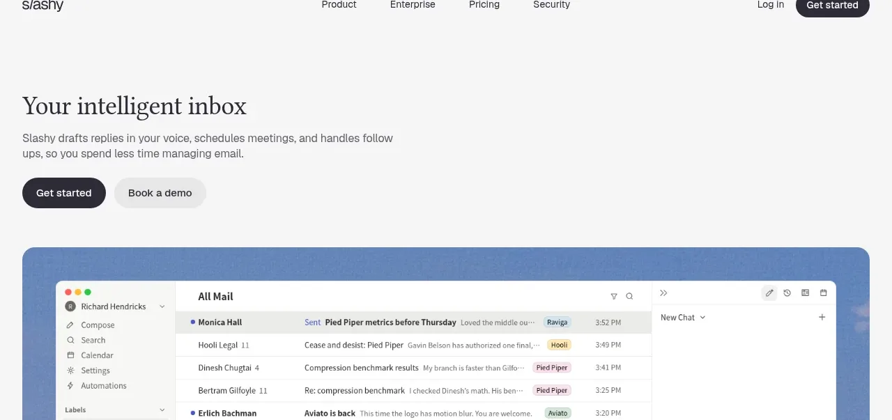
The hero pairs a large serif headline and concise value proposition with two contrasting actions, then anchors the message in a wide product interface preview. The restrained palette and generous whitespace make the product visual feel authoritative.
Prompt preview
## Reference images

Study these alongside the description below: hierarchy, rhythm, spacing, colour. Build for the product you are asked about, using this design language.

- Component: https://kage-design-assets.t3.tigrisfiles.io/components/slashy-assistant/74e10748-5554-4d85-8539-7c8daa10c12c-1789452131-1.webp
- Full page it was cut from: https://kage-design-assets.t3.tigrisfiles.io/screenshots/slashy-assistant/74e10748-5554-4d85-8539-7c8daa10c12c-1789452100080-full.webp
- Component on Kage: https://kage.design/component/slashy-assistant-hero

## Before you start
Ask what the user's product does, who the target audience is, and what its brand voice and visual identity should be. Then build an original hero using the following principles, adapted to that product rather than copied.

### Design language
- Start directly below the navigation with a left-aligned text column, inset about 22–28px from the page edge on a 900px layout.
- Use a large editorial serif or humanist display face for the headline, around 28–34px desktop, with tight line-height and near-black colour `#25242b`.
- Place one short supporting paragraph beneath it, using a compact neutral sans-serif around 12–14px, muted gray `#686870`, and a readable max width of roughly 390px.
- Present two adjacent actions: a dark filled pill for the primary conversion and a soft gray pill for the secondary action. Use `#292832` for the primary and `#e9e9e9` for the secondary.
- Leave visible breathing room between copy, buttons, and the product visual; do not vertically centre every element.
- Add a wide rounded product preview below the actions, approximately 16px radius, with a cool blue/lavender surrounding surface around `#6b8fbe`. The preview should demonstrate the product’s core workflow with realistic but original UI structure.
- Keep the hero background warm off-white around `#f7f7f7`; use responsive stacking on mobile and preserve the visual as the final anchor of the hero.
- Buttons should have clear hover/focus states, remain keyboard accessible, and use concise labels appropriate to the user's product.

### Never
- Never reuse logos, product names, copy, illustrations, or imagery from the reference.
- Never reproduce the pictured inbox, exact headline, interface labels, or visual assets; invent a product-specific equivalent.