kage
kage
slashy.com
Design analysis
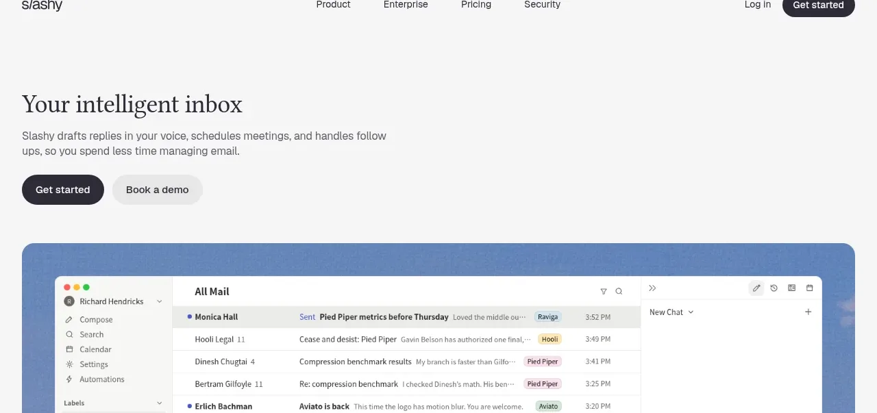
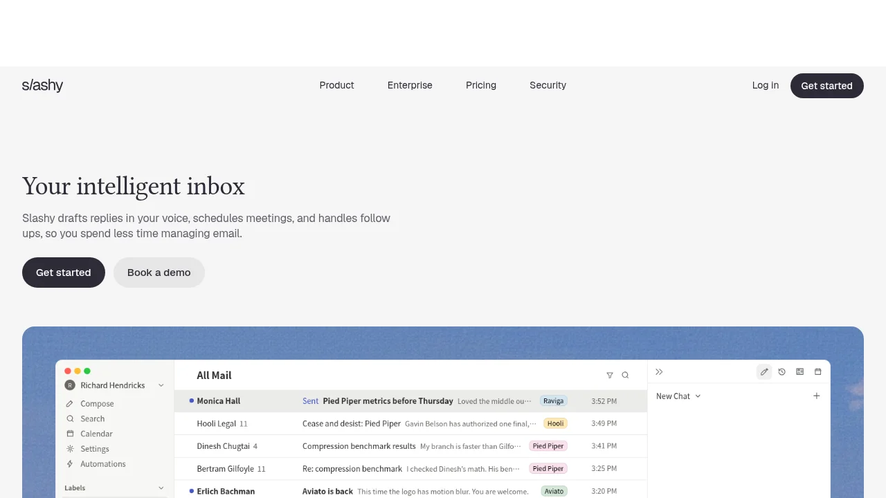
A restrained editorial landing page built on a white canvas: a lowercase sans wordmark and plain link row, then a left-aligned hero set in a large warm serif with small grey sans supporting copy and two rounded pill CTAs. The page's single visual event is a full-width periwinkle panel holding a dense email-client screenshot — coloured category chips, hairline row dividers, and a right-side AI chat panel provide a deliberate contrast to the quiet typography. Rhythm comes from alternating empty typographic air with one heavy, dense visual block; all colour is withheld until that product panel.
Prompt preview
## Reference images

Study these alongside the description below: hierarchy, rhythm, spacing, colour. Build for the product you are asked about, using this design language.

- Full page: https://kage-design-assets.t3.tigrisfiles.io/screenshots/slashy-assistant/74e10748-5554-4d85-8539-7c8daa10c12c-1789452100080-full.webp
- Above the fold: https://kage-design-assets.t3.tigrisfiles.io/screenshots/slashy-assistant/74e10748-5554-4d85-8539-7c8daa10c12c-1789452066259.webp
- Design on Kage: https://kage.design/designs/slashy-assistant-landing-page

## Before you start
Ask the user what product they are building, who it is for, and what brand assets they already have (name, colours, typography). Wait for the answers. Apply the design language below to their product — do not rebuild the reference site.

## Page structure
1. **Entry band** – a tall, empty white band closed by a full-width hairline rule; sets a quiet tone before any content appears.
2. **Navigation bar** – one 64px row on white: lowercase wordmark left, evenly spaced 15px text links centre (Product / Enterprise / Pricing / Security pattern), a text 'Log in' link plus a black pill CTA right. No border under the nav — the whitespace does the separating.
3. **Hero** – left-aligned, never centred: one large serif headline line, a two-line supporting paragraph in small grey sans, then a CTA row of two pills (dark primary, light-grey secondary). Generous margins on every side.
4. **Product showcase** – a full-width rounded panel filled with solid soft slate blue; inside it, inset with padding, sits the product UI screenshot (left icon sidebar, dense list rows with sender, subject and metadata, right-hand assistant/chat panel). This is the page's single heavy visual and the only place accent colour appears.

## Design language
- **Palette**: white `#ffffff` canvas; near-black ink `#1b1b1b` for all type and primary buttons; mid-grey `#6f6f6f` for supporting copy; hairlines `#e7e7e7`; one brand accent — soft slate blue `#7f9ac9` — used exclusively behind the product visual. Nothing else is coloured.
- **Type pairing**: a warm transitional serif for the display headline only (~56–64px, sentence case, tight ~1.05 leading); a neutral grotesque sans for everything else — nav links 15px, body 15–16px at 1.5 line height, UI labels 13px. Never serif the body, never sans the headline.
- **Hierarchy**: built from scale and colour contrast alone — one big dark serif line, then small quiet grey text. No bold-vs-bold fights, no gradient or coloured text.
- **Buttons**: fully rounded pills, ~40px tall, no borders or shadows. Primary: `#1b1b1b` fill with white 15px label. Secondary: `#ececec` fill with ink label. 12px gap between paired CTAs; hover darkens fill ~5% over 150ms.
- **Layout**: left-aligned hero with a ~640px headline measure and ~520px paragraph measure; consistent ~32px page margins; 96–120px vertical bands of pure whitespace between sections.
- **Product showcase**: solid accent-blue panel, 16–20px border radius, one soft shadow; the UI screenshot sits inset 24–32px from the panel edge. Let the UI inside be dense and detailed — the calm flat frame around it is what makes the detail feel intentional.
- **In-UI treatment**: white rows with hairline dividers, right-aligned timestamps/metadata, and category tags as small rounded chips in muted tones (soft green, yellow, coral, blue). Icons are thin-line and small (16px).
- **Rhythm down the page**: quiet typographic block → heavy dense visual block → quiet again. Alternate air and density; allow only one accent-coloured block per screen and keep everything else monochrome.
- **Motion**: essentially none. Limit to 150ms colour transitions on links and buttons; no parallax, no scroll-triggered animation, no glass or gradient effects.

## Never
- No wordmark, product name, tagline, or copy from the reference; no Silicon Valley show names (Pied Piper, Hooli, Aviato, Raviya) anywhere, including demo data.
- No recreating the email client itself — rebuild the showcase panel around the user's own product screens.
- No stock illustrations, photography, or icon sets from the reference.
- No gradients, glassmorphism, or dark neon effects — this language is flat, warm and monochrome outside the single accent panel.
- Never present the result as the reference product.