 kage
kage
spaceui.one
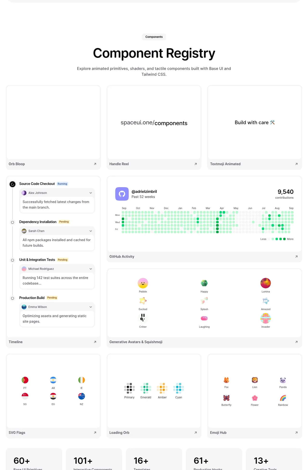
Design analysis
A section heading introduces a dense registry of large preview cards. The varied examples, consistent card framing, labels, and arrow affordances make the library feel browsable while showcasing breadth.
Prompt preview
## Reference images

Study these alongside the description below: hierarchy, rhythm, spacing, colour. Build for the product you are asked about, using this design language.

- Component: https://kage-design-assets.t3.tigrisfiles.io/components/spaceui-one/175f9577-62b1-4f69-9b00-6ff53f853c35-1790162351-2.webp
- Full page it was cut from: https://kage-design-assets.t3.tigrisfiles.io/screenshots/spaceui-one/175f9577-62b1-4f69-9b00-6ff53f853c35-1790162331209-full.webp
- Component on Kage: https://kage.design/component/spaceui-one-feature-grid

## Before you start
Ask what the user's product is, who it serves, and what brand direction they want. Apply the principles below to that product rather than reproducing the reference.

Build a browsable component registry section with a centered eyebrow, heading, and short supporting description followed by a responsive card grid. Use cards with white surfaces, very light gray borders (`#ededed`), 12–16px radius, subtle shadow, and generous preview areas. Each card should show a self-contained UI sample, a small title row, and a trailing arrow or link affordance. Mix card sizes where useful: a narrow card row alongside wider showcase cards, while maintaining a clear grid rhythm. Use 16–20px gaps, 24px outer padding, and a 14px label / 16px title hierarchy. Let previews be functional enough to communicate interaction—tabs, timelines, avatars, charts, lists, flags, or palettes—without overwhelming the card. Provide hover lift, border emphasis, and keyboard-focus states; make each card clickable.

Never: use logos, product names, copy, illustrations, or imagery from the reference.
More components

 Spend visibility and daily-cost breakdown
Subscrr · Feature grid
Spend visibility and daily-cost breakdown
Subscrr · Feature grid
 Reminders and simple setup flow
Subscrr · Feature grid
Reminders and simple setup flow
Subscrr · Feature grid

 Security and permissions cards
NotchPop · Feature grid
Security and permissions cards
NotchPop · Feature grid
 Focused feature cards
NotchPop · Feature grid
Focused feature cards
NotchPop · Feature grid
 Interactive product demonstration
NotchPop · Feature grid
Interactive product demonstration
NotchPop · Feature grid
 Quiet information cards
NotchPop · Feature grid
Quiet information cards
NotchPop · Feature grid