kage
kage
spaceui.one
Design analysis
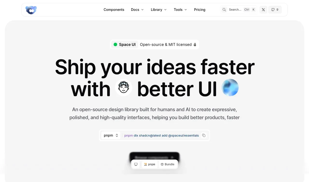
The hero uses a large soft-gray rounded panel, an oversized two-line headline, a concise value proposition, an install command control, and a small visual preview. The centered composition creates a clear path from positioning to activation.
Prompt preview
## Reference images

Study these alongside the description below: hierarchy, rhythm, spacing, colour. Build for the product you are asked about, using this design language.

- Component: https://kage-design-assets.t3.tigrisfiles.io/components/spaceui-one/175f9577-62b1-4f69-9b00-6ff53f853c35-1790162351-1.webp
- Full page it was cut from: https://kage-design-assets.t3.tigrisfiles.io/screenshots/spaceui-one/175f9577-62b1-4f69-9b00-6ff53f853c35-1790162331209-full.webp
- Component on Kage: https://kage.design/component/spaceui-one-hero

## Before you start
Ask what the user's product is, who it serves, and what brand direction they want. Apply the principles below to that product rather than reproducing the reference.

Create a centered hero inside a wide, softly contrasting panel. Use a very large responsive headline, roughly 58–72px on desktop with tight line-height and two balanced lines; place a small status/category badge above it, supporting copy below it at 15–17px with a constrained measure, then a prominent install, signup, or primary-action control. Include a compact product preview or abstract UI surface below the action, but make it specific to the user's product. Use an off-white background around `#f7f7f7`, a panel around `#f4f4f4`, black or near-black text (`#090909`), muted gray copy (`#555555`), and a 28–34px panel radius. Keep generous vertical whitespace and center all elements. Make the command/action control interactive with copy feedback or an obvious pressed state.

Never: use logos, product names, copy, illustrations, or imagery from the reference.