 kage
kage
speechka.io
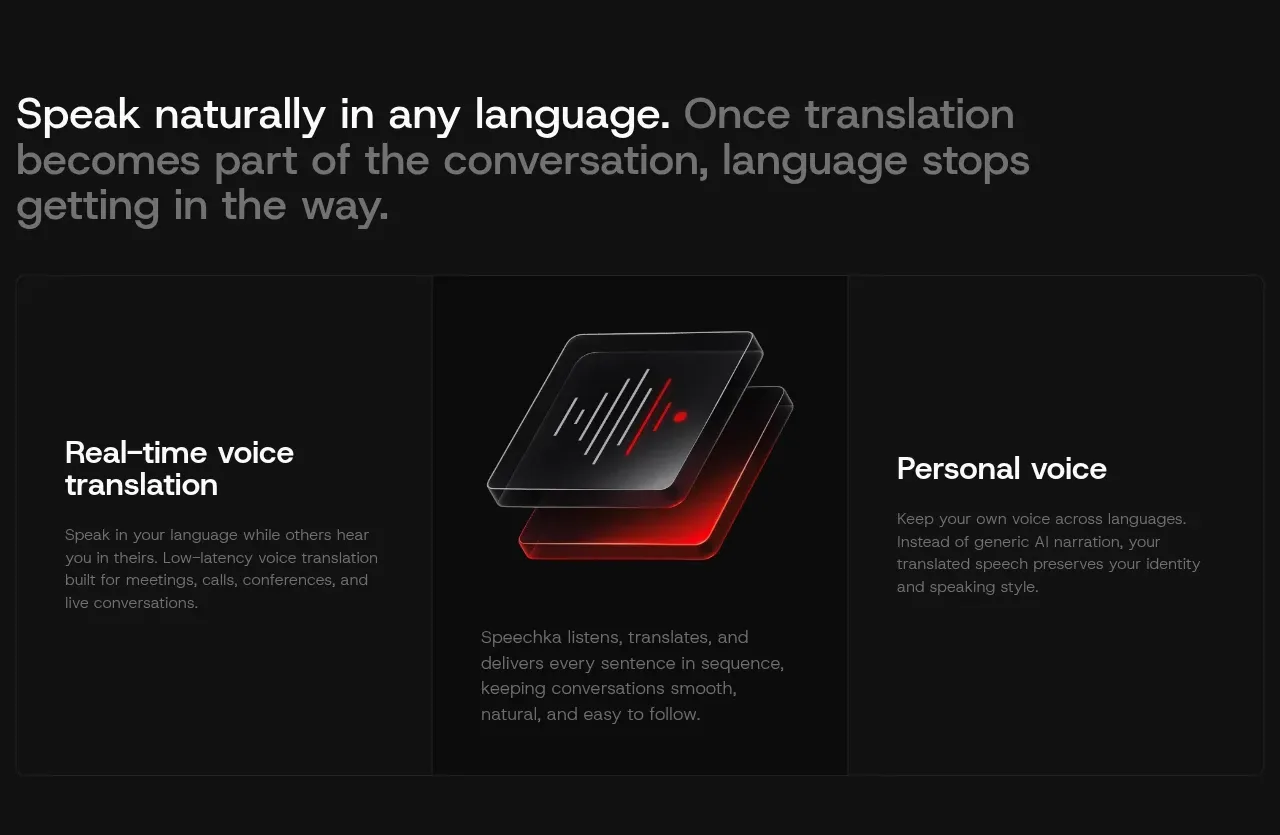
Design analysis
A large statement headline leads into a three-column feature panel, with text explanations flanking a central abstract product visual and a strong bordered grid structure.
Prompt preview
## Reference images

Study these alongside the description below: hierarchy, rhythm, spacing, colour. Build for the product you are asked about, using this design language.

- Component: https://kage-design-assets.t3.tigrisfiles.io/components/speechka/662d10a3-b9d2-40f0-bccc-e5bde29d7609-1790229790-3.webp
- Full page it was cut from: https://kage-design-assets.t3.tigrisfiles.io/screenshots/speechka/662d10a3-b9d2-40f0-bccc-e5bde29d7609-1790229722330-full.webp
- Component on Kage: https://kage.design/component/speechka-feature-grid

## Before you start
Ask what the user's product is, who it serves, and what brand personality and visual identity it should use. Apply the principles below to that product rather than reproducing the reference.

Create a feature section with an editorial statement at the top, using a large sentence where the key promise is bright and the continuation is muted. Under it, use a three-column bordered grid: left and right columns explain distinct capabilities, while the center column carries a restrained product visualization or abstract graphic. Align all columns to a shared baseline and let the central visual act as a pause in the text rhythm. Use #111111 and #0d0d0d surfaces, #f5f5f5 headings, #777777 supporting text, thin #242424 dividers, 0–4px outer corners, and a red accent #ef171b sparingly. Keep generous internal padding and stack the columns on mobile.

Never use logos, product names, copy, illustrations, or imagery from the reference.
More components

 Spend visibility and daily-cost breakdown
Subscrr · Feature grid
Spend visibility and daily-cost breakdown
Subscrr · Feature grid
 Reminders and simple setup flow
Subscrr · Feature grid
Reminders and simple setup flow
Subscrr · Feature grid

 Security and permissions cards
NotchPop · Feature grid
Security and permissions cards
NotchPop · Feature grid
 Focused feature cards
NotchPop · Feature grid
Focused feature cards
NotchPop · Feature grid
 Interactive product demonstration
NotchPop · Feature grid
Interactive product demonstration
NotchPop · Feature grid
 Quiet information cards
NotchPop · Feature grid
Quiet information cards
NotchPop · Feature grid