 kage
kage
speechka.io
Design analysis
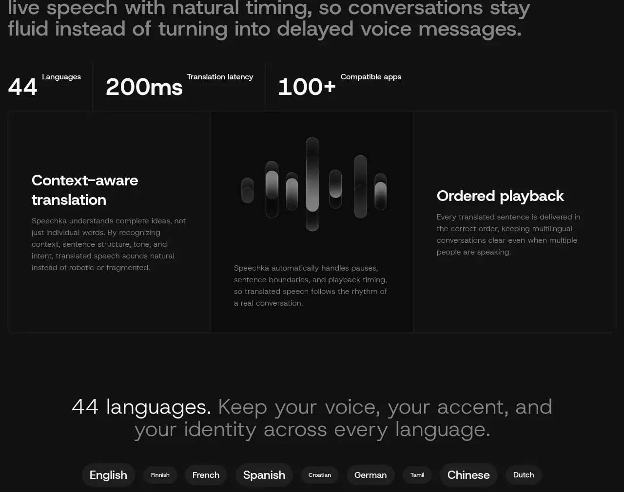
A large positioning statement is followed by three proof metrics and a three-column feature grid, turning product claims into measurable evidence and capability detail.
Prompt preview
## Reference images

Study these alongside the description below: hierarchy, rhythm, spacing, colour. Build for the product you are asked about, using this design language.

- Component: https://kage-design-assets.t3.tigrisfiles.io/components/speechka/662d10a3-b9d2-40f0-bccc-e5bde29d7609-1790229791-7.webp
- Full page it was cut from: https://kage-design-assets.t3.tigrisfiles.io/screenshots/speechka/662d10a3-b9d2-40f0-bccc-e5bde29d7609-1790229722330-full.webp
- Component on Kage: https://kage.design/component/speechka-feature-grid-2

## Before you start
Ask what the user's product is, who it serves, and what brand personality and visual identity it should use. Apply the principles below to that product rather than reproducing the reference.

Design a proof section with a large editorial statement, then a horizontal row of three metrics, followed by a three-column capability grid. Make the numbers large and high contrast, with small labels and thin vertical separators. Use the lower grid to place explanatory text at the sides and a quiet abstract visualization in the middle. Use #111111 background, #f4f4f4 for headline and numbers, #777777 for descriptions, #252525 rules, and red #ed171b only for emphasis. Keep metric spacing generous, use 0–4px grid corners, and ensure the layout becomes stacked with separators changing to horizontal on mobile. If metrics animate, respect reduced-motion preferences.

Never use logos, product names, copy, illustrations, or imagery from the reference.
More components

 Spend visibility and daily-cost breakdown
Subscrr · Feature grid
Spend visibility and daily-cost breakdown
Subscrr · Feature grid
 Reminders and simple setup flow
Subscrr · Feature grid
Reminders and simple setup flow
Subscrr · Feature grid

 Security and permissions cards
NotchPop · Feature grid
Security and permissions cards
NotchPop · Feature grid
 Focused feature cards
NotchPop · Feature grid
Focused feature cards
NotchPop · Feature grid
 Interactive product demonstration
NotchPop · Feature grid
Interactive product demonstration
NotchPop · Feature grid
 Quiet information cards
NotchPop · Feature grid
Quiet information cards
NotchPop · Feature grid