kage
kage
speechka.io
Design analysis
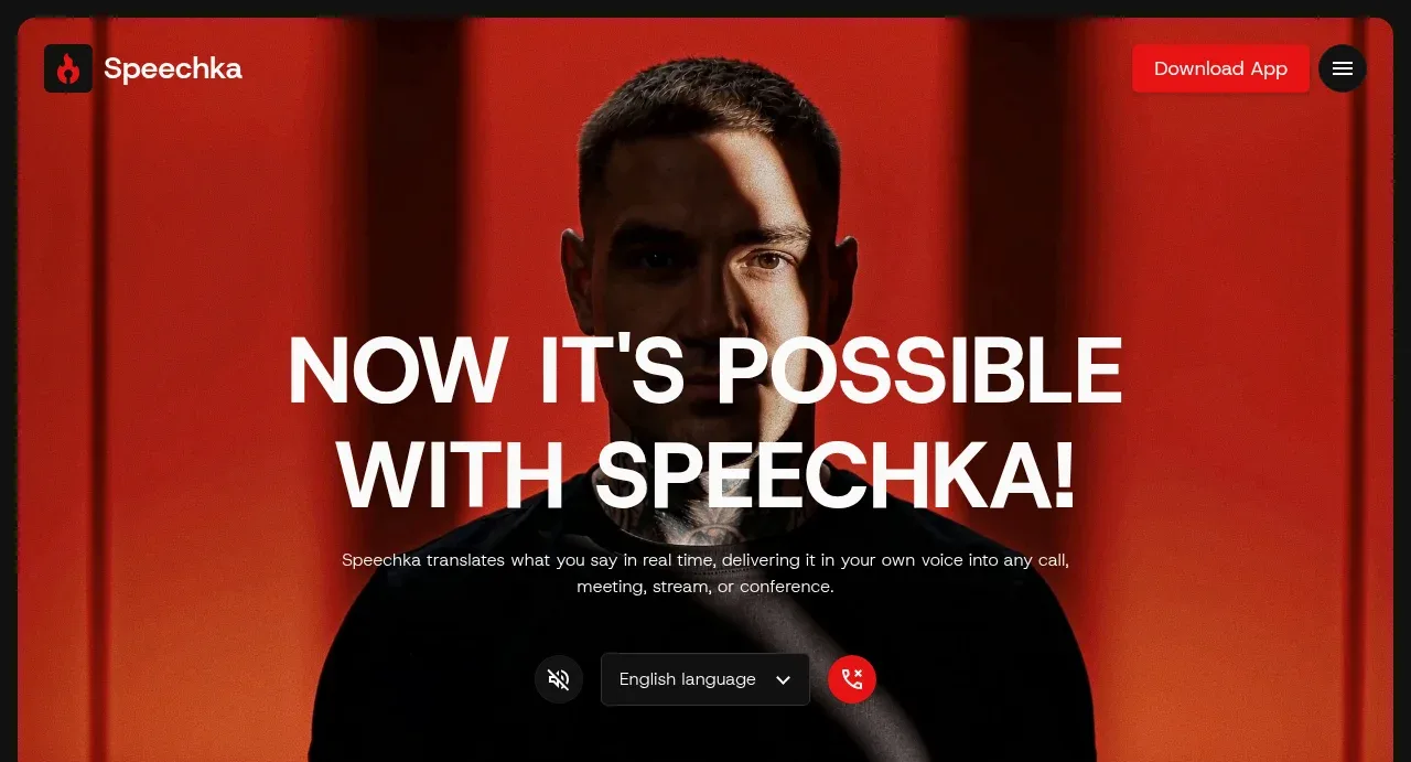
A tall red-and-black portrait visual provides immediate emotional impact behind a centered, oversized white promise, supporting explanation, and an interactive translation control row.
Prompt preview
## Reference images

Study these alongside the description below: hierarchy, rhythm, spacing, colour. Build for the product you are asked about, using this design language.

- Component: https://kage-design-assets.t3.tigrisfiles.io/components/speechka/662d10a3-b9d2-40f0-bccc-e5bde29d7609-1790229789-1.webp
- Full page it was cut from: https://kage-design-assets.t3.tigrisfiles.io/screenshots/speechka/662d10a3-b9d2-40f0-bccc-e5bde29d7609-1790229722330-full.webp
- Component on Kage: https://kage.design/component/speechka-hero

## Before you start
Ask what the user's product is, who it serves, and what brand personality and visual identity it should use. Apply the principles below to that product rather than reproducing the reference.

Create a full-width hero directly below the navigation with a darkened, cinematic visual background and a strong focal subject. Center the content vertically and horizontally: use a very large uppercase or display headline, a short muted supporting paragraph, and a compact row of controls or a primary action below it. Keep the headline to a few lines at most and make the first action obvious. Use near-black #111111, white #f7f7f7, muted gray #b0b0b0, and one energetic red accent around #ed171b. Use a 10–14px rounded container, subtle overlay gradient for legibility, tight display line-height, and generous top/bottom padding. Controls should have dark bordered fields, clear selected states, and a red circular or pill action. Make the hero responsive by reducing type size and preserving the focal point on narrow screens.

Never use logos, product names, copy, illustrations, or imagery from the reference.