kage
kage
speechka.io
Design analysis
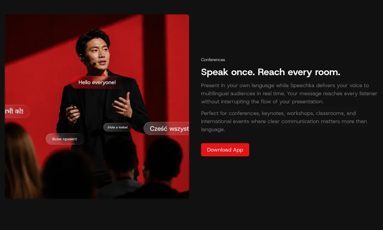
Another use-case band reverses the media and text relationship, using a large presentation image on the left and explanatory copy with a download action on the right.
Prompt preview
## Reference images

Study these alongside the description below: hierarchy, rhythm, spacing, colour. Build for the product you are asked about, using this design language.

- Component: https://kage-design-assets.t3.tigrisfiles.io/components/speechka/662d10a3-b9d2-40f0-bccc-e5bde29d7609-1790229791-6.webp
- Full page it was cut from: https://kage-design-assets.t3.tigrisfiles.io/screenshots/speechka/662d10a3-b9d2-40f0-bccc-e5bde29d7609-1790229722330-full.webp
- Component on Kage: https://kage.design/component/speechka-hero-3

## Before you start
Ask what the user's product is, who it serves, and what brand personality and visual identity it should use. Apply the principles below to that product rather than reproducing the reference.

Build a reversed two-column use-case section: place a large rounded image or video frame on the left and an eyebrow, strong headline, two concise paragraphs, and a primary action on the right. Preserve the same visual system across use cases but vary the media composition to keep the page dynamic. Use a near-black #111111 background, #f5f5f5 headings, #808080 body copy, #ed171b CTA, subtle #242424 dividers, and 8–12px media radius. Vertically center the copy beside the media and collapse to a media-first stacked layout on mobile.

Never use logos, product names, copy, illustrations, or imagery from the reference.