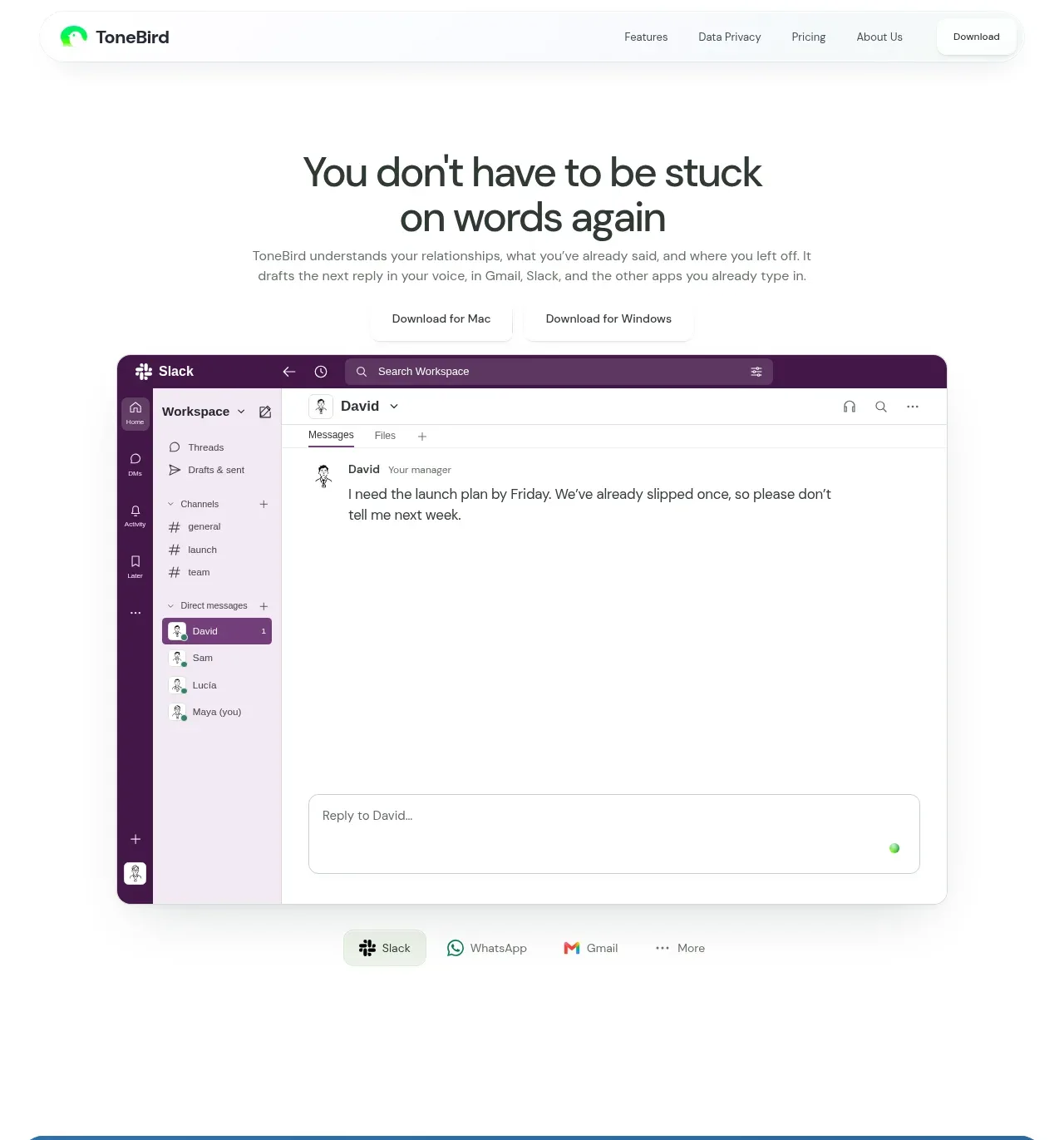
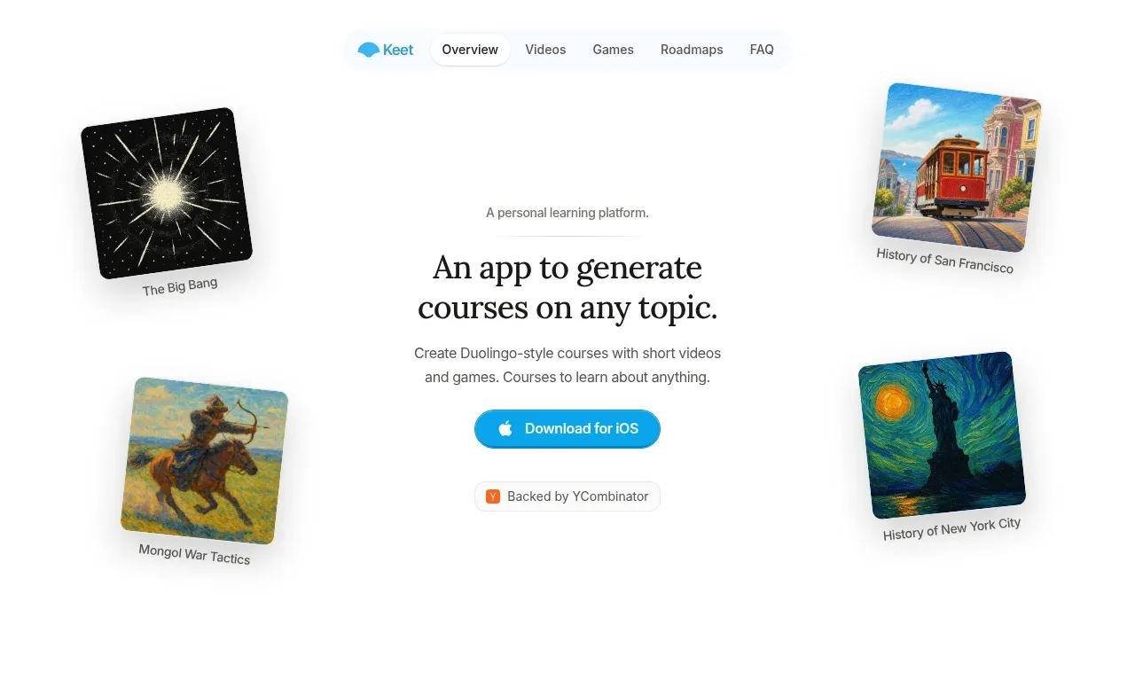
kage
kage
speechka.io
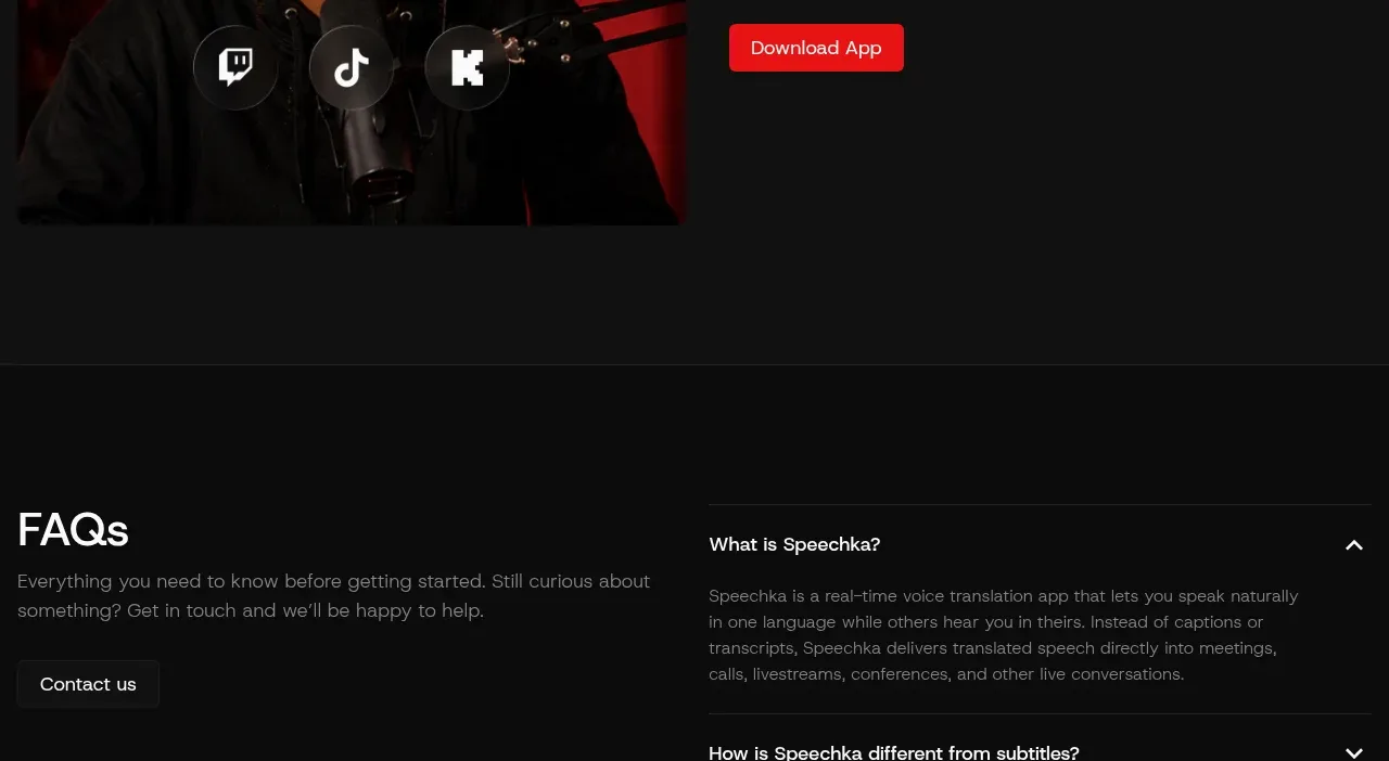
Design analysis
The media-led use-case section uses a vivid portrait frame on the left and concise streaming-focused copy with a single action on the right.
Prompt preview
## Reference images

Study these alongside the description below: hierarchy, rhythm, spacing, colour. Build for the product you are asked about, using this design language.

- Component: https://kage-design-assets.t3.tigrisfiles.io/components/speechka/662d10a3-b9d2-40f0-bccc-e5bde29d7609-1790229792-9.webp
- Full page it was cut from: https://kage-design-assets.t3.tigrisfiles.io/screenshots/speechka/662d10a3-b9d2-40f0-bccc-e5bde29d7609-1790229722330-full.webp
- Component on Kage: https://kage.design/component/speechka-hero-4

## Before you start
Ask what the user's product is, who it serves, and what brand personality and visual identity it should use. Apply the principles below to that product rather than reproducing the reference.

Create a final media-and-copy use-case band with a 1:1 or landscape media frame on the left and vertically centered text on the right. Include a small context label, a benefit-led heading, two short paragraphs, and one red CTA. Let the image carry energy while keeping the copy calm and highly legible. Use #111111, #f5f5f5, #858585, #ed171b, and #252525; give the media 8–12px radius and the CTA 6–8px radius. Preserve consistent column proportions with prior story sections, then stack the content cleanly on mobile.

Never use logos, product names, copy, illustrations, or imagery from the reference.