 kage
kage
speechka.io
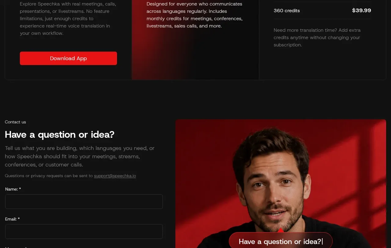
Design analysis
A large value statement precedes a three-column pricing panel with a free trial, highlighted subscription plan, and add-on credits, making the conversion path easy to compare.
Prompt preview
## Reference images

Study these alongside the description below: hierarchy, rhythm, spacing, colour. Build for the product you are asked about, using this design language.

- Component: https://kage-design-assets.t3.tigrisfiles.io/components/speechka/662d10a3-b9d2-40f0-bccc-e5bde29d7609-1790229792-11.webp
- Full page it was cut from: https://kage-design-assets.t3.tigrisfiles.io/screenshots/speechka/662d10a3-b9d2-40f0-bccc-e5bde29d7609-1790229722330-full.webp
- Component on Kage: https://kage.design/component/speechka-pricing-table

## Before you start
Ask what the user's product is, who it serves, and what brand personality and visual identity it should use. Apply the principles below to that product rather than reproducing the reference.

Create a three-column pricing table below a large editorial headline and supporting sentence. Use clear plan names, prominent prices, billing context, short descriptions, credit or feature details, and one unmistakable CTA on the entry plan. Visually highlight the recommended plan with a warm red-to-black gradient or red edge while keeping the other plans restrained. Use #111111 background, #0d0d0d cards, #f5f5f5 headings, #858585 body text, #242424 borders, #ed171b highlight, 0–4px card corners, and consistent internal padding. Make the comparison responsive by stacking cards, keep price and CTA alignment consistent, and expose billing/accessibility details clearly.

Never use logos, product names, copy, illustrations, or imagery from the reference.
More components
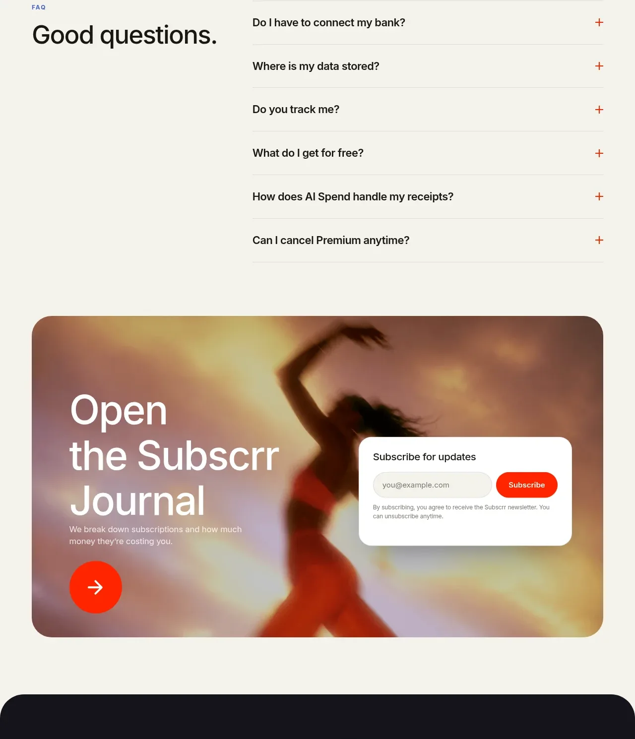
 Free and premium pricing comparison
Subscrr · Pricing table
Free and premium pricing comparison
Subscrr · Pricing table
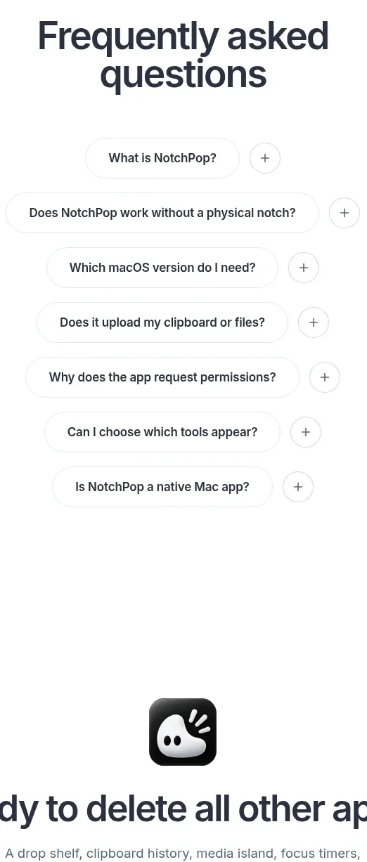
 One-time purchase pricing
NotchPop · Pricing table
One-time purchase pricing
NotchPop · Pricing table
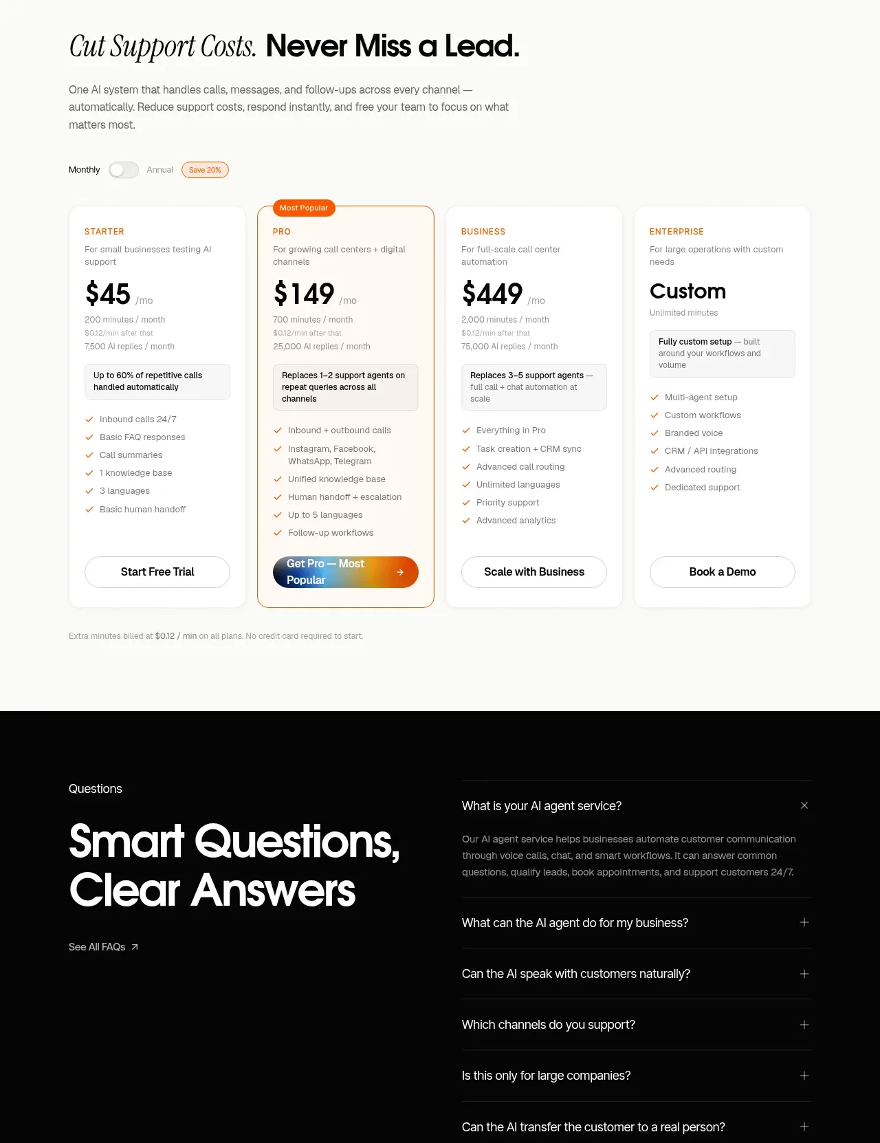
 Support plan pricing
IntellAgents.io · Pricing table
Support plan pricing
IntellAgents.io · Pricing table
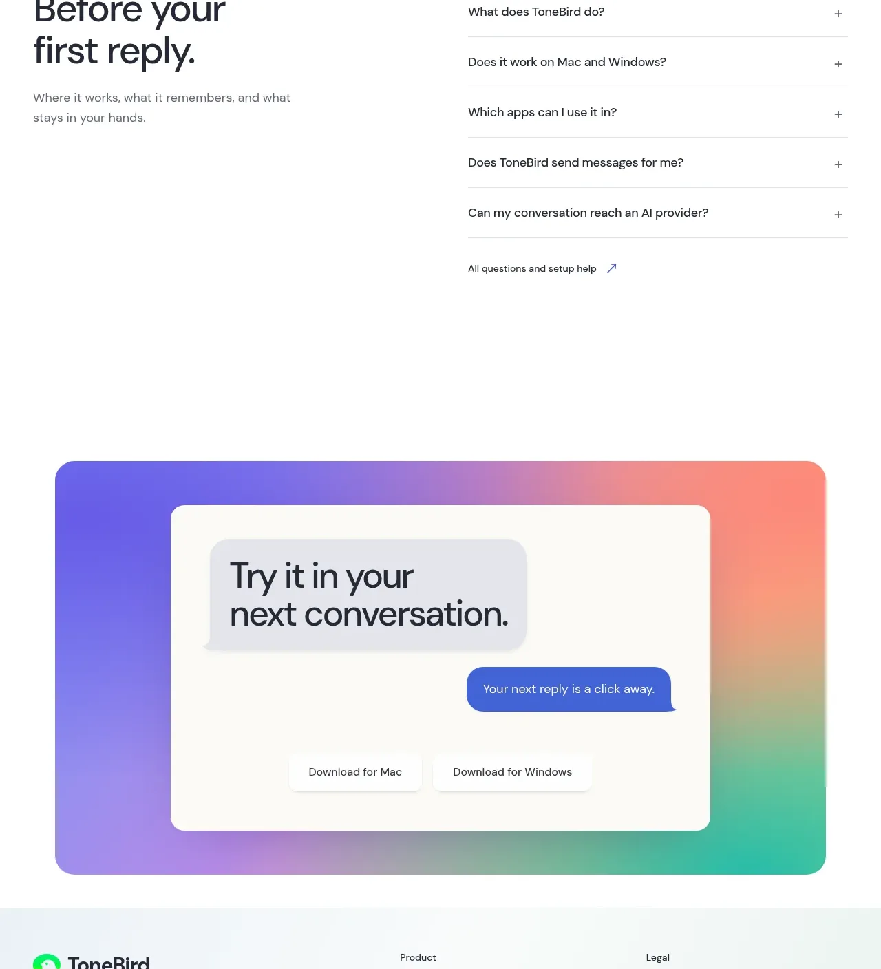
 Four-tier pricing table
ToneBird · Pricing table
Four-tier pricing table
ToneBird · Pricing table
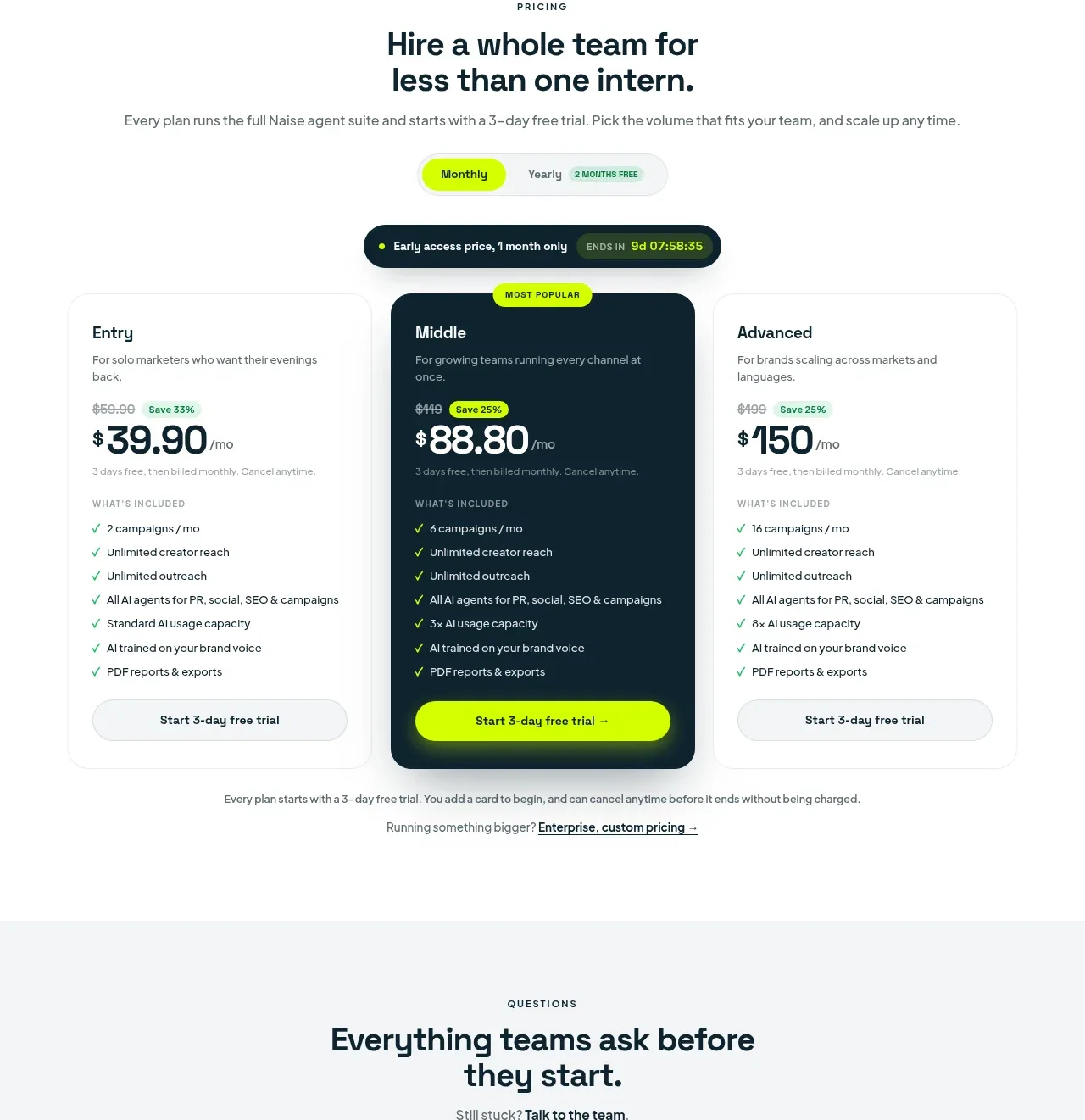
 Three-tier pricing plans
Naise AI · Pricing table
Three-tier pricing plans
Naise AI · Pricing table
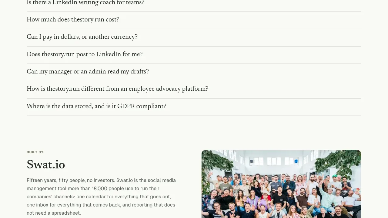
 Simple usage-based pricing
thestory.run · Pricing table
Simple usage-based pricing
thestory.run · Pricing table