 kage
kage
speechmark.co

Design analysis
A restrained, editorial tab section that pairs a vertical audience selector with a large contextual message. Strong typographic contrast, generous whitespace, and a slim active rule make the current tab clear without visual clutter.
Prompt preview
## Reference images

Study these alongside the description below: hierarchy, rhythm, spacing, colour. Build for the product you are asked about, using this design language.

- Component: https://kage-design-assets.t3.tigrisfiles.io/components/speechmark/77b904ee-7a59-4d24-b7d4-3e274188b21e-1789106593-6.webp
- Full page it was cut from: https://kage-design-assets.t3.tigrisfiles.io/screenshots/speechmark/77b904ee-7a59-4d24-b7d4-3e274188b21e-1789106544280-full.webp
- Component on Kage: https://kage.design/component/speechmark-tabs

## Before you start
Ask the user what their product is, who it serves, and what visual brand it uses. Then apply the principles below to create an original version for that product rather than reproducing the reference.

## Build an editorial audience-tabs section
Create a responsive website section that helps visitors identify with different audiences, use cases, or customer types. The component should feel calm, premium, trustworthy, and text-led, with the clarity of a well-designed editorial layout.

### Structure and layout
- Use a full-width section with a very pale cool background, approximately `#F4F9FC`, and a subtle boundary or tonal transition between adjacent sections.
- Constrain the content to a centered max width of roughly `1100–1180px`; keep generous horizontal gutters of `40–7vw` on desktop.
- Begin with a small eyebrow at the top left: a short horizontal rule followed by uppercase category text. Align both elements on one baseline.
- Place a large display heading beneath the eyebrow, spanning most of the available width. The heading should explain the audience-oriented value proposition in one concise sentence.
- Below the heading, create a two-column tab layout:
  - Left column: a vertical list of 3–5 audience or use-case tabs.
  - Right column: the selected tab’s content, including a small progress indicator, a prominent supporting headline, and a short explanatory paragraph.
- Use a column ratio near `1fr 2.2fr`, with a substantial gap between the navigation and content. Keep the content column comfortably readable rather than stretching text across the viewport.
- Reserve generous vertical space around the component. The section should feel intentional and spacious, not like a compact application control.

### Typography hierarchy
- Use a refined serif or humanist display face for the main heading and selected-panel headline. If the product brand uses a different type system, preserve the same contrast between expressive display type and highly legible body text.
- Use a neutral sans-serif or restrained serif for navigation, eyebrow labels, metadata, and body copy.
- Main heading: large and confident, approximately `42–52px` desktop with `0.98–1.08` line height; scale to `34–40px` on smaller screens.
- Panel headline: approximately `30–38px` desktop with tight, readable line height; allow it to wrap naturally across several lines.
- Body copy: approximately `17–19px`, with `1.45–1.6` line height and a muted ink colour.
- Eyebrow and progress indicator: uppercase, letter-spaced, approximately `11–12px`, medium weight.

### Colour and visual treatment
- Use a deep navy or ink colour near `#102B50` for primary headings and the active tab.
- Use a softened slate colour near `#65727D` for inactive labels and descriptive text.
- Use a cool blue accent near `#2E83B8` for the eyebrow rule and subtle emphasis.
- Inactive tab rules should be very light blue-grey, around `#D2E0E8`; the active rule should use the deep ink colour or accent blue.
- Keep contrast calm and sophisticated. Avoid gradients, shadows, glossy treatments, or decorative cards unless they are essential to the user’s brand.

### Tabs and interaction
- Render each tab as a clearly interactive button, not a static text link.
- Give each tab a slim vertical rule on its left edge. Inactive rules are pale and the active rule is darker and slightly more visually prominent.
- The active tab should use darker, heavier text while inactive tabs remain muted.
- Clicking or tapping a tab updates the progress indicator, headline, and body copy in the content column.
- Support keyboard navigation with real buttons, visible focus states, and appropriate `aria-selected`, `role="tablist"`, and `role="tabpanel"` semantics where suitable.
- Add a restrained transition when content changes, such as a short fade or vertical reveal. Do not over-animate the layout.
- On touch-sized screens, convert the vertical navigation into a horizontally scrollable tab row or a stacked accordion-like selector, while keeping the selected state obvious.
- Ensure long labels, translated text, and keyboard focus do not break the layout.

### Responsive behaviour
- At desktop widths, preserve the two-column editorial composition.
- At tablet widths, reduce the gap and type scale while keeping the navigation and content distinct.
- At mobile widths, stack the heading, tabs, and selected content vertically. Keep each tab easy to tap with at least `44px` of height and maintain generous separation.
- Avoid fixed heights; let headlines and body copy determine the panel height.

### Content guidance
- Use placeholder copy that matches the user’s product, audience, and tone. Provide a useful headline and a concise paragraph for every tab so switching feels meaningful.
- Keep the navigation labels short and scannable. Use the progress indicator to communicate position, for example `01 / 04`.

## Never
- Never copy the reference website’s logos, product names, brand language, or exact copy.
- Never reuse the reference’s audience labels, headlines, paragraphs, or distinctive phrases.
- Never include the reference’s illustrations, photography, icons, or other imagery.
- Never reproduce the exact layout measurements or treat the reference as a pixel-perfect template.
- Never make the tabs look like generic boxed UI controls if the product’s brand calls for a different treatment.
More components

 Directory filters and sorting
The Brains · Tabs & steps
Directory filters and sorting
The Brains · Tabs & steps
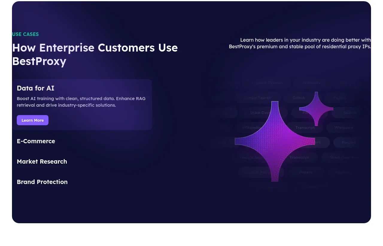
 Enterprise use cases
bestproxy.com · Tabs & steps
Enterprise use cases
bestproxy.com · Tabs & steps
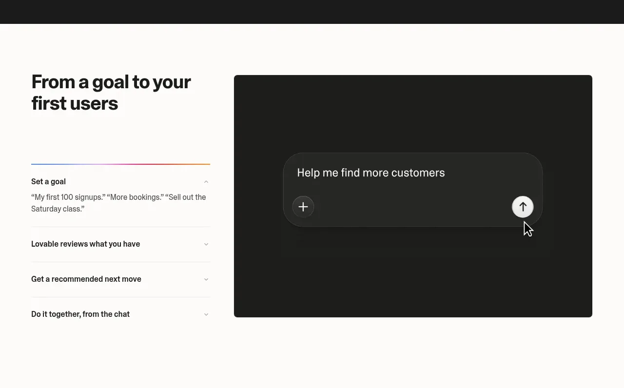
 Goal-to-first-users assistant
Lovable Growth Tools · Tabs & steps
Goal-to-first-users assistant
Lovable Growth Tools · Tabs & steps
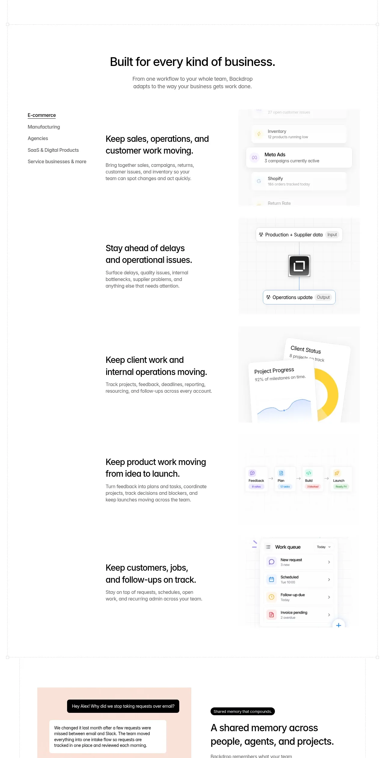
 Business use cases tabs
Backdrop · Tabs & steps
Business use cases tabs
Backdrop · Tabs & steps
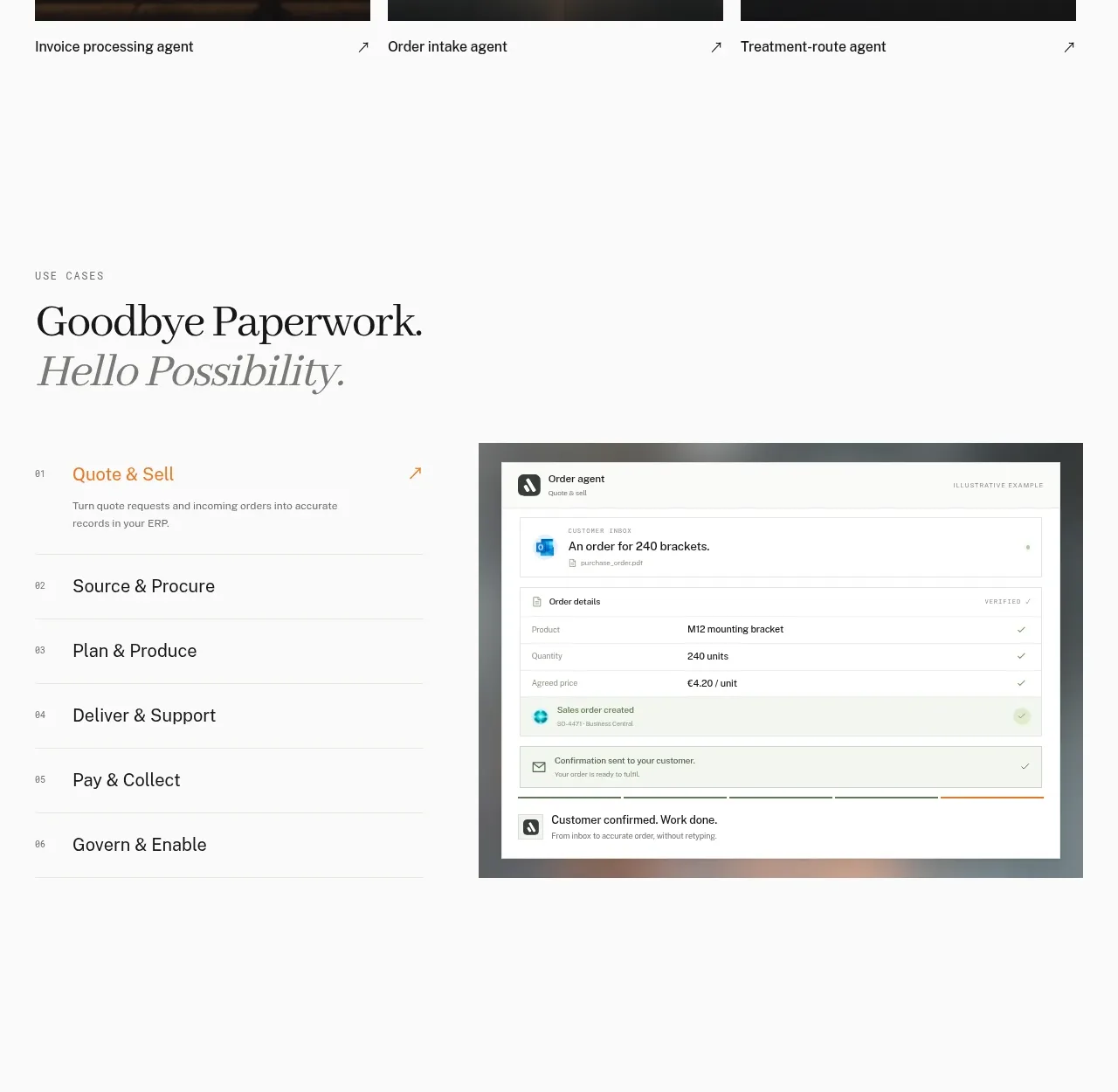
 Workflow stages with product preview
Lleverage · Tabs & steps
Workflow stages with product preview
Lleverage · Tabs & steps
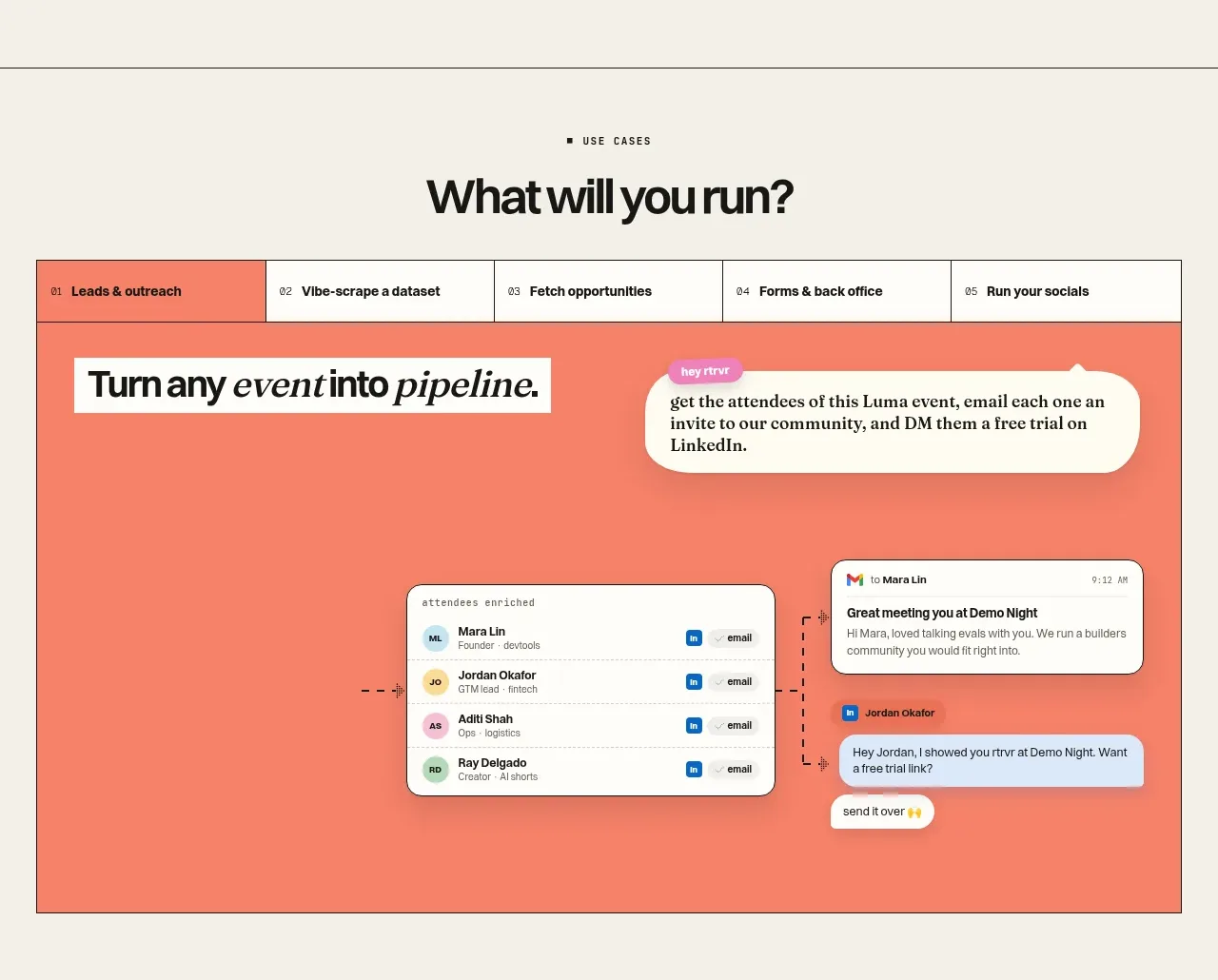
 Use-case selector and interactive showcase
Retriever AI · Tabs & steps
Use-case selector and interactive showcase
Retriever AI · Tabs & steps