 kage
kage
spira.ai

Design analysis
A use-case section pairs a stacked category selector with a tall social-video preview. The active category is marked by a bright vertical rail, making the relationship between text and media easy to scan.
Prompt preview
## Reference images

Study these alongside the description below: hierarchy, rhythm, spacing, colour. Build for the product you are asked about, using this design language.

- Component: https://kage-design-assets.t3.tigrisfiles.io/components/spira-maxima/726c84dd-363c-4980-b0d9-b04757b4422a-1791266564-4.webp
- Full page it was cut from: https://kage-design-assets.t3.tigrisfiles.io/screenshots/spira-maxima/726c84dd-363c-4980-b0d9-b04757b4422a-1791266451959-full.webp
- Component on Kage: https://kage.design/component/spira-maxima-feature-grid

## Before you start
Ask which audiences or use cases matter for the user's product and what preview media is available, then apply these principles to that product.

Build a spacious dark two-column use-case section. Put an eyebrow and large heading on the left, followed by a vertical list of 3–5 use cases. Each item should have a bold label and optional one-sentence description; indicate the active item with a bright 3px vertical line and brighter text while inactive items use a dimmer rail. On the right, show a tall rounded social-media-style preview frame with controls and a gradient fade near its edges. Keep the preview secondary to the content and align its visual center with the list. Use #080909 page background, #171819 cards, #f4f4f2 text, #8c8d91 muted text, and coral/blue accent light. Add hover and click states and make the layout stack on narrow screens.

Never: use logos, product names, copy, illustrations, or imagery from the reference.
More components

 Three-step process cards
godaylight.com · Feature grid
Three-step process cards
godaylight.com · Feature grid

 Insights and enterprise model access
FastRouter.ai · Feature grid
Insights and enterprise model access
FastRouter.ai · Feature grid
 Routing reliability and model collaboration
FastRouter.ai · Feature grid
Routing reliability and model collaboration
FastRouter.ai · Feature grid
 Solutions by organizational role
FastRouter.ai · Feature grid
Solutions by organizational role
FastRouter.ai · Feature grid
 Goal-oriented product capabilities
FastRouter.ai · Feature grid
Goal-oriented product capabilities
FastRouter.ai · Feature grid
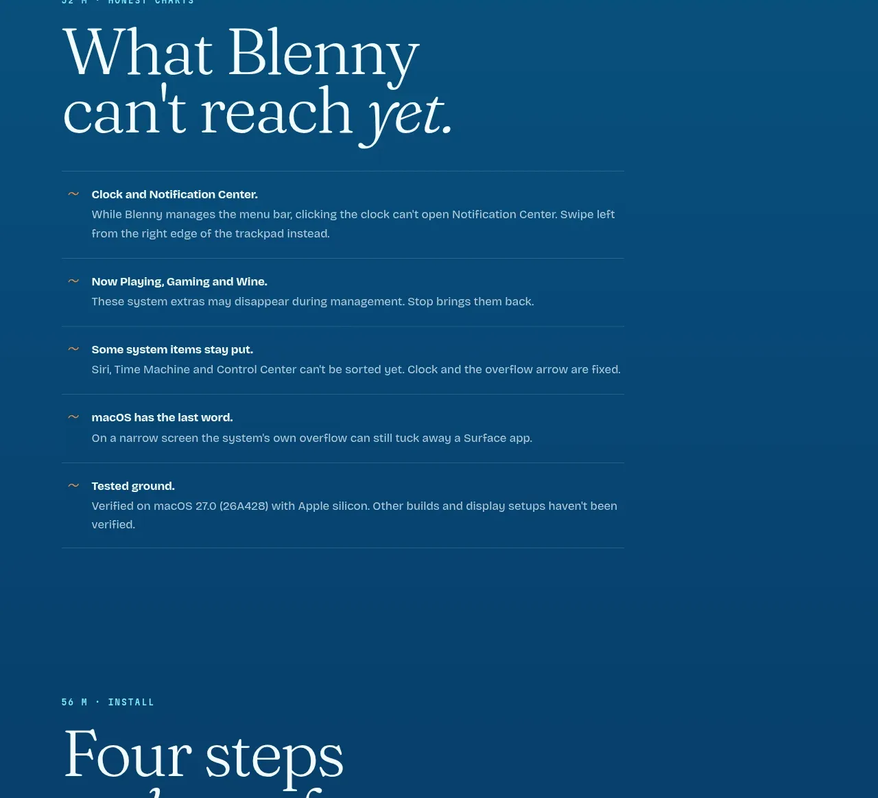
 Installation steps
Blenny · Feature grid
Installation steps
Blenny · Feature grid