 kage
kage
spira.ai
Design analysis
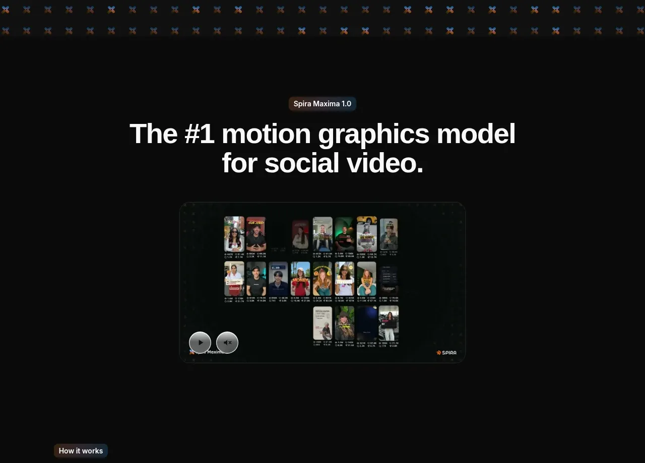
A short model-positioning headline leads into a framed video/demo preview. The black page and restrained framing keep attention on the product output.
Prompt preview
## Reference images

Study these alongside the description below: hierarchy, rhythm, spacing, colour. Build for the product you are asked about, using this design language.

- Component: https://kage-design-assets.t3.tigrisfiles.io/components/spira-maxima/726c84dd-363c-4980-b0d9-b04757b4422a-1791266563-2.webp
- Full page it was cut from: https://kage-design-assets.t3.tigrisfiles.io/screenshots/spira-maxima/726c84dd-363c-4980-b0d9-b04757b4422a-1791266451959-full.webp
- Component on Kage: https://kage.design/component/spira-maxima-hero-2

## Before you start
Ask what product capability deserves an introductory demo and what visual asset the user has, then apply these principles to that product.

Build a centered product-introduction section on #080909. Use a small dark gradient eyebrow badge, a two-line 38–52px bold heading, then a large centered demo/video frame with a 1px translucent border, 14–20px radius, subtle inner shadow, and a muted black/green surface. The media should be wide but not edge-to-edge, roughly 65–75% of the content width, with a visible play control and optional small product metadata. Maintain generous vertical spacing above and below so the section feels like a deliberate reveal. Use white headings, #a1a1a5 supporting text, and restrained blue/orange highlights.

Never: use logos, product names, copy, illustrations, or imagery from the reference.
More components

 AI workflow hero
Incredible · Hero
AI workflow hero
Incredible · Hero

 Warm mission statement panel
godaylight.com · Hero
Warm mission statement panel
godaylight.com · Hero
 Decentralized energy statement
godaylight.com · Hero
Decentralized energy statement
godaylight.com · Hero
 Grid problem statement
godaylight.com · Hero
Grid problem statement
godaylight.com · Hero
 Photographic power-home hero
godaylight.com · Hero
Photographic power-home hero
godaylight.com · Hero

 Product hero with download action and video
HyperFrames Studio (Desktop) · Hero
Product hero with download action and video
HyperFrames Studio (Desktop) · Hero