 kage
kage
spira.ai
Design analysis
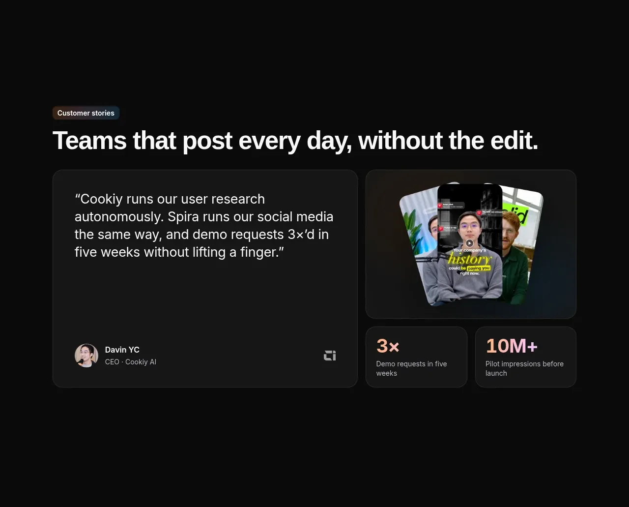
A wide customer quote card is paired with a visual proof card and two compact outcome metrics. The asymmetry feels editorial while still giving the testimonial strong credibility.
Prompt preview
## Reference images

Study these alongside the description below: hierarchy, rhythm, spacing, colour. Build for the product you are asked about, using this design language.

- Component: https://kage-design-assets.t3.tigrisfiles.io/components/spira-maxima/726c84dd-363c-4980-b0d9-b04757b4422a-1791266566-8.webp
- Full page it was cut from: https://kage-design-assets.t3.tigrisfiles.io/screenshots/spira-maxima/726c84dd-363c-4980-b0d9-b04757b4422a-1791266451959-full.webp
- Component on Kage: https://kage.design/component/spira-maxima-testimonials

## Before you start
Ask who the user's ideal customer is, what verified quote and outcomes are available, and whether consent exists for any portrait or media, then apply these principles to that product.

Build a dark customer-story section with an eyebrow and a wide heading. Use a responsive asymmetric grid: a large rounded quote card with a 24–30px quote, customer attribution row, and optional company mark; a visual/media card with a rounded preview; and two small metric cards beneath or beside it. Use #171819 surfaces, #2a2c2d borders, 16px radius, soft shadows, warm coral and pale peach for numeric accents, and muted gray supporting text. Keep the quote easy to read, limit decorative elements, and let the proof metrics reinforce rather than repeat the quote. Use real, permissioned customer media only.

Never: use logos, product names, copy, illustrations, or imagery from the reference.
More components
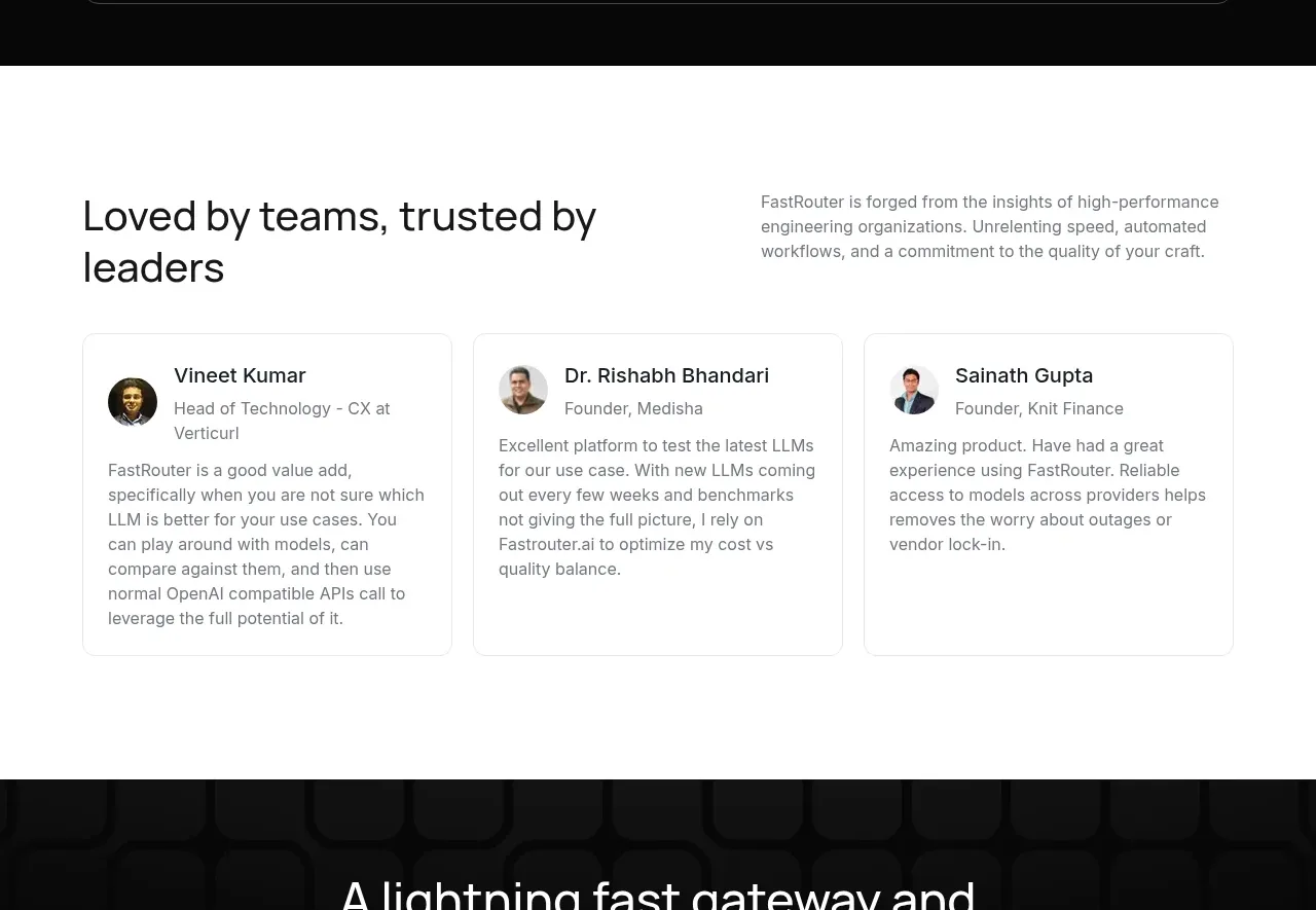
 Customer testimonial cards
FastRouter.ai · Testimonials
Customer testimonial cards
FastRouter.ai · Testimonials
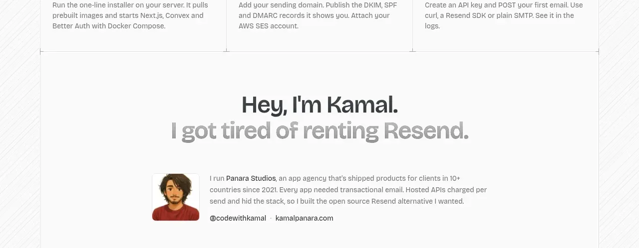
 Founder story
opensend.cc · Testimonials
Founder story
opensend.cc · Testimonials
P
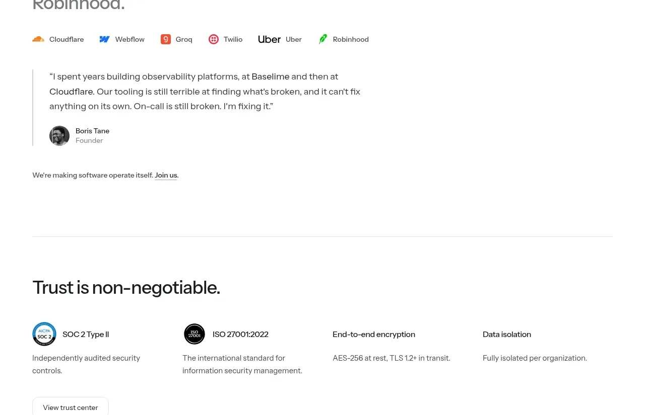
Founder testimonial
Polylane · Testimonials
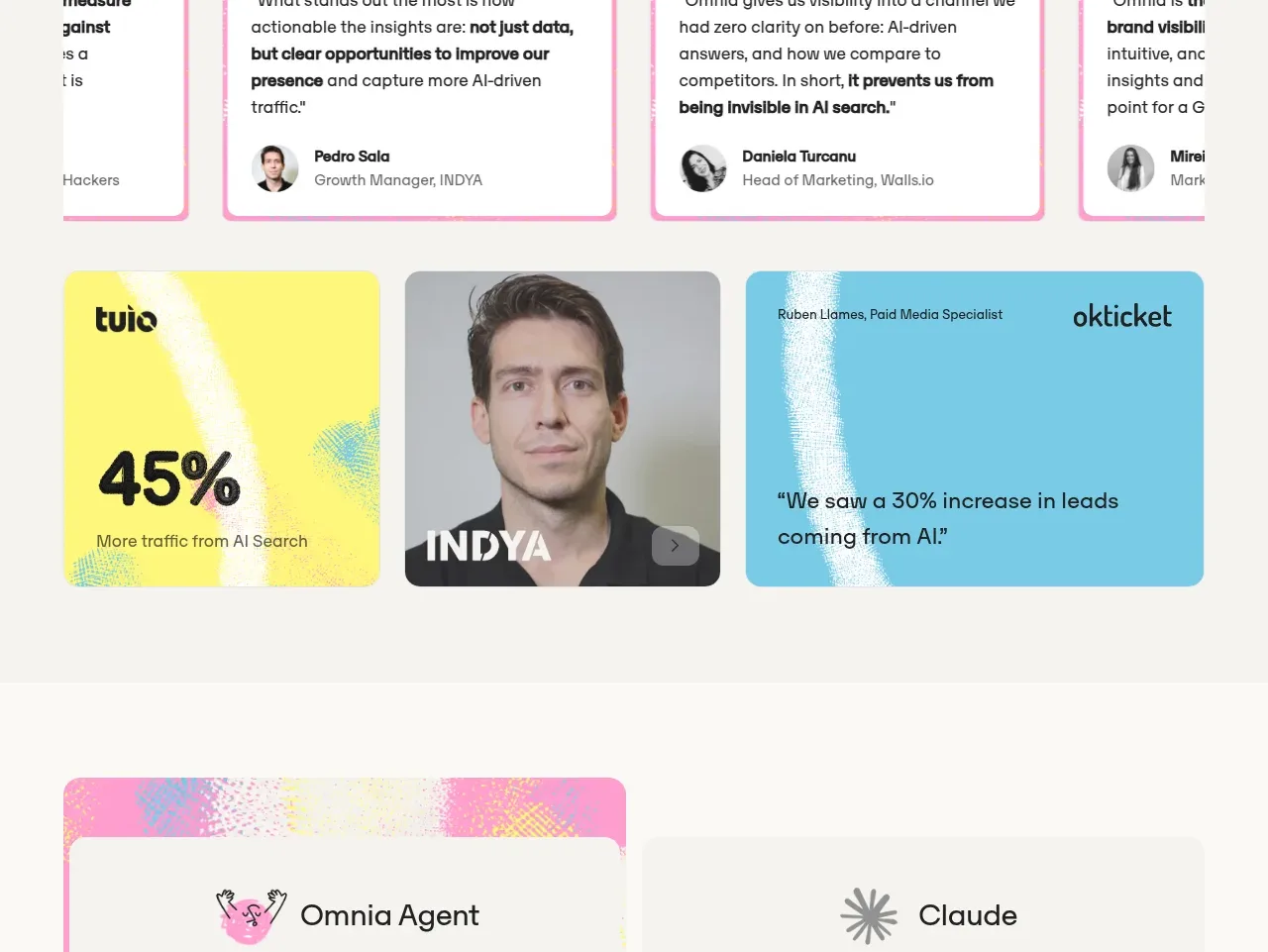
 Customer proof and outcomes
Omnia Agent · Testimonials
Customer proof and outcomes
Omnia Agent · Testimonials
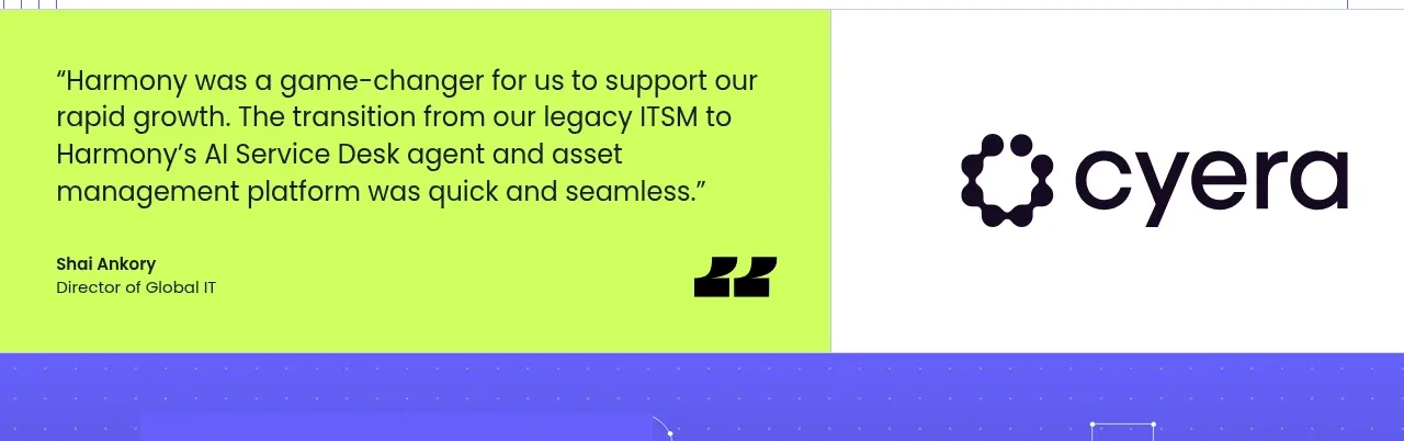
 Customer proof statement
Harmony · Testimonials
Customer proof statement
Harmony · Testimonials
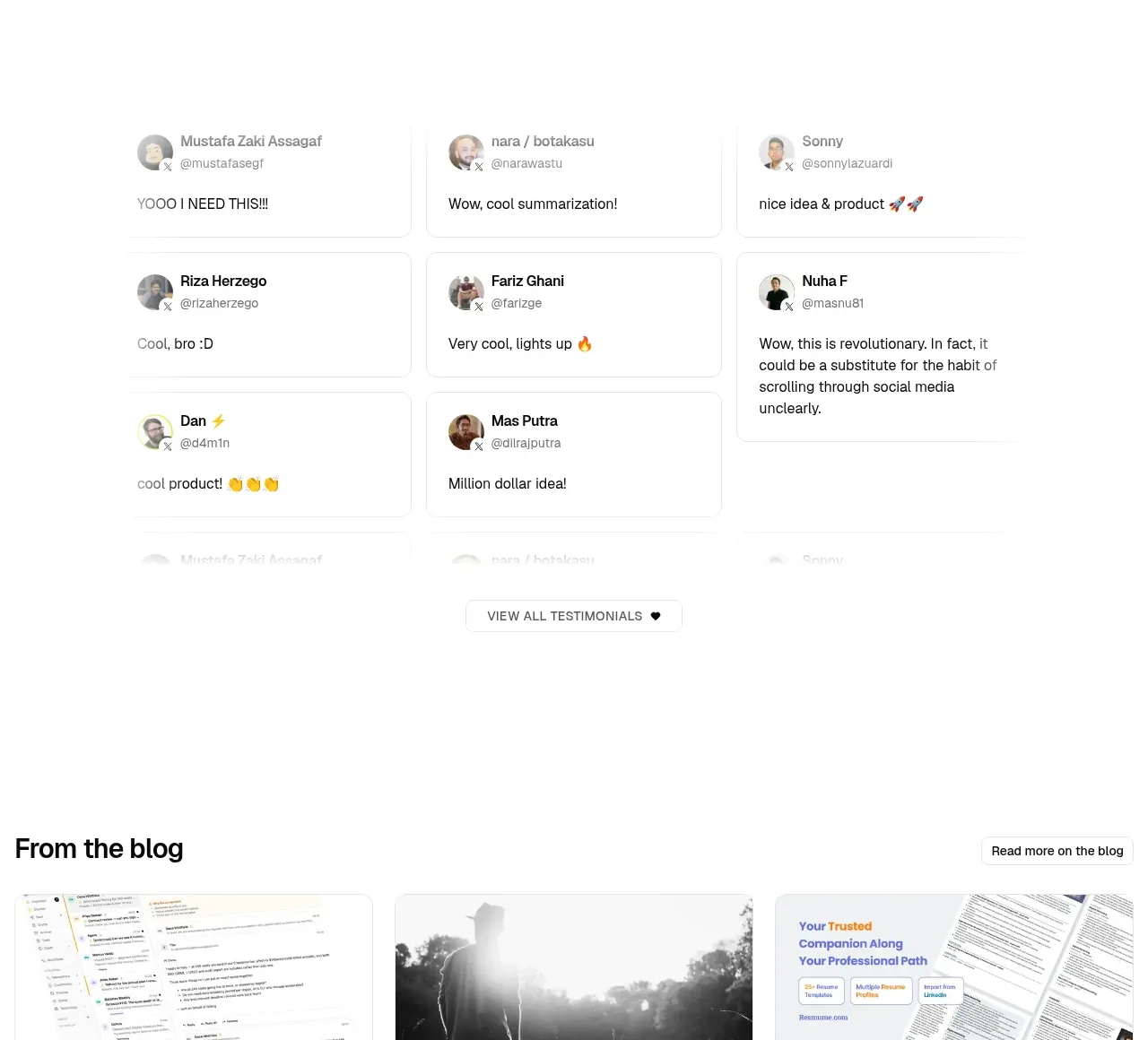
 Community testimonials
LaterOn v2: The agentic email plaftform · Testimonials
Community testimonials
LaterOn v2: The agentic email plaftform · Testimonials