 kage
kage
splitformac.com
Design analysis
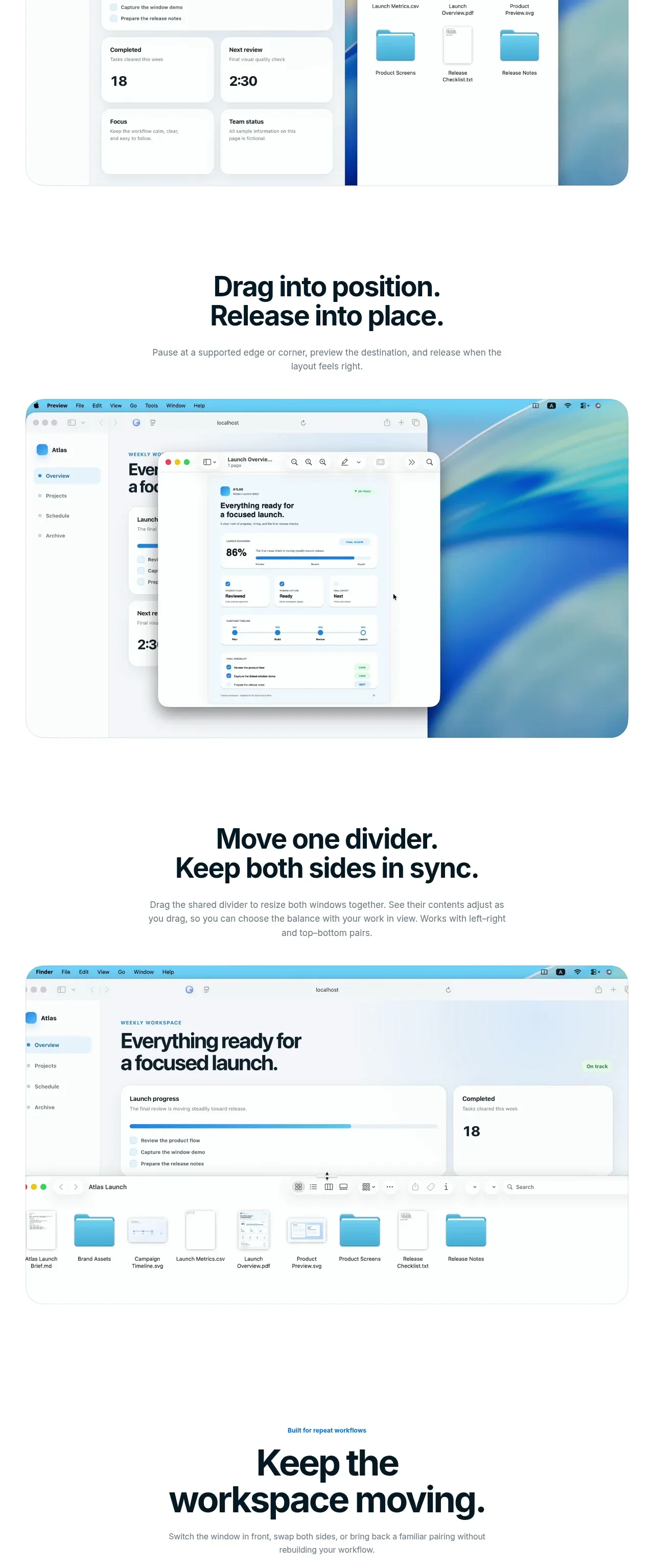
Three feature stories explain ratio placement, drag positioning, and synchronized resizing through a consistent heading-plus-visual pattern.
Prompt preview
## Reference images

Study these alongside the description below: hierarchy, rhythm, spacing, colour. Build for the product you are asked about, using this design language.

- Component: https://kage-design-assets.t3.tigrisfiles.io/components/split/8556c614-105f-4777-9be3-693330882192-1790402627-3.webp
- Full page it was cut from: https://kage-design-assets.t3.tigrisfiles.io/screenshots/split/8556c614-105f-4777-9be3-693330882192-1790402544582-full.webp
- Component on Kage: https://kage.design/component/split-feature-grid

## Before you start
Ask what the user's product is, who it is for, and what their brand style should feel like. Apply the principles below to that product rather than copying this reference.

Create a vertical feature-story layout with three evenly structured feature blocks. Each block should contain a strong 28–38px heading, concise explanatory copy, and a large product visualization that demonstrates the behavior rather than merely decorating the page. Alternate visual emphasis or alignment only when it improves rhythm; otherwise keep a consistent centered grid and predictable spacing. Use dark #07151d typography, muted #6c767d body copy, white space, pale blue-gray surfaces #f4f8fa, 1px borders, and 18–24px radii. Make interactions understandable with visible dividers, window edges, drag handles, or state changes, and provide reduced-motion fallbacks.

Never use the reference's logos, product names, copy, illustrations, imagery, or exact visual assets.
More components

 Three-step process cards
godaylight.com · Feature grid
Three-step process cards
godaylight.com · Feature grid

 Use-case selector with vertical video preview
Spira Maxima · Feature grid
Use-case selector with vertical video preview
Spira Maxima · Feature grid

 Insights and enterprise model access
FastRouter.ai · Feature grid
Insights and enterprise model access
FastRouter.ai · Feature grid
 Solutions by organizational role
FastRouter.ai · Feature grid
Solutions by organizational role
FastRouter.ai · Feature grid
 Routing reliability and model collaboration
FastRouter.ai · Feature grid
Routing reliability and model collaboration
FastRouter.ai · Feature grid
 Goal-oriented product capabilities
FastRouter.ai · Feature grid
Goal-oriented product capabilities
FastRouter.ai · Feature grid