 kage
kage
splitformac.com
Design analysis
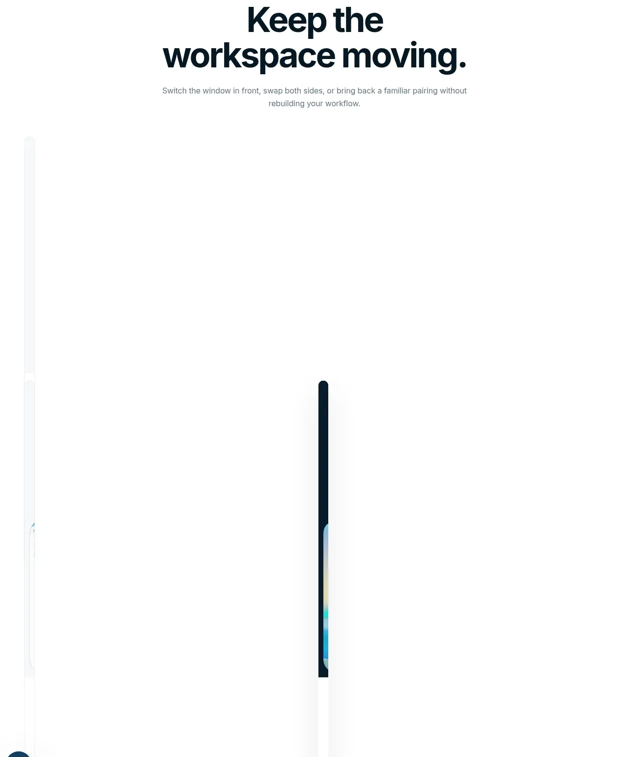
A new feature chapter reframes the product as a repeatable workflow, pairing a short eyebrow and headline with an expansive visual demonstration.
Prompt preview
## Reference images

Study these alongside the description below: hierarchy, rhythm, spacing, colour. Build for the product you are asked about, using this design language.

- Component: https://kage-design-assets.t3.tigrisfiles.io/components/split/8556c614-105f-4777-9be3-693330882192-1790402627-4.webp
- Full page it was cut from: https://kage-design-assets.t3.tigrisfiles.io/screenshots/split/8556c614-105f-4777-9be3-693330882192-1790402544582-full.webp
- Component on Kage: https://kage.design/component/split-feature-grid-2

## Before you start
Ask what the user's product is, who it is for, and what their brand style should feel like. Apply the principles below to that product rather than copying this reference.

Design a feature chapter focused on continuity and repeat use. Use a centered eyebrow in a small accent color, followed by a large two-line headline and a restrained supporting paragraph. Below the text, leave room for a wide, immersive product state or interaction visualization. Use a minimal white canvas, generous vertical padding, typography in #07151d, secondary text in #6c767d, and a small cyan/blue accent around #2eb8e6. The visual may be partially revealed as the user scrolls, but it must remain understandable without motion. Keep alignment centered and maintain a clear hierarchy from promise to proof.

Never use the reference's logos, product names, copy, illustrations, imagery, or exact visual assets.
More components

 Three-step process cards
godaylight.com · Feature grid
Three-step process cards
godaylight.com · Feature grid

 Use-case selector with vertical video preview
Spira Maxima · Feature grid
Use-case selector with vertical video preview
Spira Maxima · Feature grid

 Insights and enterprise model access
FastRouter.ai · Feature grid
Insights and enterprise model access
FastRouter.ai · Feature grid
 Solutions by organizational role
FastRouter.ai · Feature grid
Solutions by organizational role
FastRouter.ai · Feature grid
 Routing reliability and model collaboration
FastRouter.ai · Feature grid
Routing reliability and model collaboration
FastRouter.ai · Feature grid
 Goal-oriented product capabilities
FastRouter.ai · Feature grid
Goal-oriented product capabilities
FastRouter.ai · Feature grid