 kage
kage
splitformac.com
Design analysis
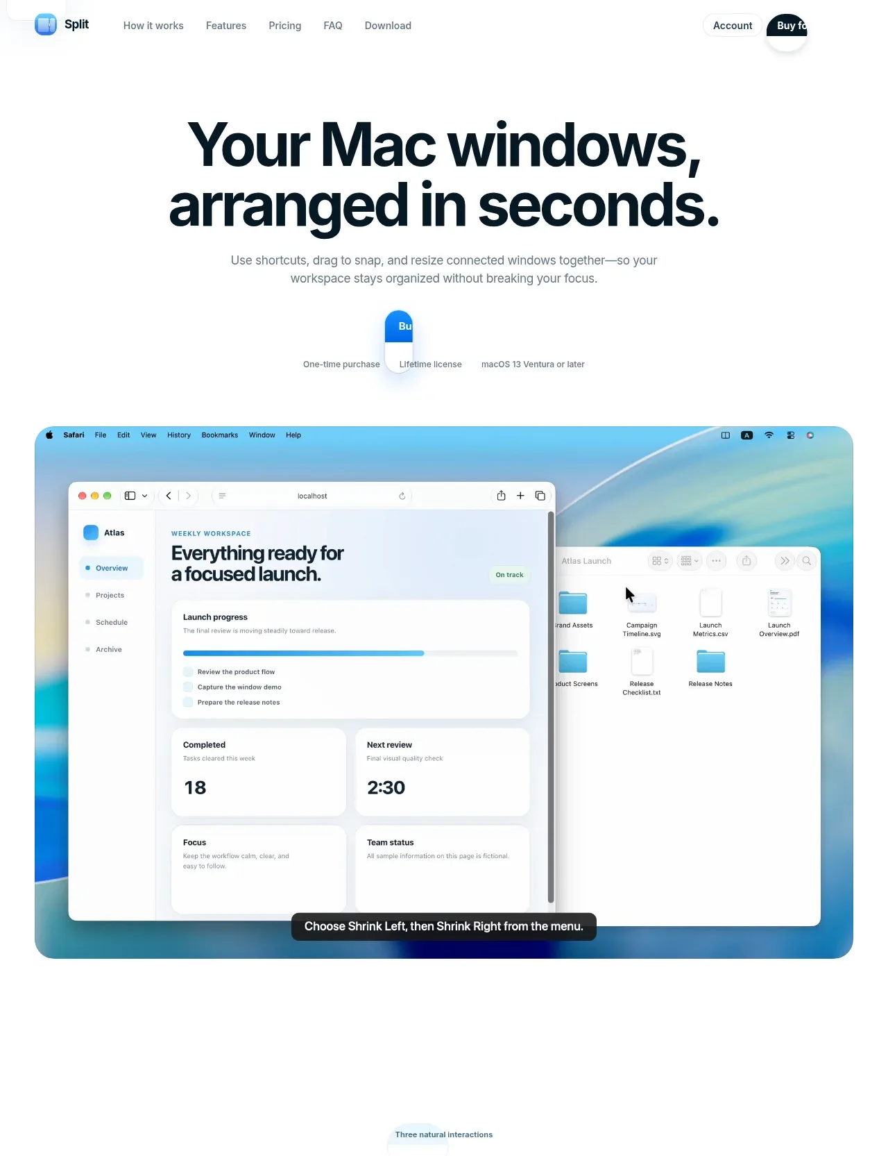
A large, highly legible headline and short explanation lead into a centered purchase cue and a broad product screenshot, making the value proposition immediately tangible.
Prompt preview
## Reference images

Study these alongside the description below: hierarchy, rhythm, spacing, colour. Build for the product you are asked about, using this design language.

- Component: https://kage-design-assets.t3.tigrisfiles.io/components/split/8556c614-105f-4777-9be3-693330882192-1790402626-1.webp
- Full page it was cut from: https://kage-design-assets.t3.tigrisfiles.io/screenshots/split/8556c614-105f-4777-9be3-693330882192-1790402544582-full.webp
- Component on Kage: https://kage.design/component/split-hero

## Before you start
Ask what the user's product is, who it is for, and what their brand style should feel like. Apply the principles below to that product rather than copying this reference.

Create a spacious hero directly below the navigation. Center a bold two-line headline in a dark near-black #07151d, approximately 52–64px with tight line height, followed by a concise muted-gray explanation at 14–16px. Add a small centered purchase/license cue beneath the copy, then place a wide product visual or interface preview below it with generous whitespace. The visual should be the dominant proof point, use a softly rounded 20–24px container, subtle shadow, and a bright but restrained blue/cyan accent such as #35bfe6 with pale blue gradients around #dff7ff. Keep the content column centered and limit the text width so the headline remains impactful. Add a clear primary CTA and a secondary supporting action if the product requires it.

Never use the reference's logos, product names, copy, illustrations, imagery, or exact visual assets.
More components

 AI workflow hero
Incredible · Hero
AI workflow hero
Incredible · Hero

 Decentralized energy statement
godaylight.com · Hero
Decentralized energy statement
godaylight.com · Hero
 Grid problem statement
godaylight.com · Hero
Grid problem statement
godaylight.com · Hero
 Photographic power-home hero
godaylight.com · Hero
Photographic power-home hero
godaylight.com · Hero
 Warm mission statement panel
godaylight.com · Hero
Warm mission statement panel
godaylight.com · Hero

 Product hero with download action and video
HyperFrames Studio (Desktop) · Hero
Product hero with download action and video
HyperFrames Studio (Desktop) · Hero