 kage
kage
splitformac.com
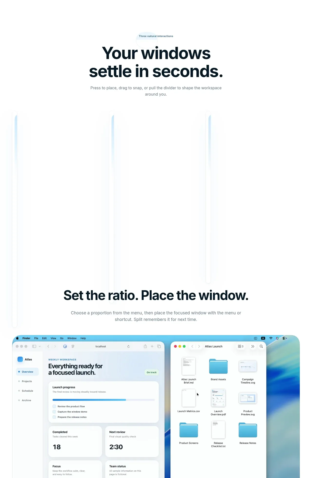
Design analysis
A repeated product-demo band introduces three natural interactions, using short explanatory headings and large visual examples separated by generous vertical rhythm.
Prompt preview
## Reference images

Study these alongside the description below: hierarchy, rhythm, spacing, colour. Build for the product you are asked about, using this design language.

- Component: https://kage-design-assets.t3.tigrisfiles.io/components/split/8556c614-105f-4777-9be3-693330882192-1790402626-2.webp
- Full page it was cut from: https://kage-design-assets.t3.tigrisfiles.io/screenshots/split/8556c614-105f-4777-9be3-693330882192-1790402544582-full.webp
- Component on Kage: https://kage.design/component/split-hero-2

## Before you start
Ask what the user's product is, who it is for, and what their brand style should feel like. Apply the principles below to that product rather than copying this reference.

Build a sequential interaction-demo section for three core workflows. Start with a small eyebrow label, then a centered headline and one or two lines of supporting copy. Present each workflow as its own vertically stacked module with a concise benefit-led title and a large, wide interface preview beneath or beside it. Use substantial whitespace between modules, consistent max-width around 730px, and a calm white background. Interface previews should have rounded 18–24px corners, a faint border #e5edf0, soft shadow, and optional blue/cyan highlight accents. Ensure each demo explains the action, result, and why it matters; support responsive stacking and accessible captions.

Never use the reference's logos, product names, copy, illustrations, imagery, or exact visual assets.
More components
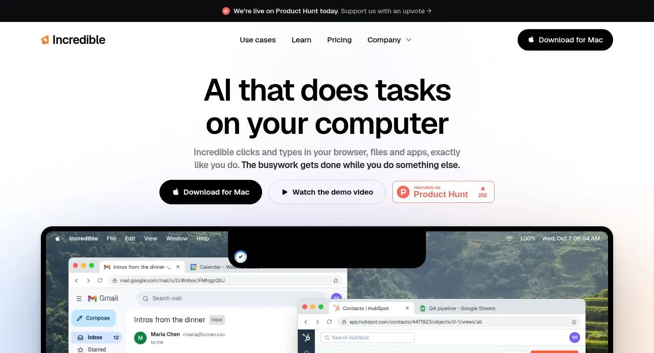
 AI workflow hero
Incredible · Hero
AI workflow hero
Incredible · Hero
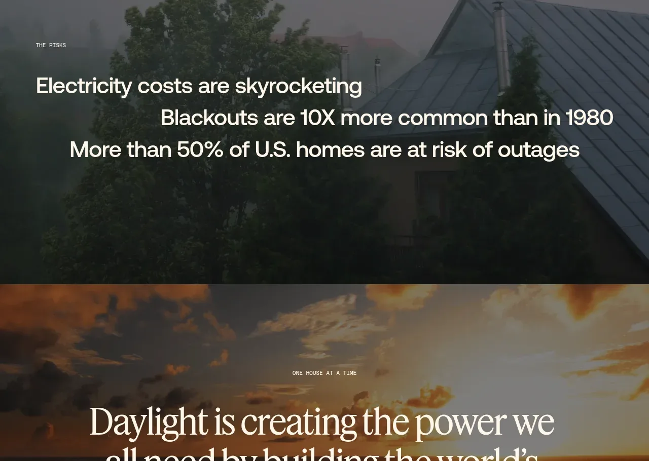
 Decentralized energy statement
godaylight.com · Hero
Decentralized energy statement
godaylight.com · Hero
 Grid problem statement
godaylight.com · Hero
Grid problem statement
godaylight.com · Hero
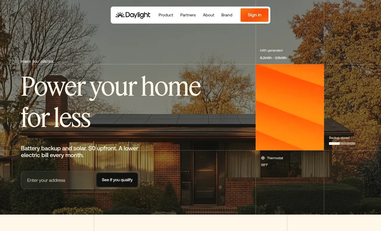 Photographic power-home hero
godaylight.com · Hero
Photographic power-home hero
godaylight.com · Hero
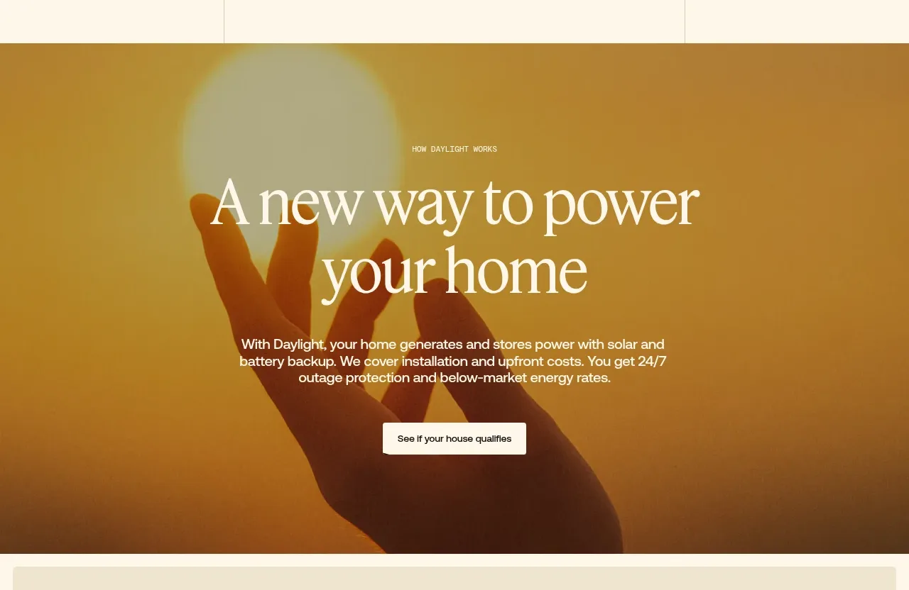 Warm mission statement panel
godaylight.com · Hero
Warm mission statement panel
godaylight.com · Hero
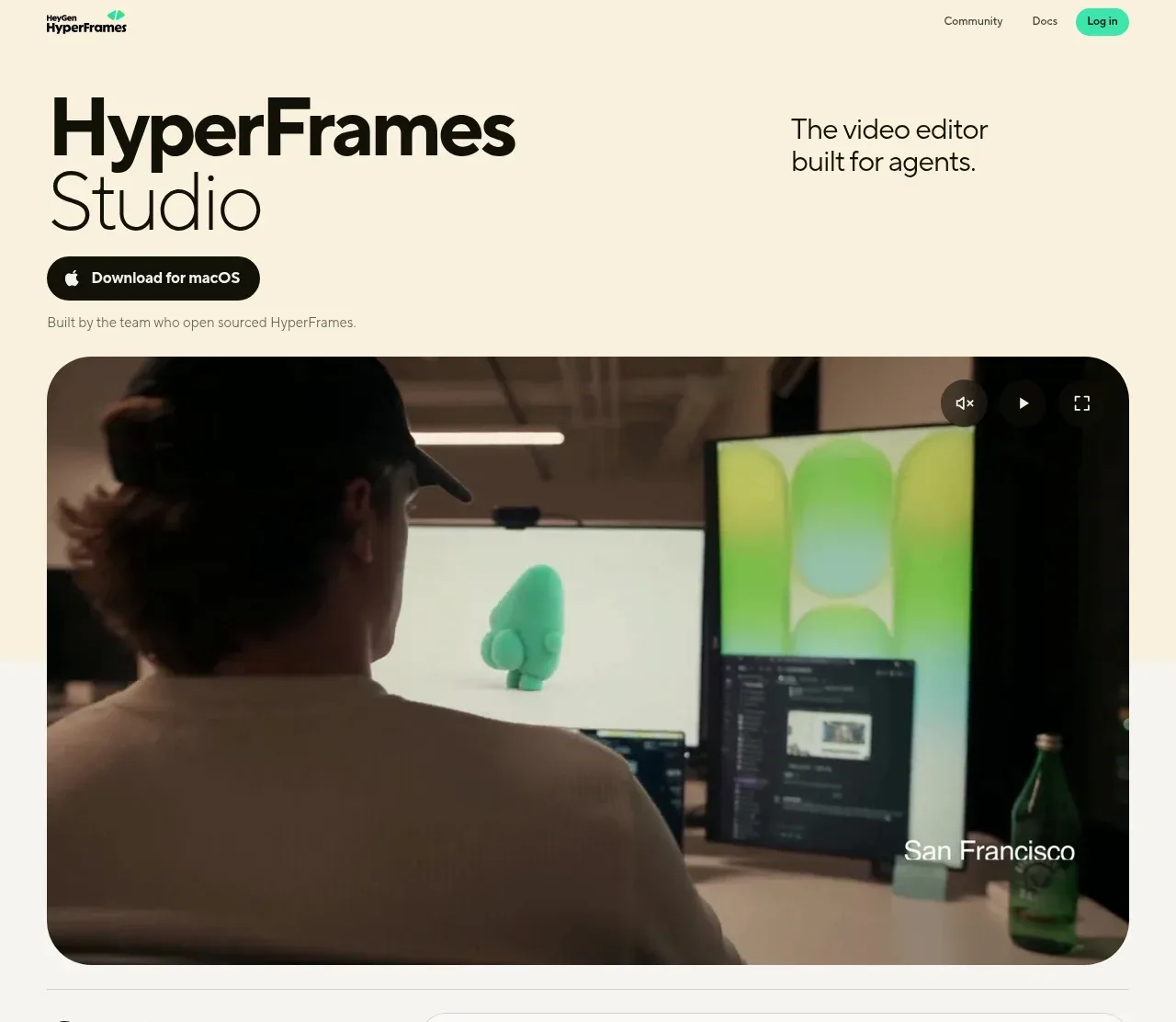
 Product hero with download action and video
HyperFrames Studio (Desktop) · Hero
Product hero with download action and video
HyperFrames Studio (Desktop) · Hero