 kage
kage
splitformac.com
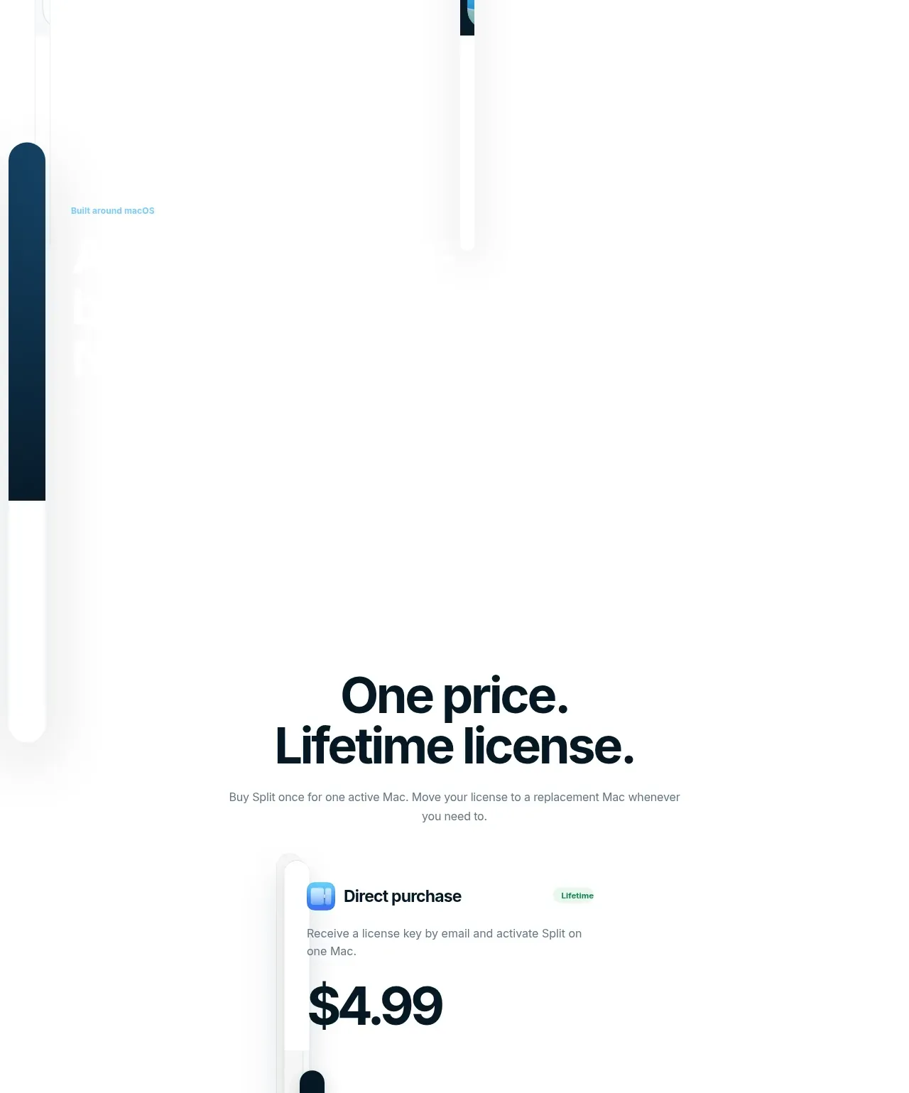
Design analysis
A centered pricing section makes the commercial model explicit with one prominent lifetime offer, benefit list, and low-friction purchase framing.
Prompt preview
## Reference images

Study these alongside the description below: hierarchy, rhythm, spacing, colour. Build for the product you are asked about, using this design language.

- Component: https://kage-design-assets.t3.tigrisfiles.io/components/split/8556c614-105f-4777-9be3-693330882192-1790402628-5.webp
- Full page it was cut from: https://kage-design-assets.t3.tigrisfiles.io/screenshots/split/8556c614-105f-4777-9be3-693330882192-1790402544582-full.webp
- Component on Kage: https://kage.design/component/split-pricing-table

## Before you start
Ask what the user's product is, who it is for, and what their brand style should feel like. Apply the principles below to that product rather than copying this reference.

Build a single-offer pricing section centered on the page. Start with a bold two-line heading and a brief explanation of the billing model. Use one elevated pricing card approximately 500–560px wide with a white surface, 1px #e5ecef border, 20–28px radius, and soft shadow. Include an offer label, a clear large price, a short description, a prominent dark CTA, and a vertical checklist of concrete benefits with subtle check icons. Add reassurance text below for checkout, support, or licensing. Use near-black #07151d, muted gray #69747c, pale green status accents #d8f3e5, and blue/cyan interaction accents. Make the card responsive and keep the CTA visible without scrolling on mobile where possible.

Never use the reference's logos, product names, copy, illustrations, imagery, or exact visual assets.
More components
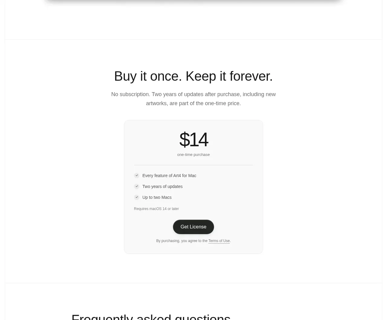
 Single purchase pricing card
Art4 · Pricing table
Single purchase pricing card
Art4 · Pricing table
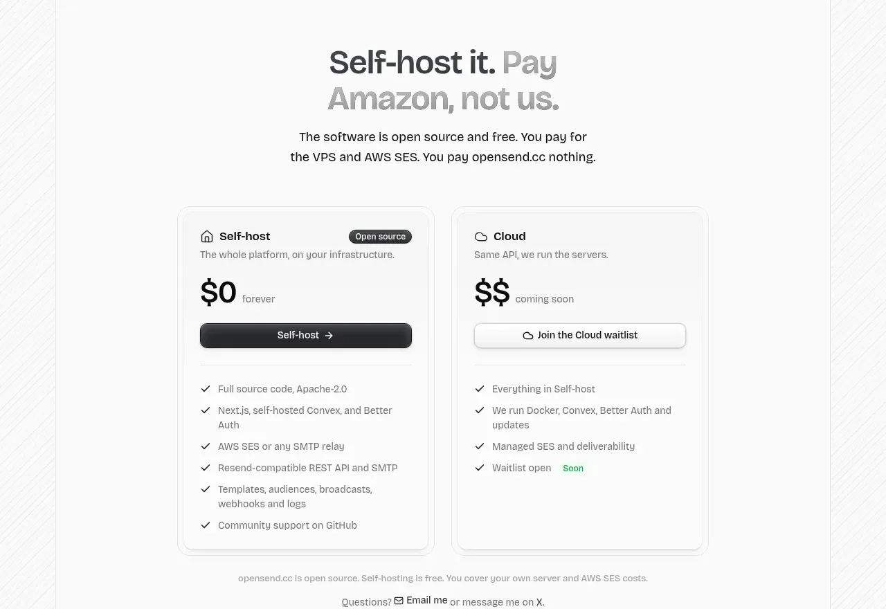
 Self-host versus cloud pricing
opensend.cc · Pricing table
Self-host versus cloud pricing
opensend.cc · Pricing table
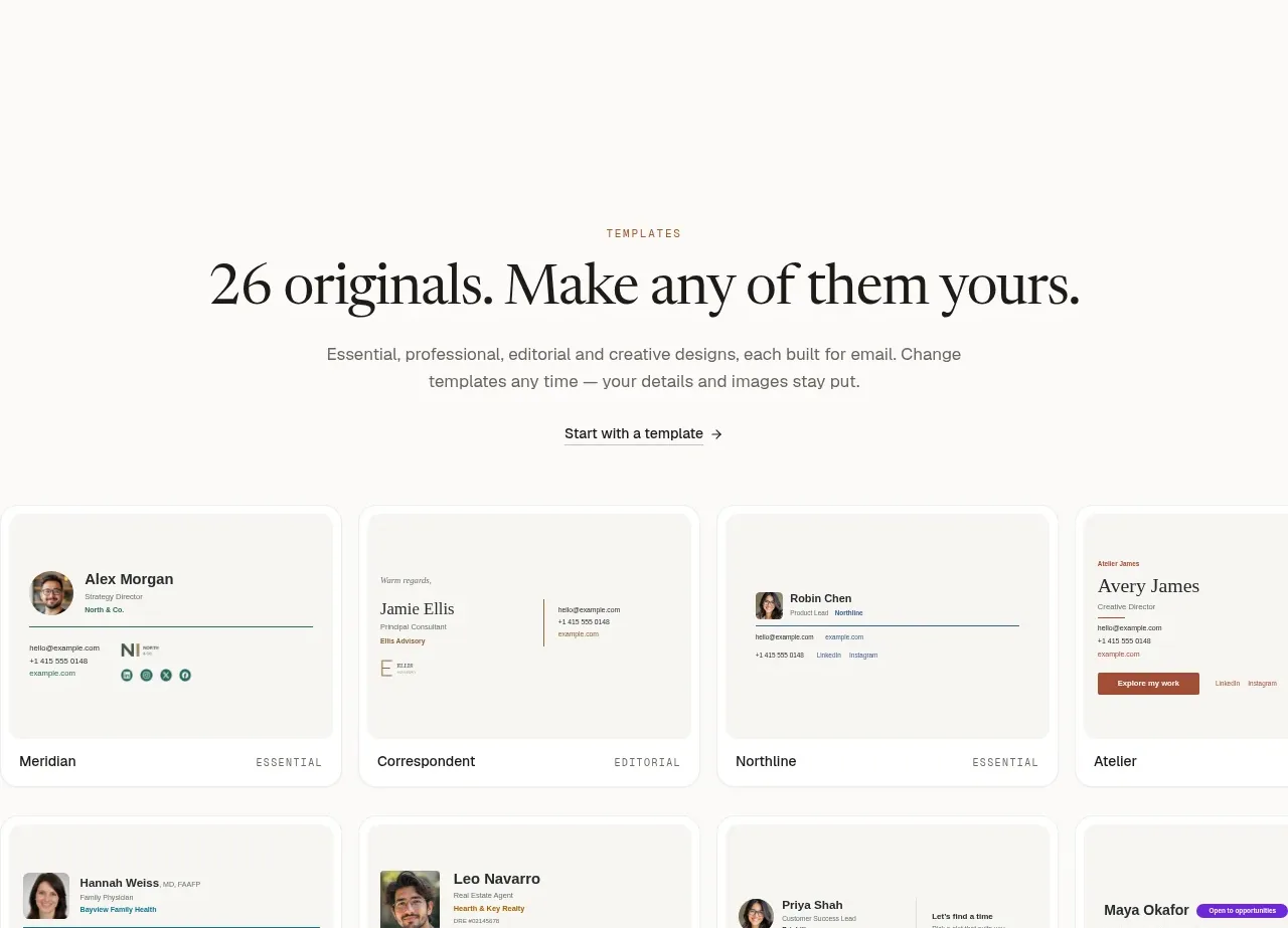
 Two-tier pricing table
esigna · Pricing table
Two-tier pricing table
esigna · Pricing table
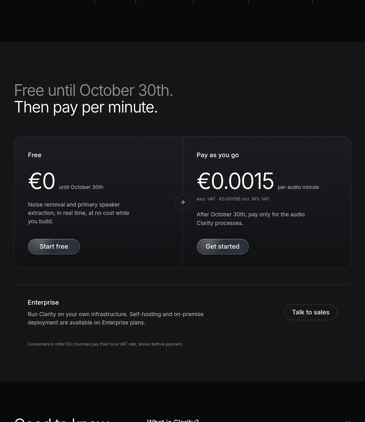
 Usage-based pricing
Clarity · Pricing table
Usage-based pricing
Clarity · Pricing table
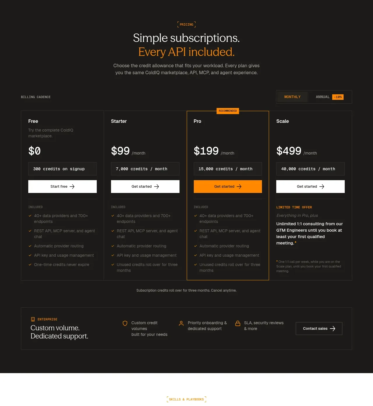
 Four-tier subscription pricing
ColdIQ x Slack · Pricing table
Four-tier subscription pricing
ColdIQ x Slack · Pricing table
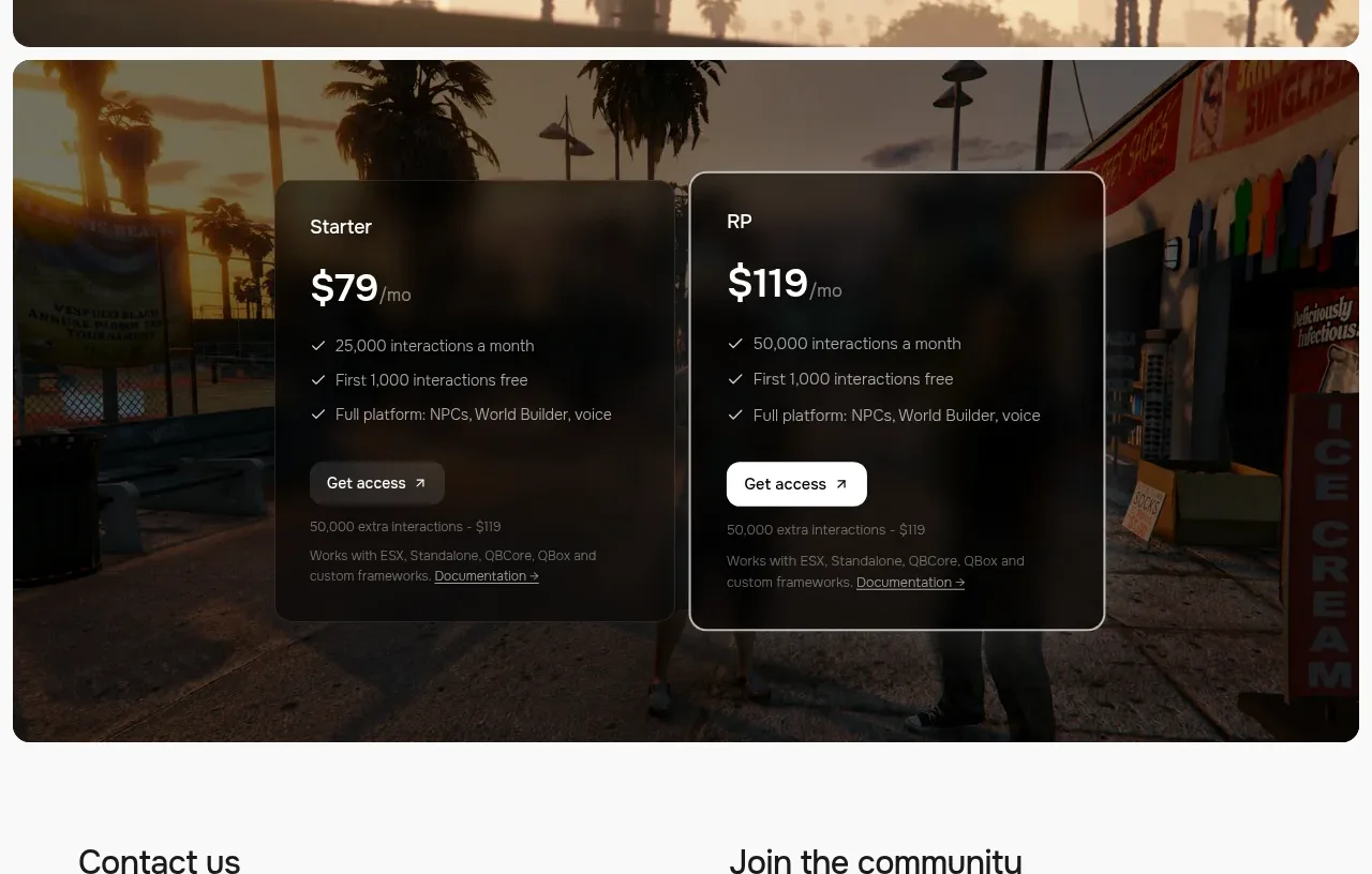
 Two-plan access pricing
Humalike x GTA RP · Pricing table
Two-plan access pricing
Humalike x GTA RP · Pricing table