 kage
kage
storyshort.ai

Design analysis
A contained textured CTA card restates the simplest starting point, uses a large two-line headline, short reassurance copy, and one centered action before the footer.
Prompt preview
## Reference images

Study these alongside the description below: hierarchy, rhythm, spacing, colour. Build for the product you are asked about, using this design language.

- Component: https://kage-design-assets.t3.tigrisfiles.io/components/storyshort-ai/c734da75-ded5-4c81-9b78-0aa9ae185a47-1791551955-9.webp
- Full page it was cut from: https://kage-design-assets.t3.tigrisfiles.io/screenshots/storyshort-ai/c734da75-ded5-4c81-9b78-0aa9ae185a47-1791551915904-full.webp
- Component on Kage: https://kage.design/component/storyshort-cta

## Before you start
Ask what lowest-friction action should begin the user's journey and what reassurance removes hesitation. Tailor the CTA to the product's actual signup or trial flow.

Create a centered conversion banner inside a wide but not full-width card. Use a subtle dark texture or radial gradient over #171717, a 16–20px radius, faint border, and generous 56–72px vertical padding. Place a bold 32–42px two-line headline in the center, a short 13–15px supporting sentence below, and one compact primary button. Keep the CTA visually isolated from the footer with surrounding black space. Use the established accent color sparingly and make the button clearly actionable with hover, focus, and pressed states.

Never: use the reference's logo, product name, copy, illustrations, imagery, or exact CTA wording.
More components
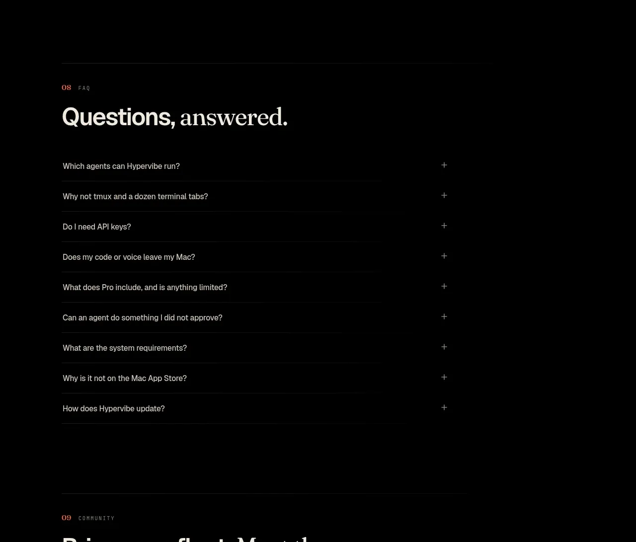
 Community invitation
Hypervibe · Call to action
Community invitation
Hypervibe · Call to action
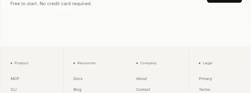
 Trust and final conversion
Lune · Call to action
Trust and final conversion
Lune · Call to action
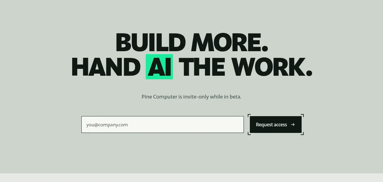
 Request-access conversion block
Pine Computer · Call to action
Request-access conversion block
Pine Computer · Call to action
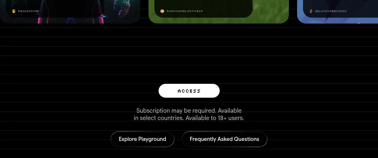
 Access conversion block
Playground by Google Labs · Call to action
Access conversion block
Playground by Google Labs · Call to action
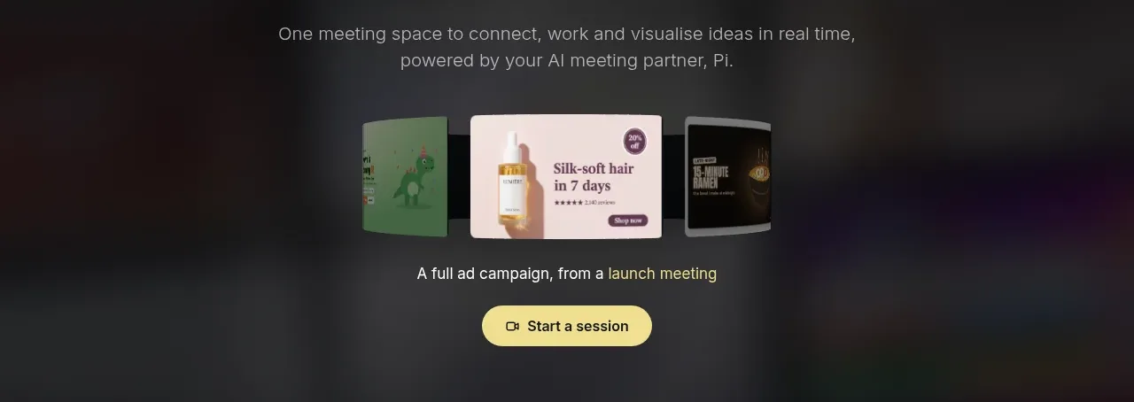
 Closing product call to action
HeyPi · Call to action
Closing product call to action
HeyPi · Call to action
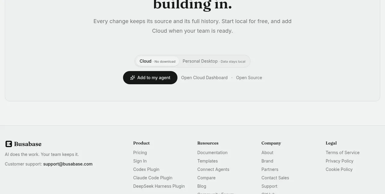
 Final conversion call to action
Busabase · Call to action
Final conversion call to action
Busabase · Call to action