 kage
kage
storyshort.ai

Design analysis
A compact black navigation bar keeps the brand at left, provides a small set of utility links, and makes the primary start action visible at the far right.
Prompt preview
## Reference images

Study these alongside the description below: hierarchy, rhythm, spacing, colour. Build for the product you are asked about, using this design language.

- Component: https://kage-design-assets.t3.tigrisfiles.io/components/storyshort-ai/c734da75-ded5-4c81-9b78-0aa9ae185a47-1791551950-0.webp
- Full page it was cut from: https://kage-design-assets.t3.tigrisfiles.io/screenshots/storyshort-ai/c734da75-ded5-4c81-9b78-0aa9ae185a47-1791551915904-full.webp
- Component on Kage: https://kage.design/component/storyshort-navigation

## Before you start
Ask what the user's product is, who it serves, and what its brand personality and primary conversion goal are. Apply the principles below to that product rather than copying this reference.

Build a compact, dark-mode product navigation bar. Use a full-width near-black background (#050505), a constrained content row with generous horizontal padding, and a small brand lockup on the left. Keep primary links sparse and low-contrast white/gray (#f5f5f5 / #a5a5a5), with one subtle announcement badge if useful. Place utility/login actions toward the right and make the main CTA a small rounded dark-gray pill with a thin border. Use a clean sans-serif, 12–14px navigation type, 20–24px vertical height, and 8–999px radius depending on control. Maintain strong alignment and enough contrast for accessibility. On mobile, collapse secondary links into a menu while preserving the CTA.

Never: use the reference's logo, product name, copy, illustrations, imagery, or exact navigation labels.
More components

 Minimal top navigation
Agibot · Navigation
Minimal top navigation
Agibot · Navigation

 Top navigation
Hypervibe · Navigation
Top navigation
Hypervibe · Navigation
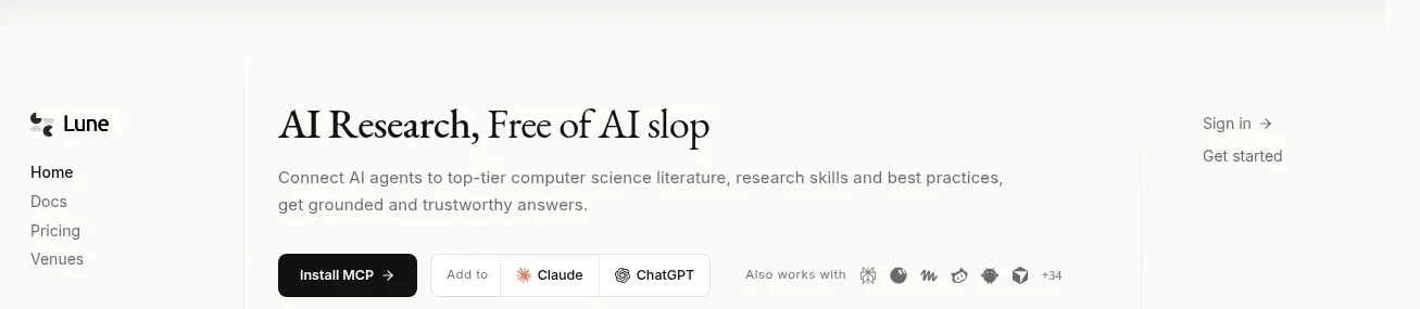
 Editorial research product navigation
Lune · Navigation
Editorial research product navigation
Lune · Navigation

 Minimal product navigation
Pine Computer · Navigation
Minimal product navigation
Pine Computer · Navigation

 Top experiment navigation
Playground by Google Labs · Navigation
Top experiment navigation
Playground by Google Labs · Navigation
 Sticky section navigation
Playground by Google Labs · Navigation
Sticky section navigation
Playground by Google Labs · Navigation