kage
kage
subscrr.app
Design analysis
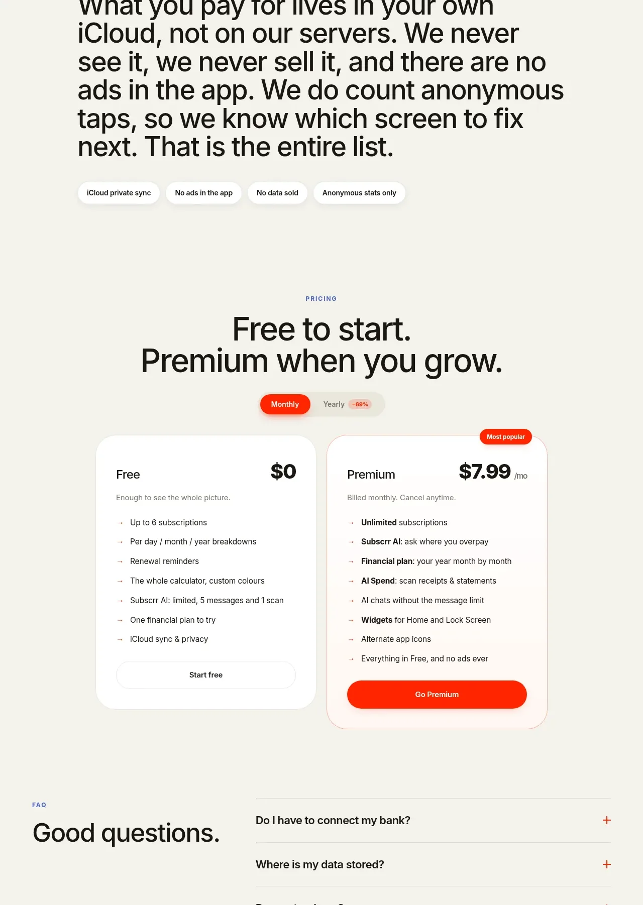
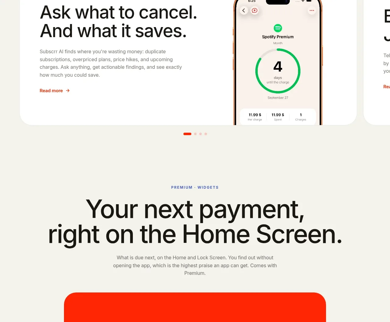
A horizontal carousel of large white feature cards previews advanced capabilities, with one dominant card and the next card partially visible to imply more content.
Prompt preview
## Reference images

Study these alongside the description below: hierarchy, rhythm, spacing, colour. Build for the product you are asked about, using this design language.

- Component: https://kage-design-assets.t3.tigrisfiles.io/components/subscrr/31e8b1bf-7154-4569-a65b-7b8da9be3511-1790316325-5.webp
- Full page it was cut from: https://kage-design-assets.t3.tigrisfiles.io/screenshots/subscrr/31e8b1bf-7154-4569-a65b-7b8da9be3511-1790316149312-full.webp
- Component on Kage: https://kage.design/component/subscrr-card

## Before you start
Ask what advanced capabilities the user's product offers and whether users should browse them as cards, tabs, or a carousel. Apply the same visual principles to the chosen interaction.

Build a horizontally scrollable feature-card rail. Each card should be a large white rounded rectangle on the ivory page, with a small eyebrow, a strong two-line heading, concise supporting copy, an optional text link, and a product screenshot or visual anchored to one side. Show the next card peeking into view on desktop to signal horizontal navigation; include dots or arrow controls only if needed. Use 28px radius, subtle `#e5e5df` border, 32–40px internal padding, 34–48px headings, and coral links. Ensure keyboard and touch scrolling work, with snap points and accessible labels.

Never: use logos, product names, copy, illustrations, or imagery from the reference.