kage
kage
subscrr.app
Design analysis
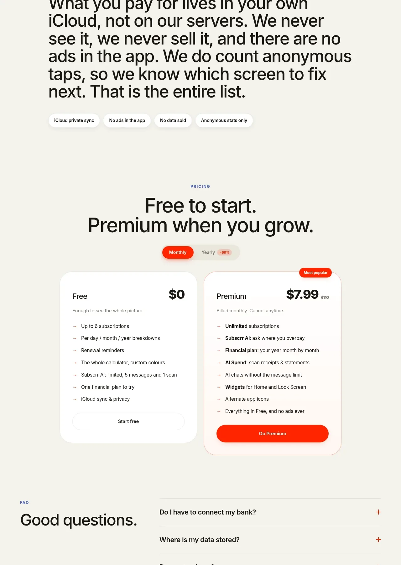
Large editorial copy first states the product philosophy, then follows with a privacy explanation and compact trust badges, creating a clear bridge into pricing.
Prompt preview
## Reference images

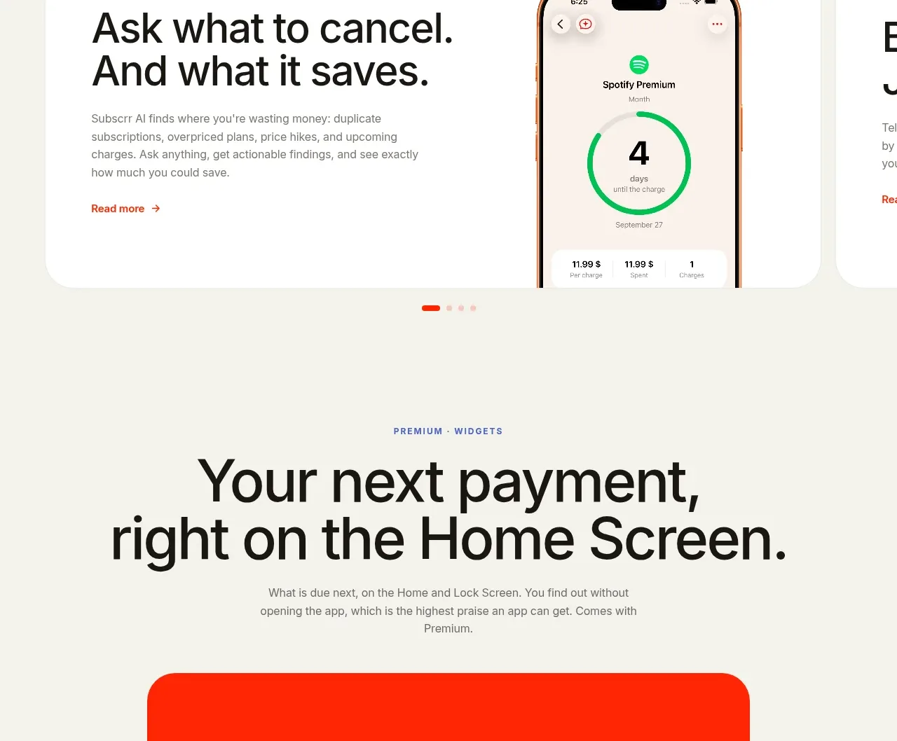
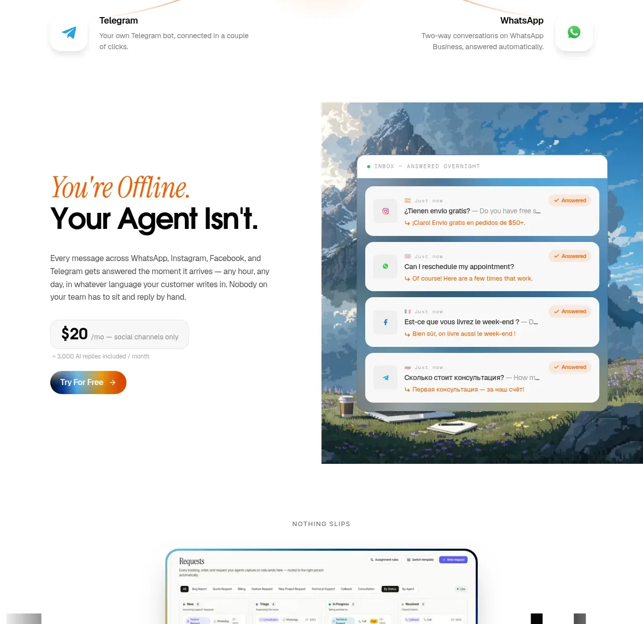
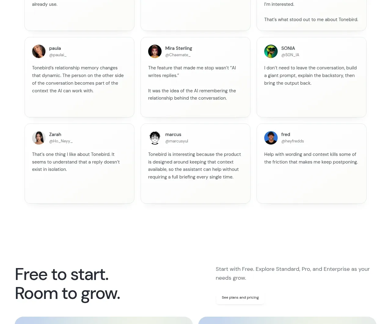
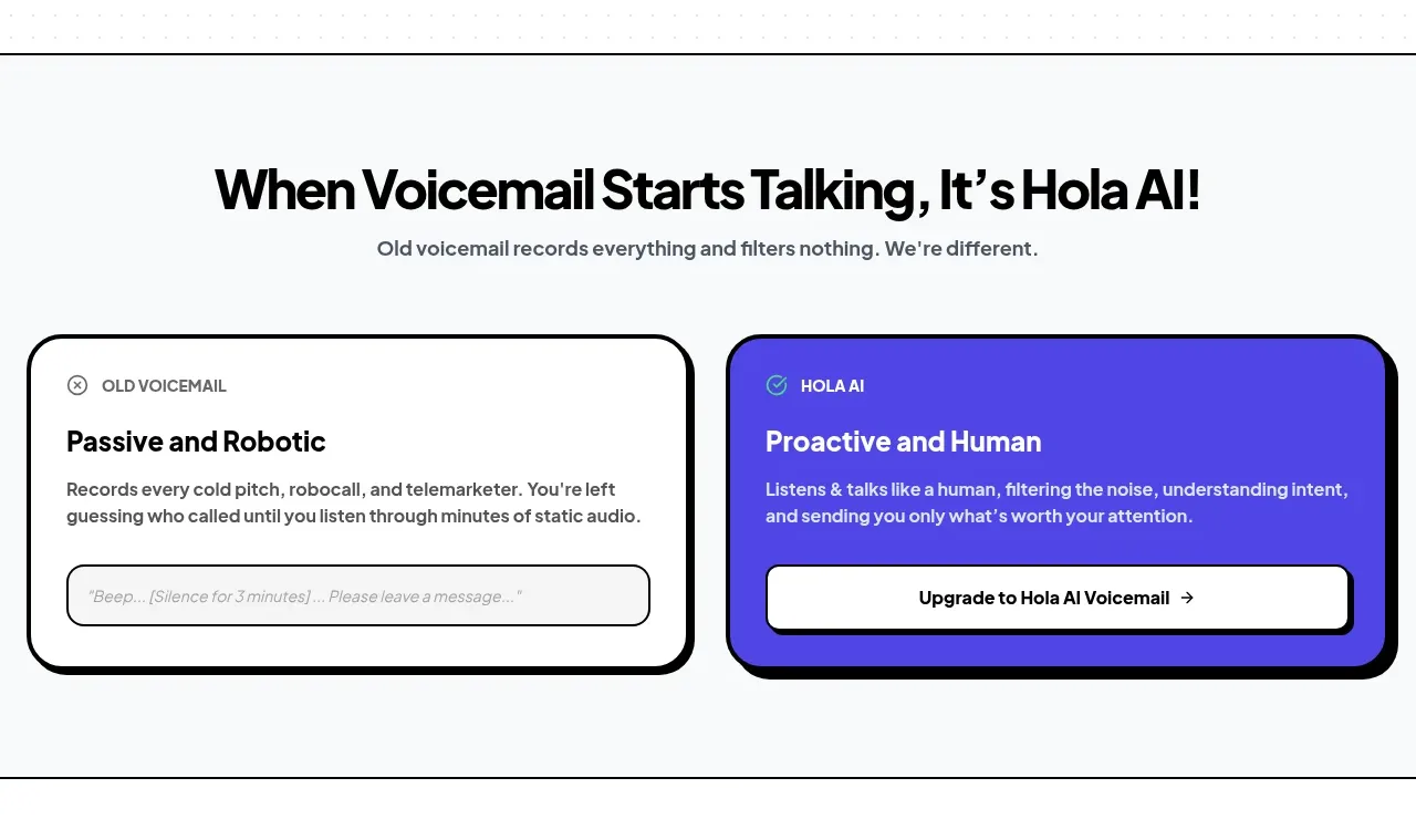
Study these alongside the description below: hierarchy, rhythm, spacing, colour. Build for the product you are asked about, using this design language.

- Component: https://kage-design-assets.t3.tigrisfiles.io/components/subscrr/31e8b1bf-7154-4569-a65b-7b8da9be3511-1790316326-8.webp
- Full page it was cut from: https://kage-design-assets.t3.tigrisfiles.io/screenshots/subscrr/31e8b1bf-7154-4569-a65b-7b8da9be3511-1790316149312-full.webp
- Component on Kage: https://kage.design/component/subscrr-card-2

## Before you start
Ask what trust promise the user's product can honestly make, where data lives, and which concise proof points support it. Do not invent privacy claims.

Create an editorial trust section on an ivory background. Start with a wide, bold statement using selective coral emphasis, then follow with a narrower privacy subheading and large supporting paragraph. Finish with a row of small white pill badges for verified principles. Use a strong 28–38px editorial statement, 30–40px privacy heading, 20–30px body copy, and ample vertical spacing. Align the statement to a consistent content grid; keep badges compact with 11–12px text, 999px radius, faint border, and white fill. The visual language should feel direct and transparent, not like a dense legal page.

Never: use logos, product names, copy, illustrations, or imagery from the reference.