 kage
kage
subscrr.app

Design analysis
Two explanatory product sections turn the core promise into concrete benefits: seeing total spend and translating annual plans into daily cost, with alternating image/text layouts.
Prompt preview
## Reference images

Study these alongside the description below: hierarchy, rhythm, spacing, colour. Build for the product you are asked about, using this design language.

- Component: https://kage-design-assets.t3.tigrisfiles.io/components/subscrr/31e8b1bf-7154-4569-a65b-7b8da9be3511-1790316324-3.webp
- Full page it was cut from: https://kage-design-assets.t3.tigrisfiles.io/screenshots/subscrr/31e8b1bf-7154-4569-a65b-7b8da9be3511-1790316149312-full.webp
- Component on Kage: https://kage.design/component/subscrr-feature-grid

## Before you start
Ask what the user's product's primary insight is and what supporting features prove it. Then create an adaptable pair of feature bands for that product.

Build two vertically stacked feature rows on a warm ivory page. The first begins with a small uppercase eyebrow, a large left-aligned heading, and a media-plus-copy row beneath or beside it. The second sits in a white rounded card with an inverse text/media arrangement. Use a 12-column grid, roughly 48–64px gutters, and alternate visual placement to create rhythm. Headlines should be 38–52px, body copy 13–15px, and eyebrow labels 9–11px with tracked uppercase lettering in a muted blue-gray. Use soft white cards, 24–28px radii, subtle borders, and one coral accent for the key phrase or metric. Supporting bullets should have small circular check indicators. Images or product previews should be rounded and cropped consistently.

Never: use logos, product names, copy, illustrations, or imagery from the reference.
More components

 Reminders and simple setup flow
Subscrr · Feature grid
Reminders and simple setup flow
Subscrr · Feature grid

 Security and permissions cards
NotchPop · Feature grid
Security and permissions cards
NotchPop · Feature grid
 Interactive product demonstration
NotchPop · Feature grid
Interactive product demonstration
NotchPop · Feature grid
 Focused feature cards
NotchPop · Feature grid
Focused feature cards
NotchPop · Feature grid
 Quiet information cards
NotchPop · Feature grid
Quiet information cards
NotchPop · Feature grid
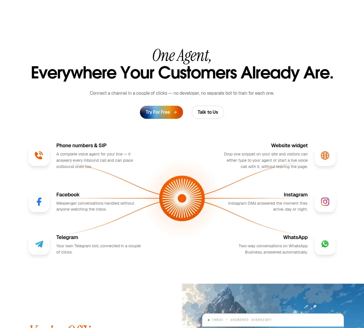
 Omnichannel connection map
IntellAgents.io · Feature grid
Omnichannel connection map
IntellAgents.io · Feature grid