 kage
kage
subscrr.app

Design analysis
A centered reminder message transitions into a practical import workflow, combining emotional reassurance with three compact numbered setup actions and a large phone image.
Prompt preview
## Reference images

Study these alongside the description below: hierarchy, rhythm, spacing, colour. Build for the product you are asked about, using this design language.

- Component: https://kage-design-assets.t3.tigrisfiles.io/components/subscrr/31e8b1bf-7154-4569-a65b-7b8da9be3511-1790316325-4.webp
- Full page it was cut from: https://kage-design-assets.t3.tigrisfiles.io/screenshots/subscrr/31e8b1bf-7154-4569-a65b-7b8da9be3511-1790316149312-full.webp
- Component on Kage: https://kage.design/component/subscrr-feature-grid-2

## Before you start
Ask what recurring problem your product prevents and what the shortest setup journey is. Use those answers to tailor the message and steps.

Create a section with a centered, high-impact statement at the top, a brief supporting sentence, and a wide rounded media panel that visually communicates the benefit. Follow it with a two-column setup row: explanatory copy and three small numbered action chips on the left, and a tall product image on the right. Maintain generous vertical spacing, warm ivory background, large black type, and coral-red highlights. Use small uppercase blue-gray eyebrows, 42–56px display headings, 13–15px body text, white pill chips with faint borders, and coral circular step numbers. Media should use 24–30px radii and sit flush within a balanced grid.

Never: use logos, product names, copy, illustrations, or imagery from the reference.
More components

 Spend visibility and daily-cost breakdown
Subscrr · Feature grid
Spend visibility and daily-cost breakdown
Subscrr · Feature grid

 Security and permissions cards
NotchPop · Feature grid
Security and permissions cards
NotchPop · Feature grid
 Interactive product demonstration
NotchPop · Feature grid
Interactive product demonstration
NotchPop · Feature grid
 Focused feature cards
NotchPop · Feature grid
Focused feature cards
NotchPop · Feature grid
 Quiet information cards
NotchPop · Feature grid
Quiet information cards
NotchPop · Feature grid
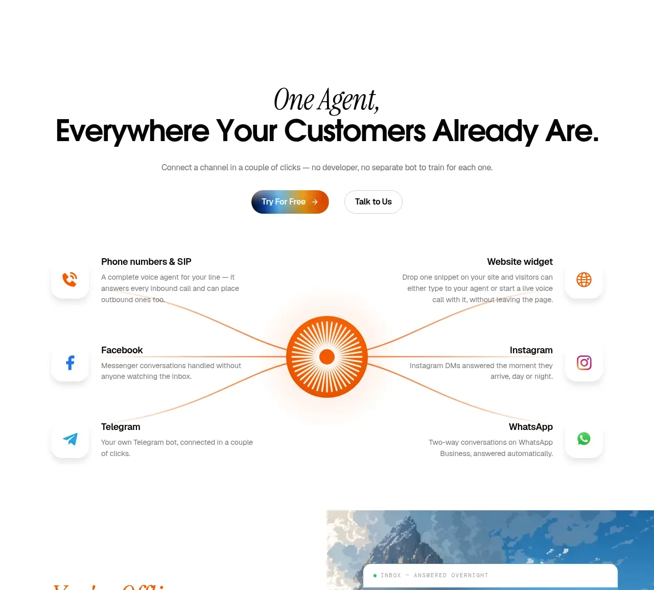
 Omnichannel connection map
IntellAgents.io · Feature grid
Omnichannel connection map
IntellAgents.io · Feature grid