kage
kage
subscrr.app
Design analysis
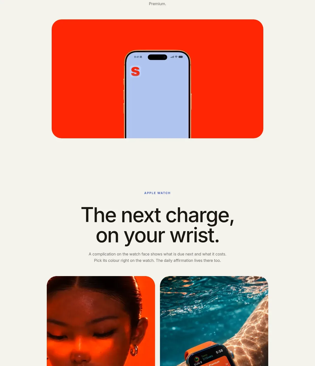
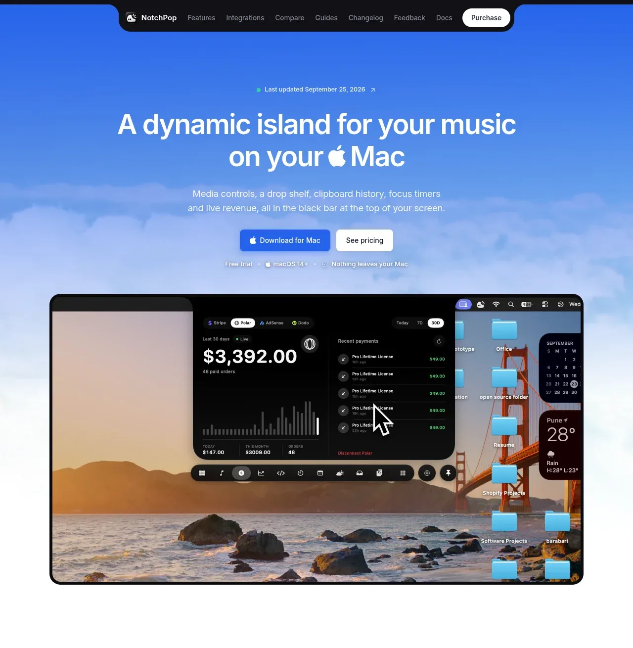
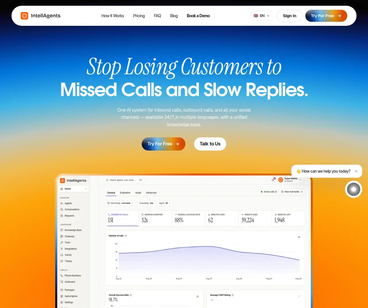
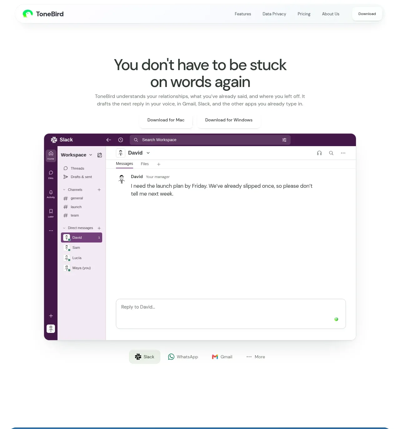
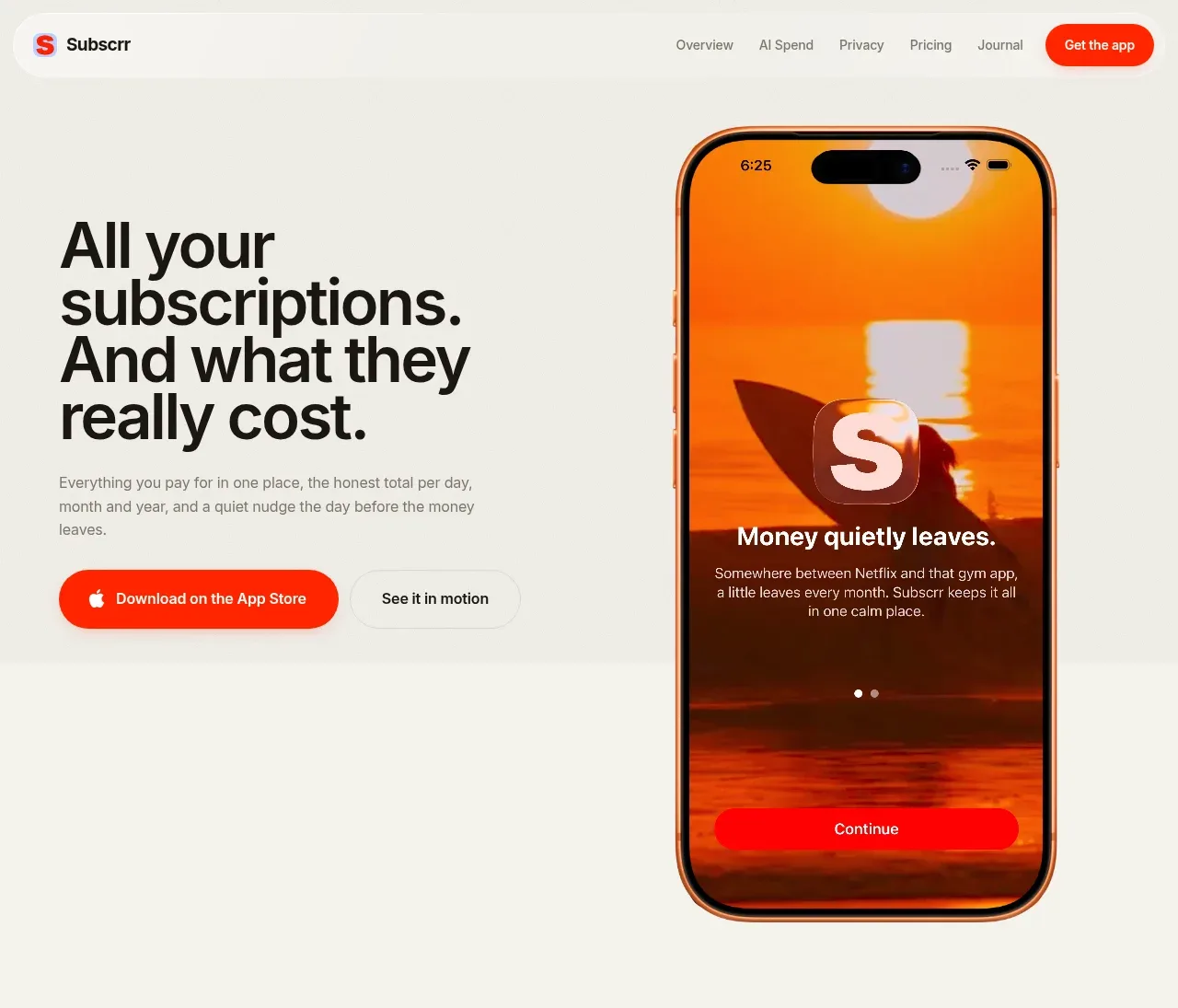
The hero uses an oversized statement on the left, two actions below it, and a tall app mockup on the right against a quiet cream canvas.
Prompt preview
## Reference images

Study these alongside the description below: hierarchy, rhythm, spacing, colour. Build for the product you are asked about, using this design language.

- Component: https://kage-design-assets.t3.tigrisfiles.io/components/subscrr/31e8b1bf-7154-4569-a65b-7b8da9be3511-1790316323-1.webp
- Full page it was cut from: https://kage-design-assets.t3.tigrisfiles.io/screenshots/subscrr/31e8b1bf-7154-4569-a65b-7b8da9be3511-1790316149312-full.webp
- Component on Kage: https://kage.design/component/subscrr-hero

## Before you start
Ask what the user's product does, what outcome matters most, and which brand colours and type style they want. Apply the following structure to that product.

Build a two-column hero directly beneath the navigation. Put a bold, multi-line headline and concise explanatory paragraph in the left column, followed by a filled primary download/action button and a quiet secondary motion/demo button. Place a tall mobile product preview or other product visual in the right column, allowing it to extend vertically within the hero while remaining contained. Use a warm ivory background around `#f4f4ed`, near-black text `#111111`, and vivid coral-red primary accents around `#ff3218`. Make the headline 44–58px with tight line-height and slight negative tracking; body copy should be 13–15px with relaxed line-height and muted gray. Use 999px buttons, subtle light borders on secondary controls, and 64–96px side padding. On mobile, stack copy above the visual and center or left-align consistently.

Never: use logos, product names, copy, illustrations, or imagery from the reference.