kage
kage
subscrr.app
Design analysis
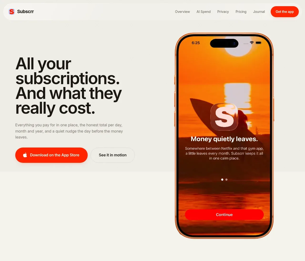
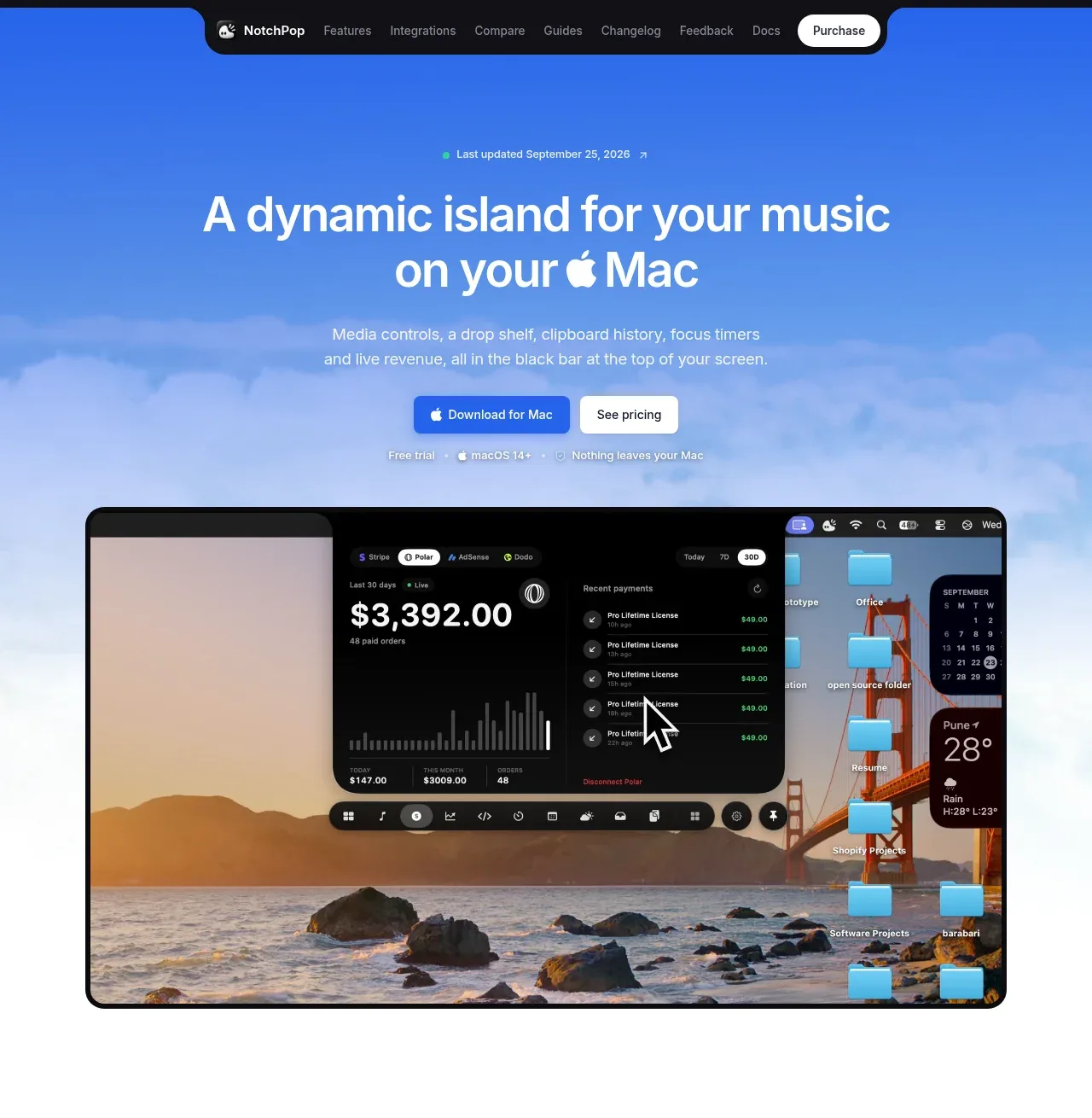
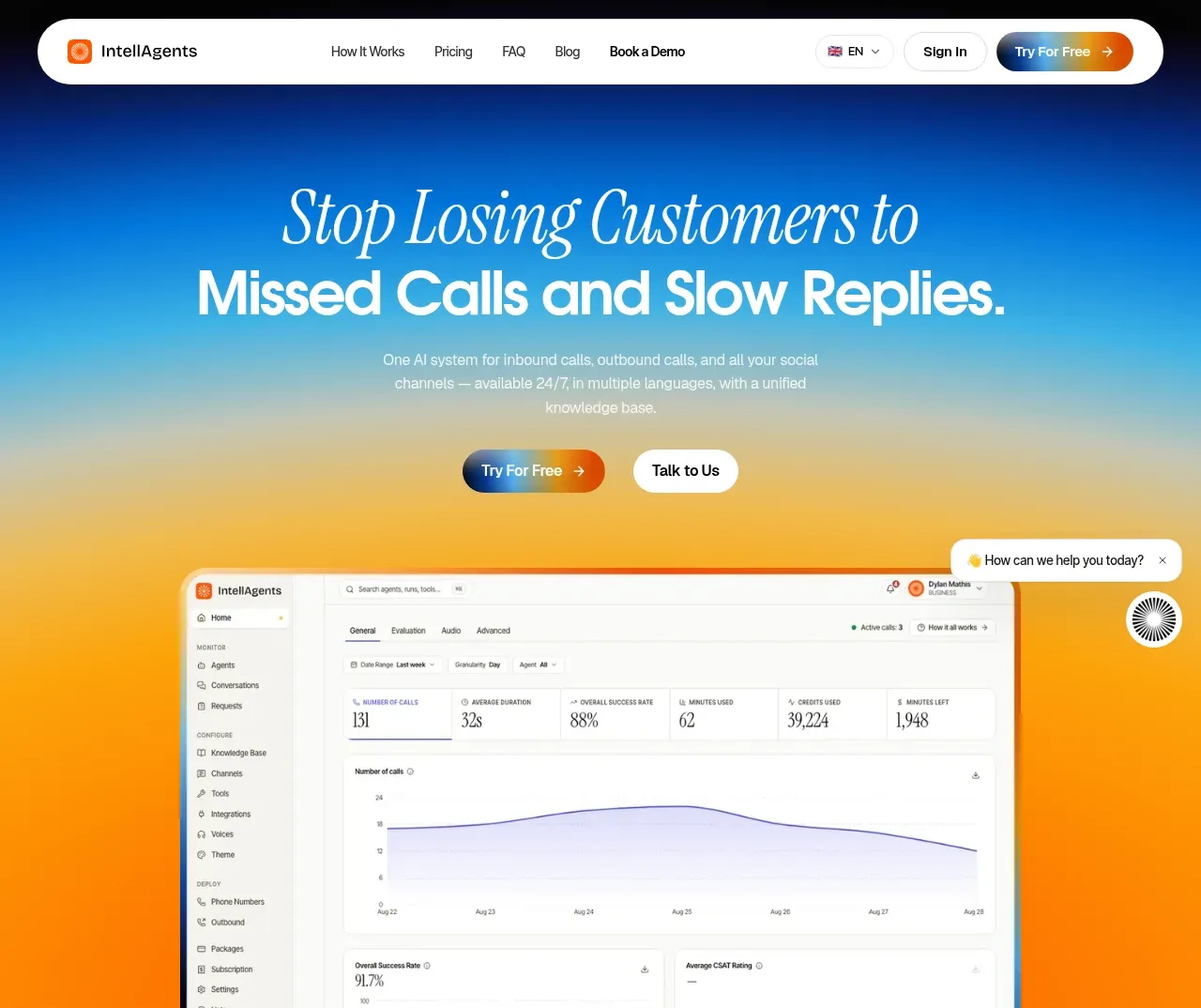
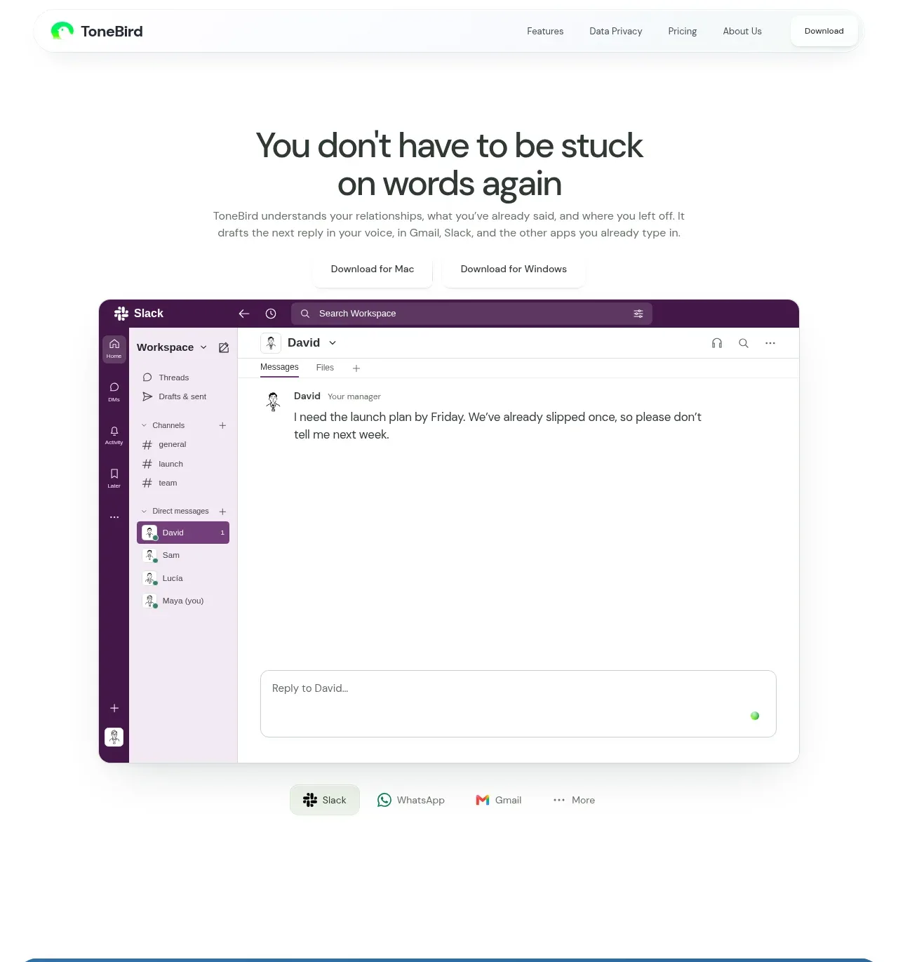
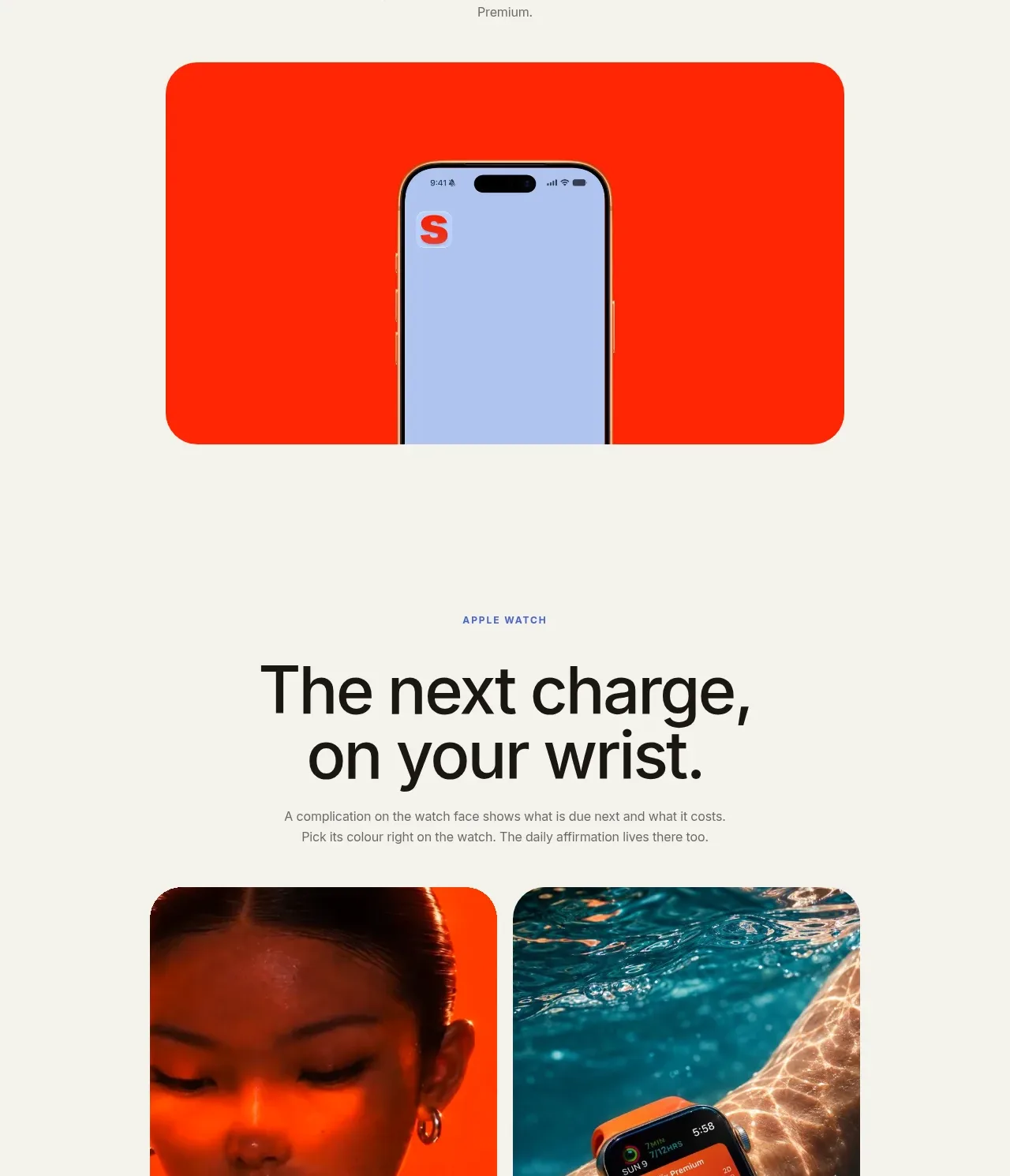
A centered promotional section explains the glanceable widget benefit and places a large, high-contrast product visual beneath the headline.
Prompt preview
## Reference images

Study these alongside the description below: hierarchy, rhythm, spacing, colour. Build for the product you are asked about, using this design language.

- Component: https://kage-design-assets.t3.tigrisfiles.io/components/subscrr/31e8b1bf-7154-4569-a65b-7b8da9be3511-1790316325-6.webp
- Full page it was cut from: https://kage-design-assets.t3.tigrisfiles.io/screenshots/subscrr/31e8b1bf-7154-4569-a65b-7b8da9be3511-1790316149312-full.webp
- Component on Kage: https://kage.design/component/subscrr-hero-2

## Before you start
Ask which glanceable or ambient feature the user's product has and what action it should encourage. Design the section around that benefit.

Create a centered feature-promotion band with a small uppercase eyebrow, a two-line headline, a short paragraph, and one large rounded visual block below. Use a calm ivory background and a saturated accent media surface, approximately `#ff2e14`, with a device preview emerging from or sitting inside it. Keep the content column narrow for a strong editorial silhouette. Use 48–60px headline type with tight line-height, 13–15px muted body copy, 80–112px spacing between text and media, and 28–32px media radius. The visual should feel like a product demo rather than decoration.

Never: use logos, product names, copy, illustrations, or imagery from the reference.