 kage
kage
subscrr.app
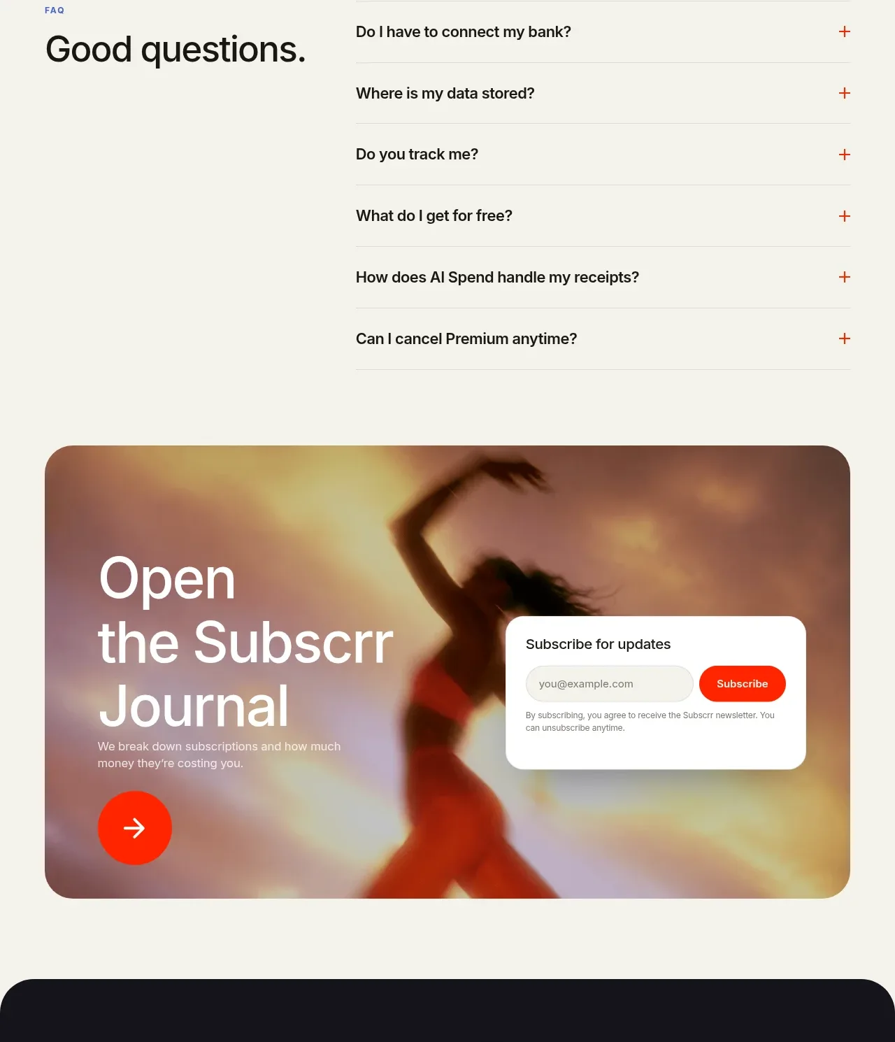
Design analysis
A clear pricing heading and billing toggle lead into two contrasting plan cards, with the premium plan visually emphasized through coral treatment and a recommendation badge.
Prompt preview
## Reference images

Study these alongside the description below: hierarchy, rhythm, spacing, colour. Build for the product you are asked about, using this design language.

- Component: https://kage-design-assets.t3.tigrisfiles.io/components/subscrr/31e8b1bf-7154-4569-a65b-7b8da9be3511-1790316327-9.webp
- Full page it was cut from: https://kage-design-assets.t3.tigrisfiles.io/screenshots/subscrr/31e8b1bf-7154-4569-a65b-7b8da9be3511-1790316149312-full.webp
- Component on Kage: https://kage.design/component/subscrr-pricing-table

## Before you start
Ask what plans, limits, billing cadence, and conversion goal the user's product has. Build a truthful comparison for those plans.

Create a pricing section with a centered eyebrow and headline, followed by a monthly/yearly segmented toggle and two side-by-side plan cards. Give the free plan a white neutral card and the recommended plan a slightly warmer border, coral CTA, and small recommendation badge. Include price, billing note, concise feature bullets, and a full-width action button in each card. Use 24–28px card radii, 1px `#deded7` borders, 32–40px padding, 30–36px prices, 13–15px body text, and coral `#ff3218` for active controls. Make the toggle keyboard accessible and ensure cards stack cleanly on mobile.

Never: use logos, product names, copy, illustrations, or imagery from the reference.
More components
 One-time purchase pricing
NotchPop · Pricing table
One-time purchase pricing
NotchPop · Pricing table
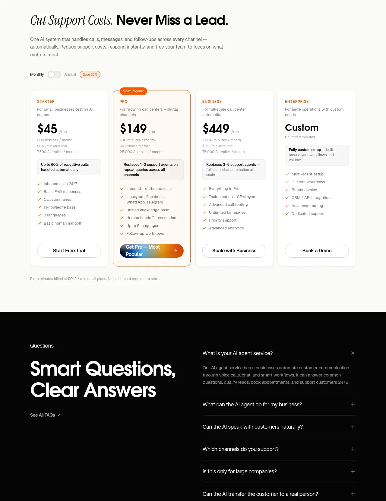
 Support plan pricing
IntellAgents.io · Pricing table
Support plan pricing
IntellAgents.io · Pricing table
 Four-tier pricing table
ToneBird · Pricing table
Four-tier pricing table
ToneBird · Pricing table
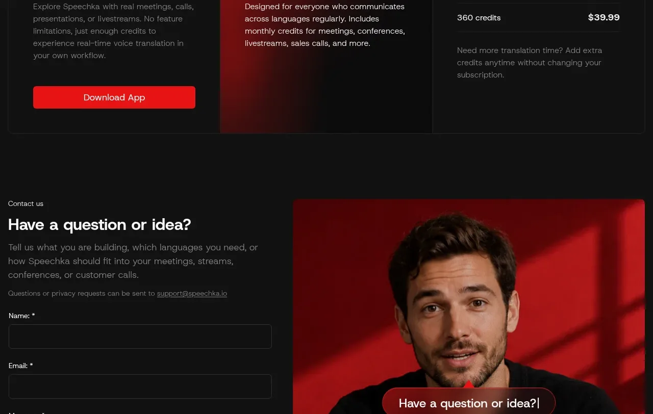
 Trial and subscription plans
Speechka · Pricing table
Trial and subscription plans
Speechka · Pricing table
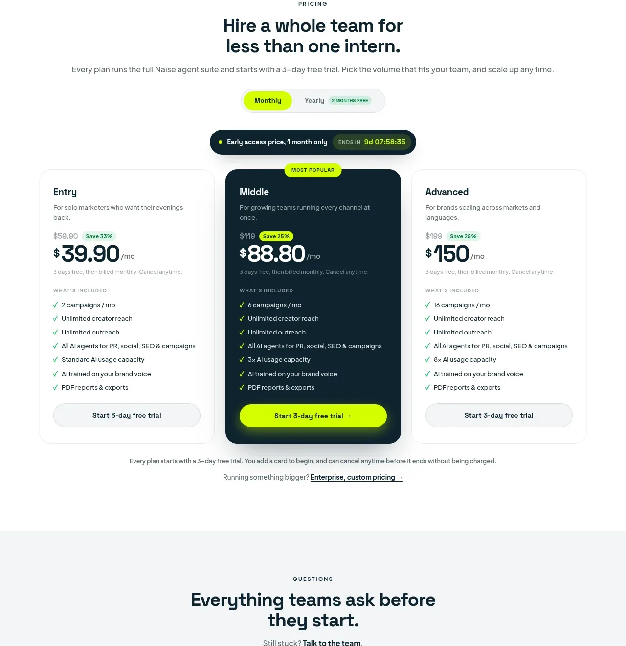
 Three-tier pricing plans
Naise AI · Pricing table
Three-tier pricing plans
Naise AI · Pricing table
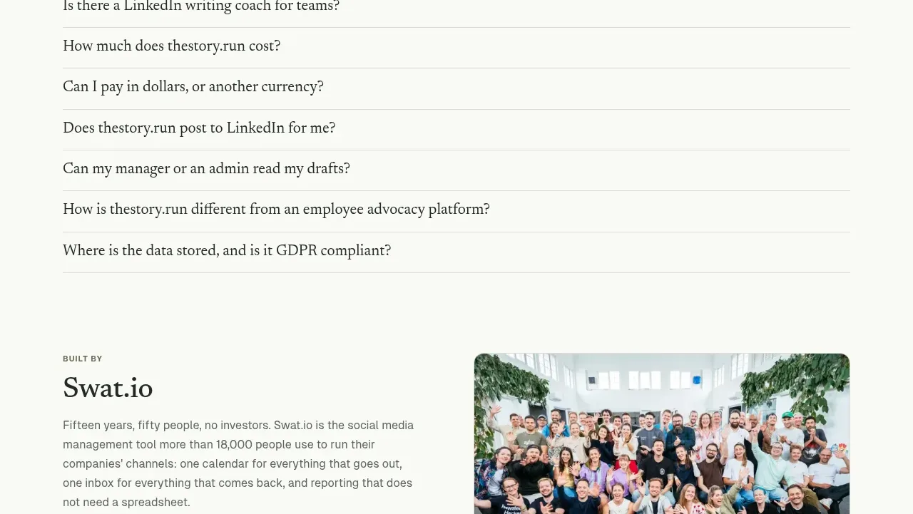
 Simple usage-based pricing
thestory.run · Pricing table
Simple usage-based pricing
thestory.run · Pricing table