 kage
kage
takweemai.com
Design analysis
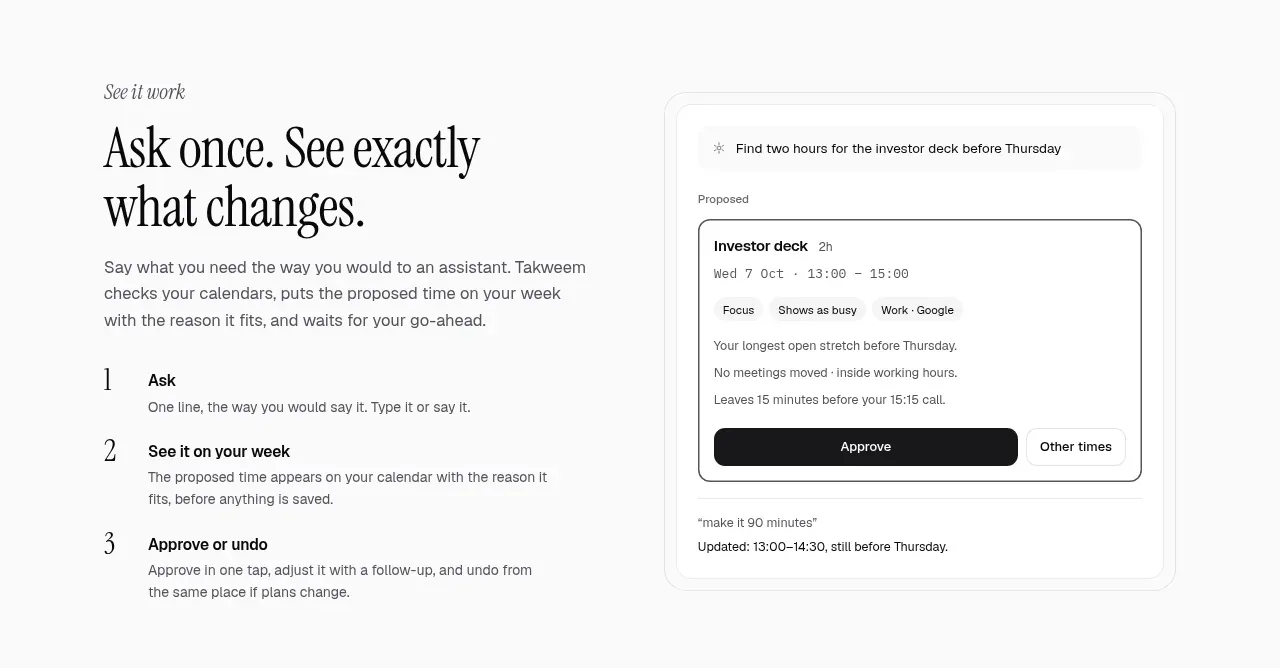
This explainer introduces a three-step workflow beside a focused interface card, connecting the product’s interaction model to a concrete result.
Prompt preview
## Reference images

Study these alongside the description below: hierarchy, rhythm, spacing, colour. Build for the product you are asked about, using this design language.

- Component: https://kage-design-assets.t3.tigrisfiles.io/components/takweem-ai/0f53cdf8-216d-4033-bf99-d7586d054974-1791439459-4.webp
- Full page it was cut from: https://kage-design-assets.t3.tigrisfiles.io/screenshots/takweem-ai/0f53cdf8-216d-4033-bf99-d7586d054974-1791439356553-full.webp
- Component on Kage: https://kage.design/component/takweem-feature-grid-2

## Before you start
Ask the user what their product’s main workflow is, what three actions users take, and what interface state best demonstrates the result. Then apply these rules.

- Use a two-column section with an eyebrow, large editorial heading, explanatory paragraph, and numbered vertical steps on the left.
- Put a realistic product-state panel on the right inside layered, lightly bordered frames.
- Number steps prominently, but keep the step titles bold sans-serif and descriptions quieter.
- Let the mock interface carry the proof: include fields, status, controls, and a clear successful outcome.
- Align the top of the copy with the visual and use ample whitespace between sections.
- Palette: #fcfcfa background, #171717 text, #70706b secondary text, #f7f7f4 panel fill, #dcdcd6 borders, black primary controls, 12–18px radii.
- Make the two columns stack cleanly on small screens.

Never: use logos, product names, copy, illustrations, or imagery from the reference.
More components

 Privacy and optional intelligence
Mailwell · Feature grid
Privacy and optional intelligence
Mailwell · Feature grid
 Reliable, recoverable actions
Mailwell · Feature grid
Reliable, recoverable actions
Mailwell · Feature grid
 Unified account setup
Mailwell · Feature grid
Unified account setup
Mailwell · Feature grid
 Fast local workflow and calm reading
Mailwell · Feature grid
Fast local workflow and calm reading
Mailwell · Feature grid

 Cloud layer workflows
ProcBoss · Feature grid
Cloud layer workflows
ProcBoss · Feature grid
 Operational blind spots
ProcBoss · Feature grid
Operational blind spots
ProcBoss · Feature grid