 kage
kage
takweemai.com
Design analysis
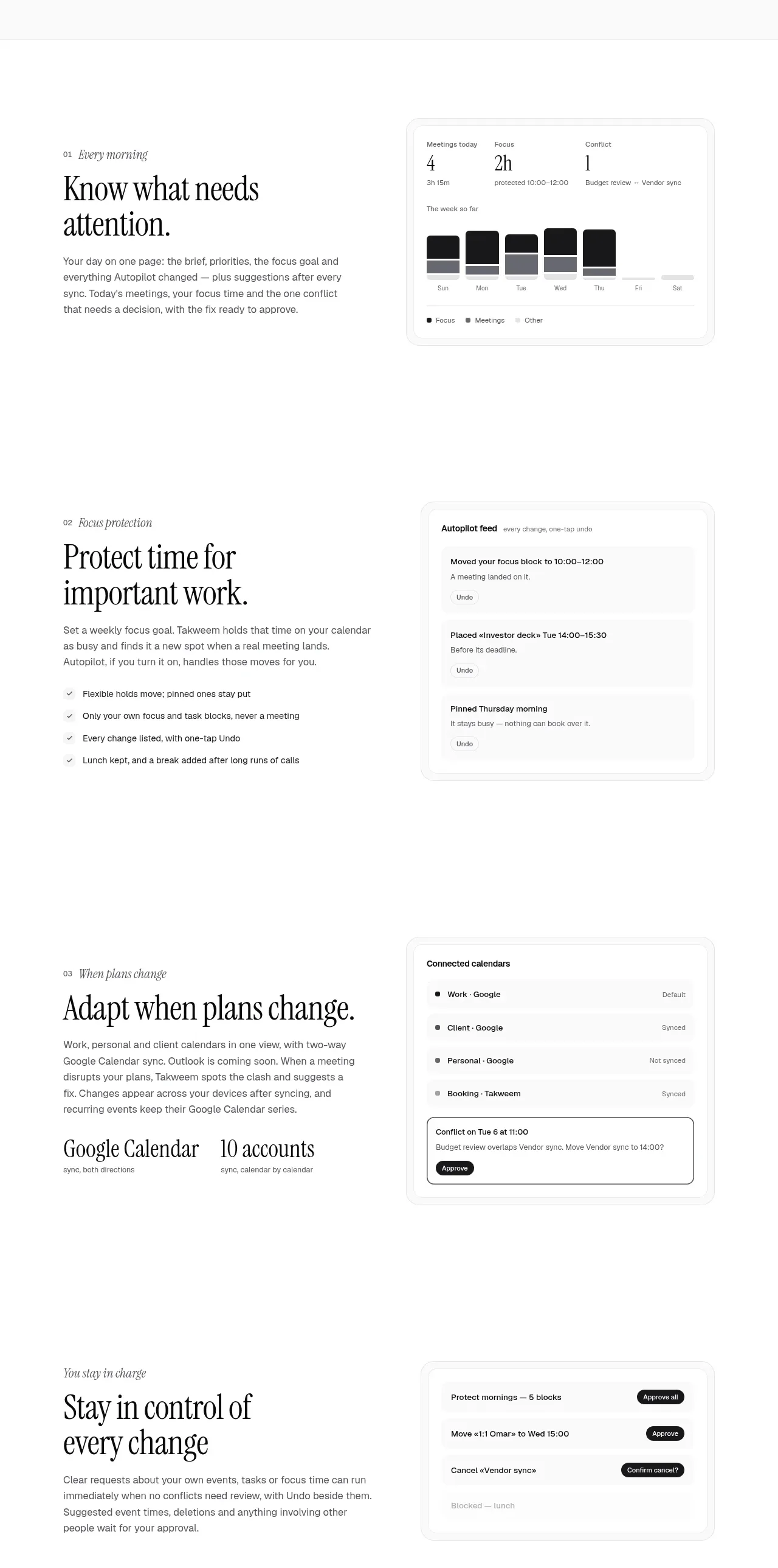
A sequence of spacious alternating product-story bands presents three capabilities with large editorial copy, supporting details, and focused UI panels.
Prompt preview
## Reference images

Study these alongside the description below: hierarchy, rhythm, spacing, colour. Build for the product you are asked about, using this design language.

- Component: https://kage-design-assets.t3.tigrisfiles.io/components/takweem-ai/0f53cdf8-216d-4033-bf99-d7586d054974-1791439460-5.webp
- Full page it was cut from: https://kage-design-assets.t3.tigrisfiles.io/screenshots/takweem-ai/0f53cdf8-216d-4033-bf99-d7586d054974-1791439356553-full.webp
- Component on Kage: https://kage.design/component/takweem-feature-grid-3

## Before you start
Ask the user which capabilities deserve dedicated stories, what evidence each needs, and what product UI can demonstrate them. Then construct an original capability sequence.

- Create three or four generous horizontal feature bands; each should have a text column and a product UI card column.
- Alternate visual emphasis or alignment subtly between bands, but retain a consistent reading rhythm.
- Give every band an eyebrow/index, a large serif heading, a short paragraph, and optional checklist or metric details.
- UI panels should be believable functional states—activity summaries, automation logs, connected sources, approvals, or similar—not generic rectangles.
- Use large vertical gaps between bands so each capability reads as its own chapter.
- Keep borders hairline and shadows very soft; use #ffffff/#fcfcfa backgrounds, #171717 headings, #686864 body text, #f6f6f3 panels, #e2e2dc borders, 14–18px radii.
- On mobile, put text above the visual and reduce the empty space while preserving hierarchy.

Never: use logos, product names, copy, illustrations, or imagery from the reference.
More components

 Privacy and optional intelligence
Mailwell · Feature grid
Privacy and optional intelligence
Mailwell · Feature grid
 Reliable, recoverable actions
Mailwell · Feature grid
Reliable, recoverable actions
Mailwell · Feature grid
 Unified account setup
Mailwell · Feature grid
Unified account setup
Mailwell · Feature grid
 Fast local workflow and calm reading
Mailwell · Feature grid
Fast local workflow and calm reading
Mailwell · Feature grid

 Cloud layer workflows
ProcBoss · Feature grid
Cloud layer workflows
ProcBoss · Feature grid
 Operational blind spots
ProcBoss · Feature grid
Operational blind spots
ProcBoss · Feature grid