 kage
kage
takweemai.com
Design analysis
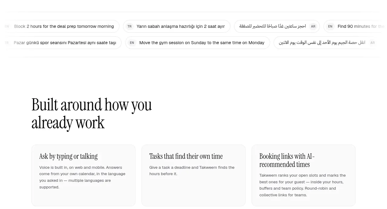
A heading introduces a six-card grid of practical capabilities, with compact rounded cards and concise descriptions that broaden the product story.
Prompt preview
## Reference images

Study these alongside the description below: hierarchy, rhythm, spacing, colour. Build for the product you are asked about, using this design language.

- Component: https://kage-design-assets.t3.tigrisfiles.io/components/takweem-ai/0f53cdf8-216d-4033-bf99-d7586d054974-1791439460-6.webp
- Full page it was cut from: https://kage-design-assets.t3.tigrisfiles.io/screenshots/takweem-ai/0f53cdf8-216d-4033-bf99-d7586d054974-1791439356553-full.webp
- Component on Kage: https://kage.design/component/takweem-feature-grid-4

## Before you start
Ask the user which supporting capabilities and edge cases should be surfaced, and what brand tone the cards should use. Then build this section from the following rules.

- Start with a large left-aligned section heading, followed by a two-row, three-column grid.
- Use light cards with subtle borders, small corner radii, short serif or humanist headings, and compact sans-serif descriptions.
- Keep card heights consistent and align content to the top; avoid icons unless the user’s product genuinely benefits from them.
- Use generous gutters and a faint background contrast so the grid feels organized without becoming dense.
- Approximate colours: #fcfcfa section background, #ffffff cards, #171717 headings, #666663 copy, #e5e5df borders; radius 12–16px.
- Make cards responsive: two columns on tablet, one column on mobile.

Never: use logos, product names, copy, illustrations, or imagery from the reference.
More components

 Privacy and optional intelligence
Mailwell · Feature grid
Privacy and optional intelligence
Mailwell · Feature grid
 Reliable, recoverable actions
Mailwell · Feature grid
Reliable, recoverable actions
Mailwell · Feature grid
 Unified account setup
Mailwell · Feature grid
Unified account setup
Mailwell · Feature grid
 Fast local workflow and calm reading
Mailwell · Feature grid
Fast local workflow and calm reading
Mailwell · Feature grid

 Cloud layer workflows
ProcBoss · Feature grid
Cloud layer workflows
ProcBoss · Feature grid
 Operational blind spots
ProcBoss · Feature grid
Operational blind spots
ProcBoss · Feature grid